|
Another month of pandemic-era work has included a LOT of work behind the bar at Porchlight, but also some fun design projects.
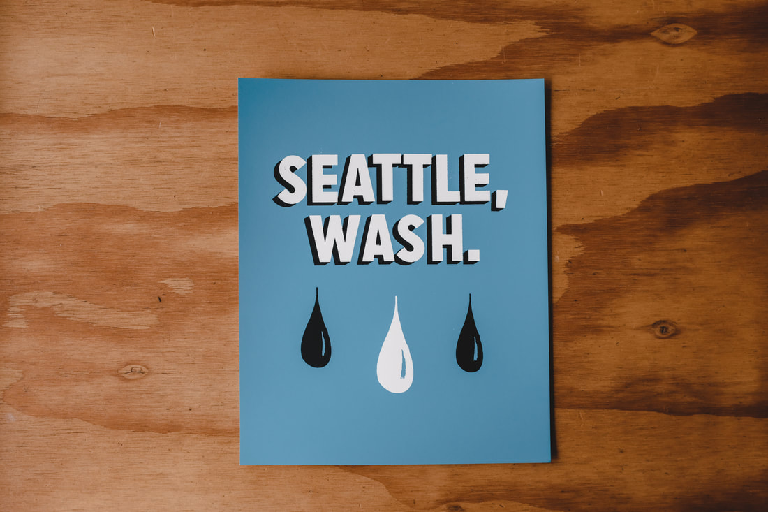
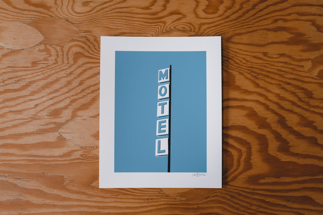
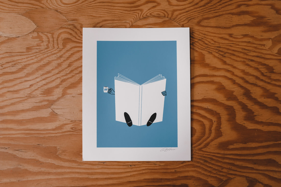
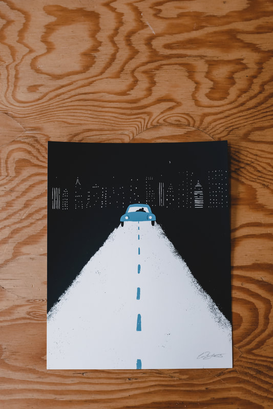
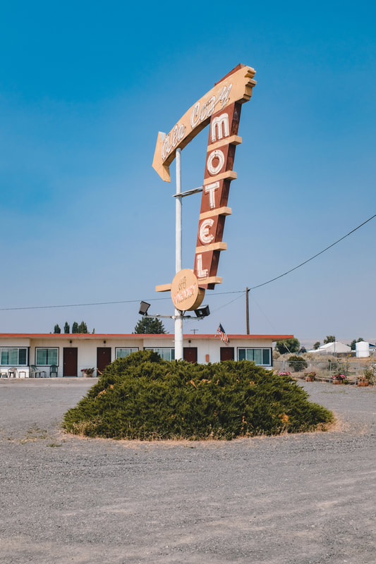
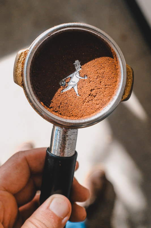
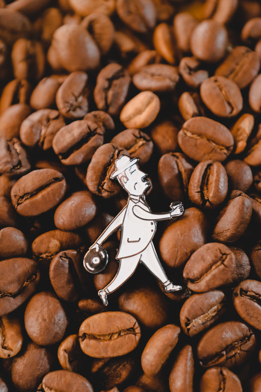
Early in the month I released a series of four 8" x 10" screen prints: a little bit of a punny play on my favorite "Washington" abbreviation, a little reading and coffee-drinking guy, a romantic night drive and a motel. They're all available over at Porchlight Design Co. for the oh-so-low price of $15 each.
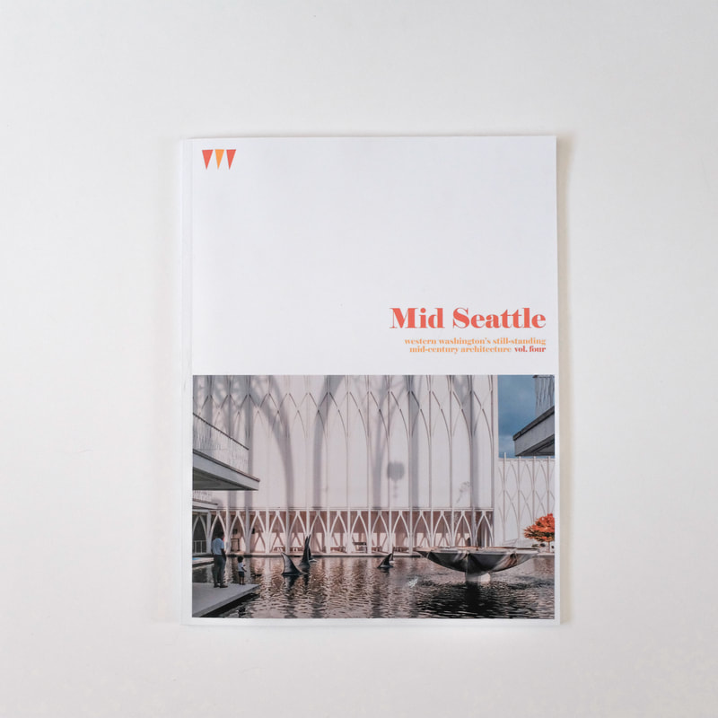
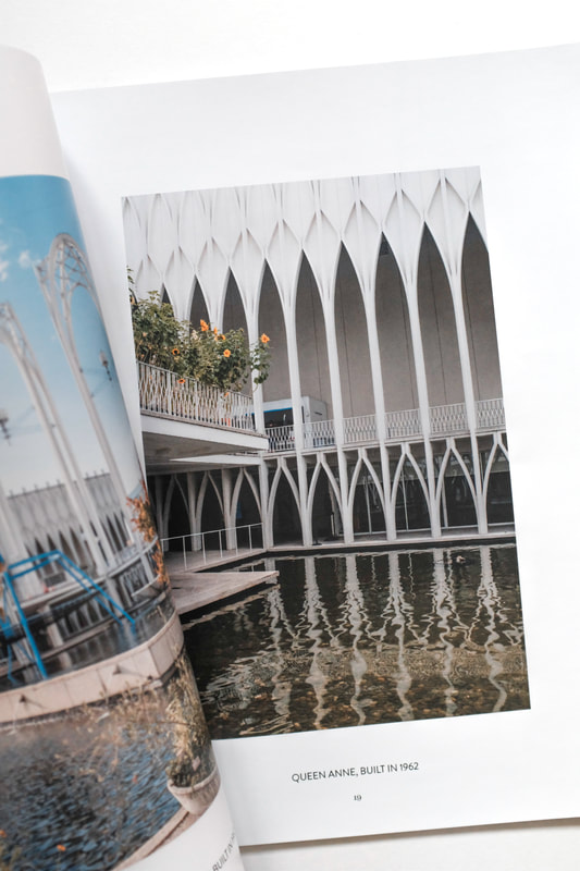
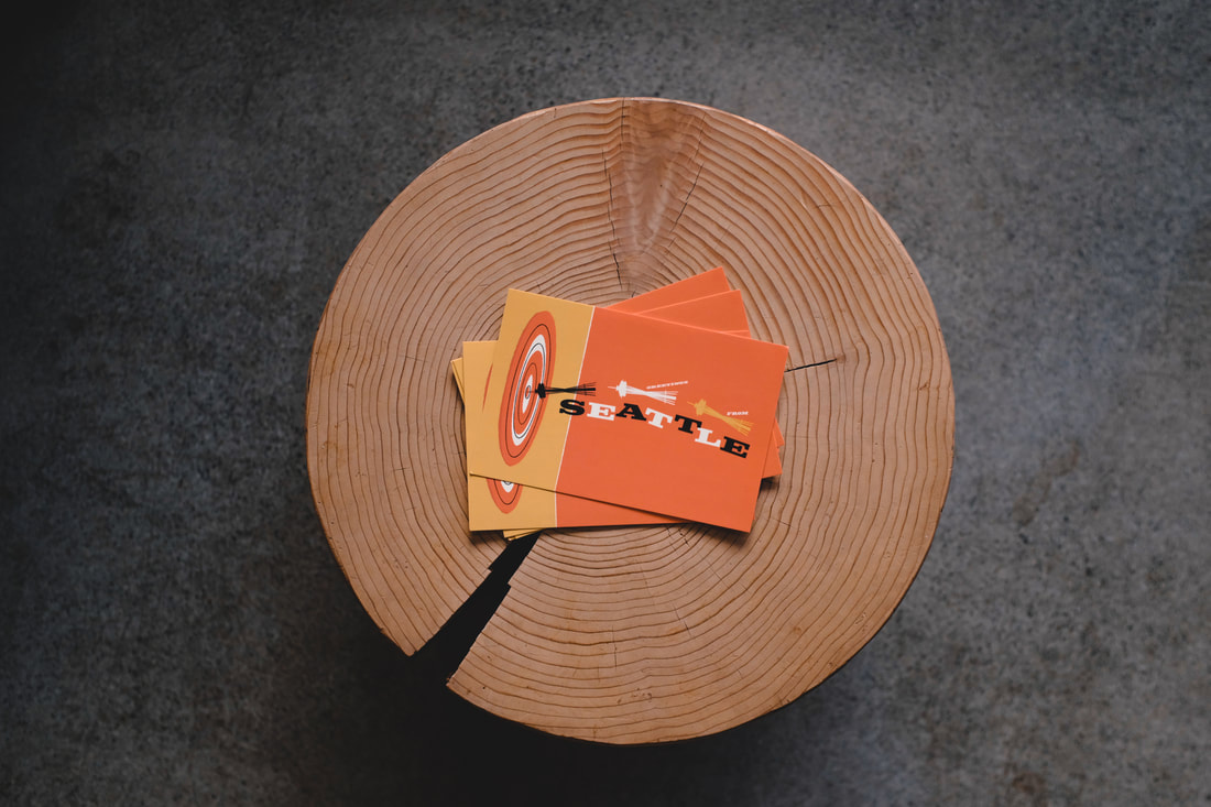
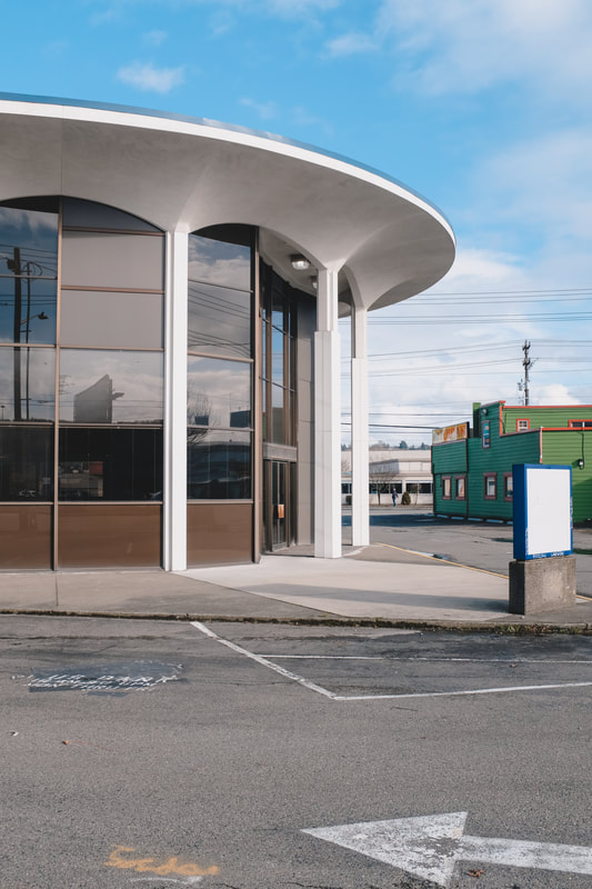
April brought the release of the latest Mid Seattle and to promote the new issue, I made a weird little stop motion video and took some photos. I recorded the background music from home as well. Volume 4 features the Pacific Science Center, which is one of my all-time favorite places in the city, designed by Minoru Yamasaki who graduated from Garfield High in the 30s. You can grab a copy at Porchlight, or online at midseattle.com or Porchlight Design Co.
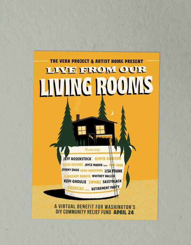
Across the world, pandemic-relief funds are gathering donations, but not many folks are raising money for small DIY spaces–but luckily, The Vera Project is doing just that. Makeshift venues are important safe spaces for all-ages music and give a voice to those that deserve to be heard. I designed this poster for Vera's event featuring a whole bunch of lovely musicians playing from home in order to raise money for Seattle's DIY spaces. The event was a big ol' success and raised over $10,000.
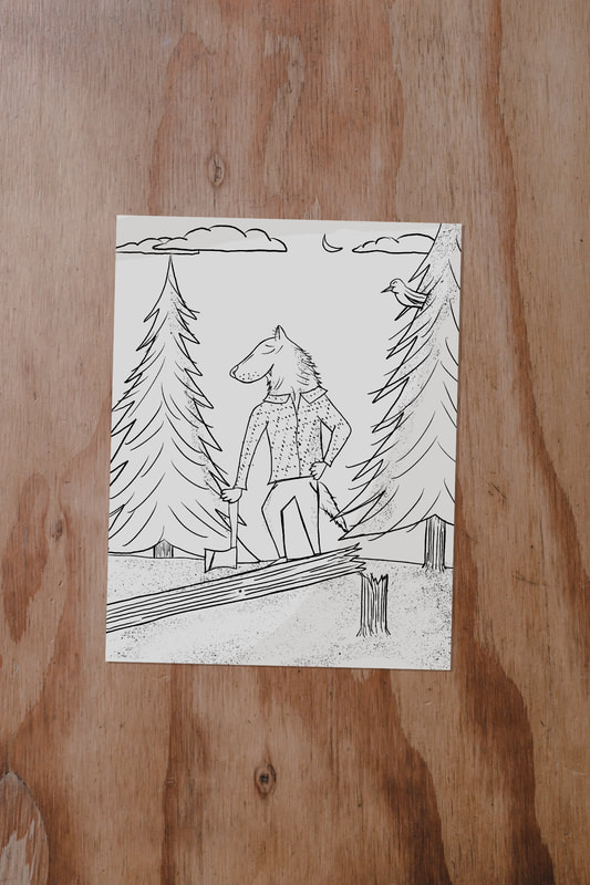
Stay Inside The Lines has made a downloadable coloring book to keep folks occupied during their time at home. I adapted a poster I made for Sera Cahoone a couple years ago into a timberwolf coloring page. You can download the book right here.
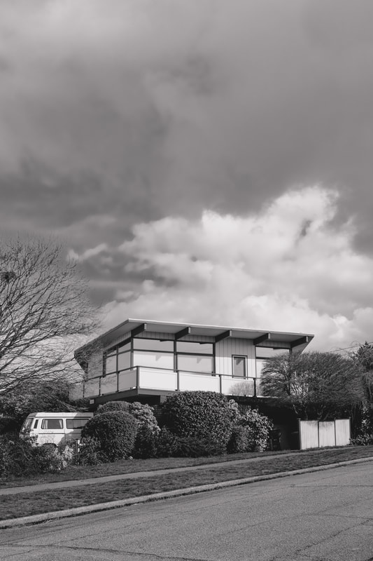
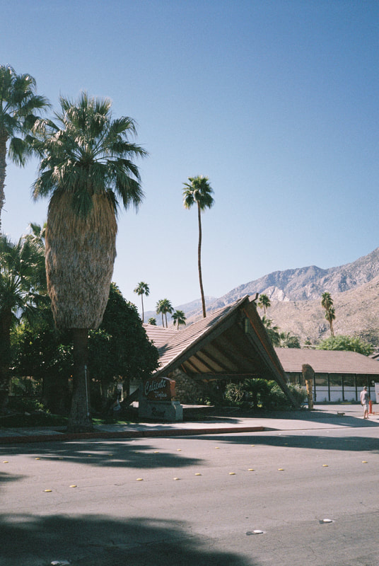
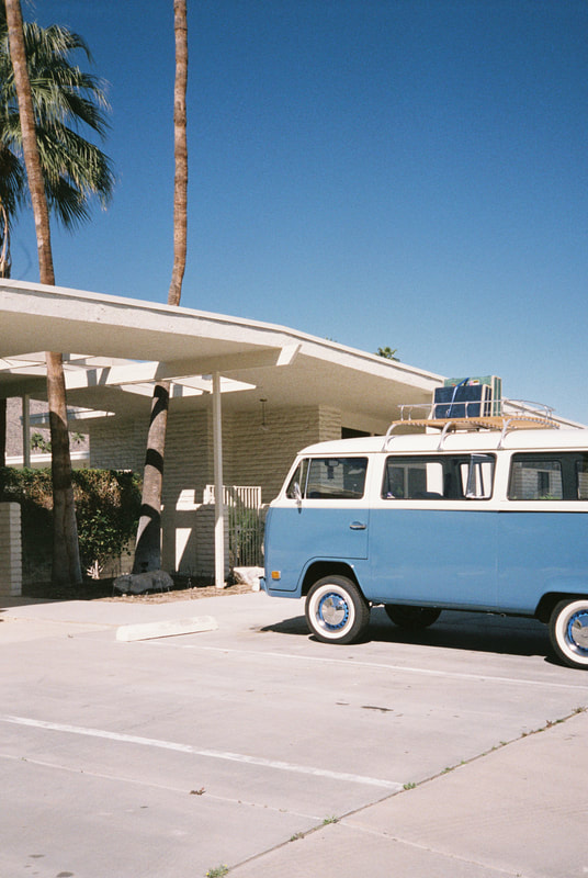
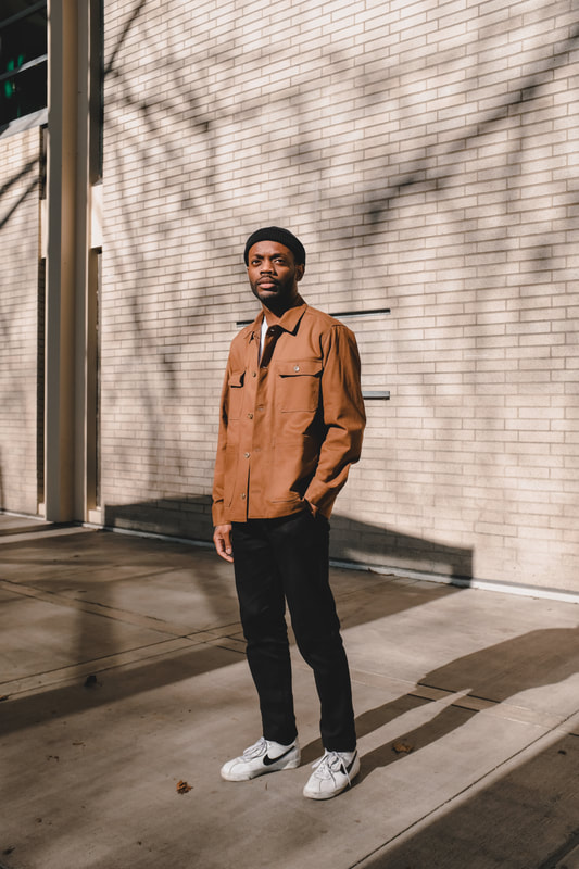
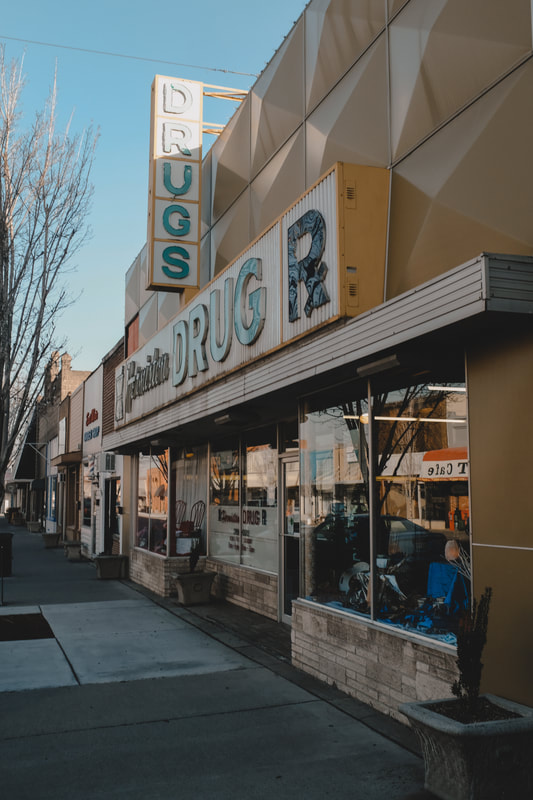
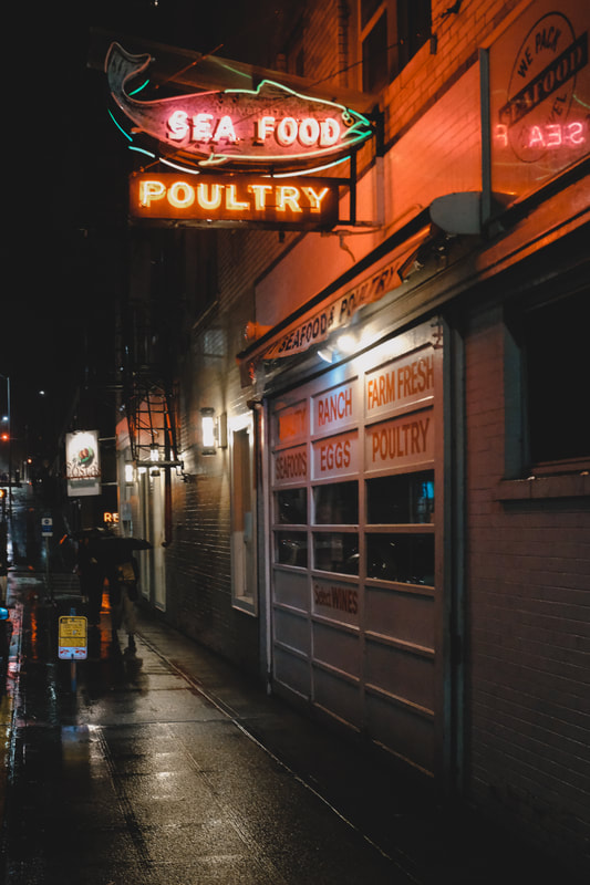
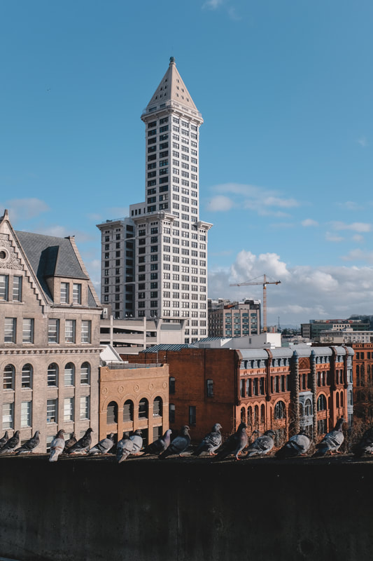
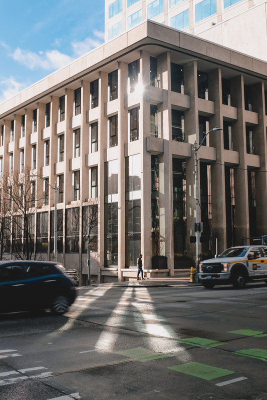
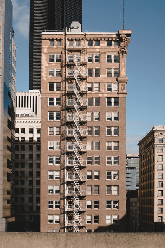
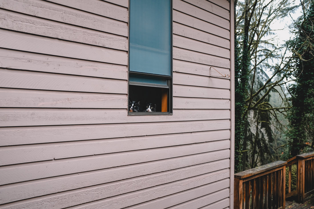
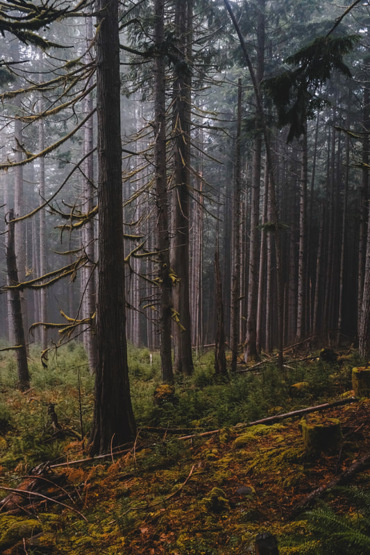
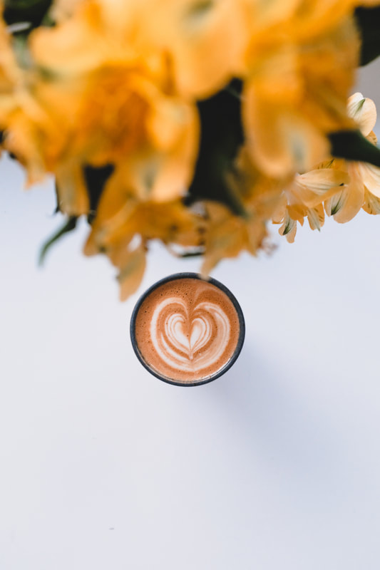
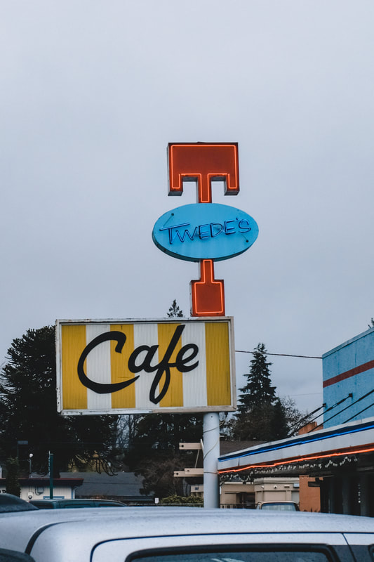
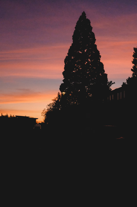
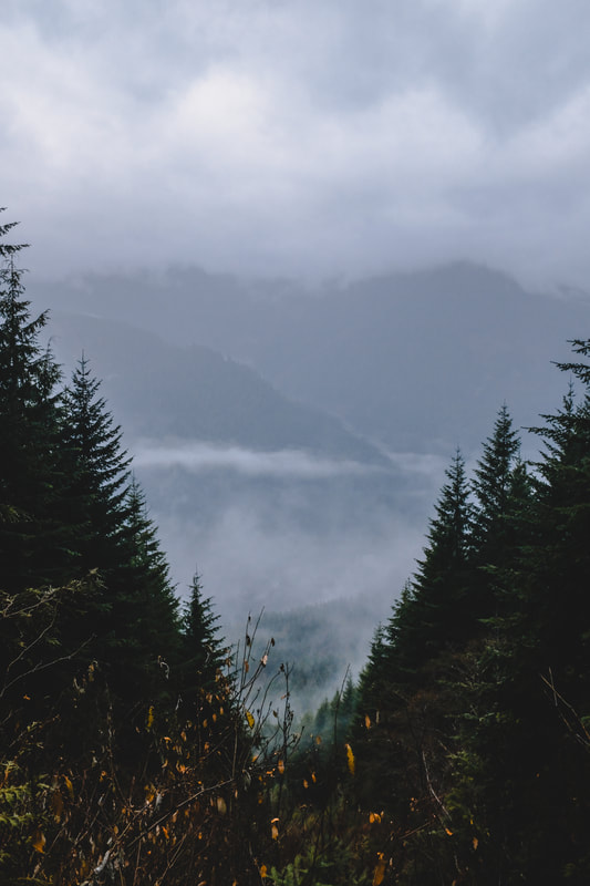
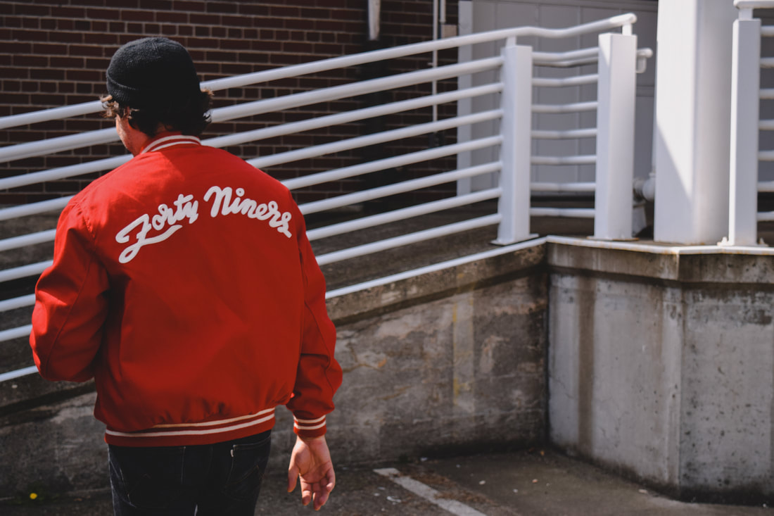
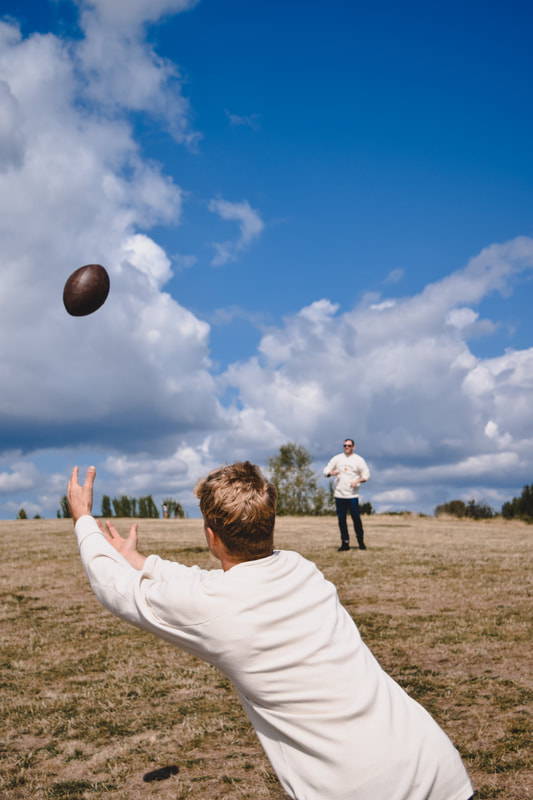
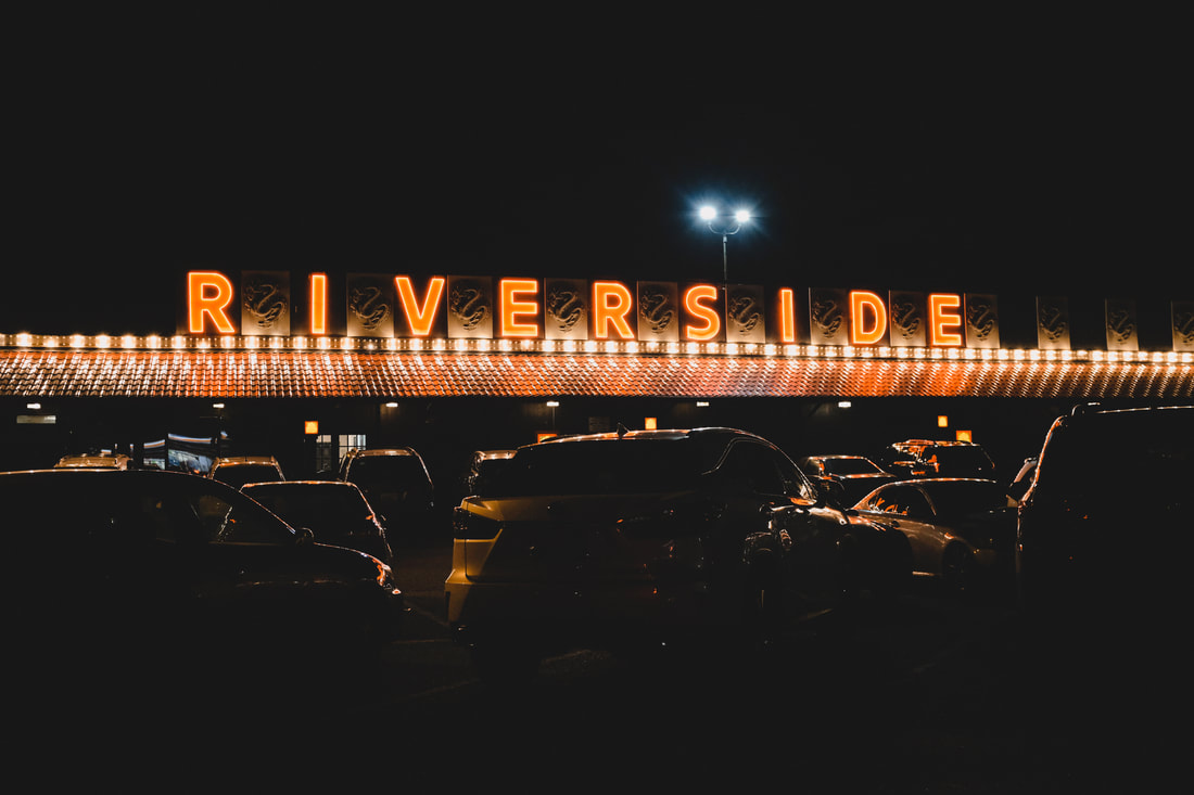
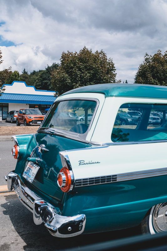
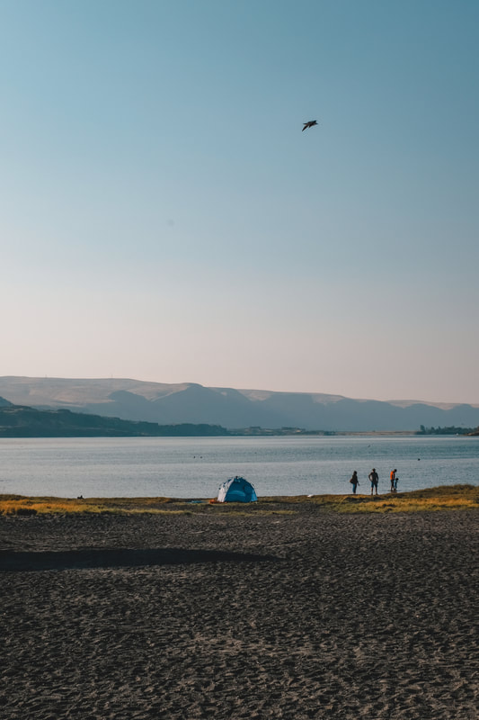
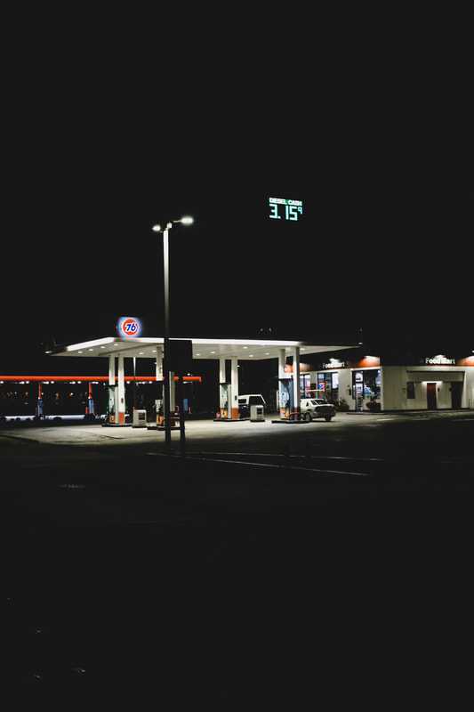
Lastly, some of my favorite photos of the month...
While times are weird, there is still work to be done. April 7th marks the release of Tomo Nakayama's new record "Melonday", which Porchlight is releasing on vinyl (currently #1 on KEXP's Northwest Charts!). Along with some small promotional material to promote the release, I created a long-distance music video with Tomo. I texted him one morning with an idea for his song "There Goes The Neighborhood"–I wanted to combine old photos of Seattle and the Pacific Northwest, with him singing. The end video I was hoping for was to look almost like projections over his face, while he sat in a photo booth. I used my collection of Kodachrome slides that I've gathered over the years, so most were already digitized and retouched. Watch the video below and listen to KEXP to hear "There Goes The Neighborhood" and more from the new album.
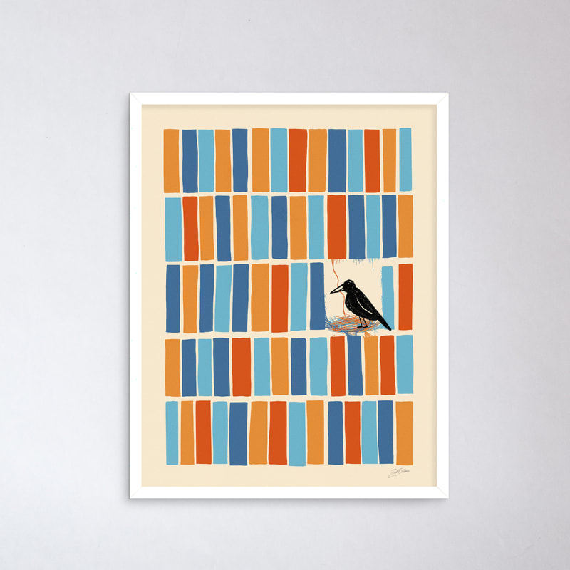
Next up is an art print that started off as a color palette practice. I've been using old advertisements and print posters to broaden my color preferences and it gradually morphed into this new print. It's available via Porchlight Design Co.
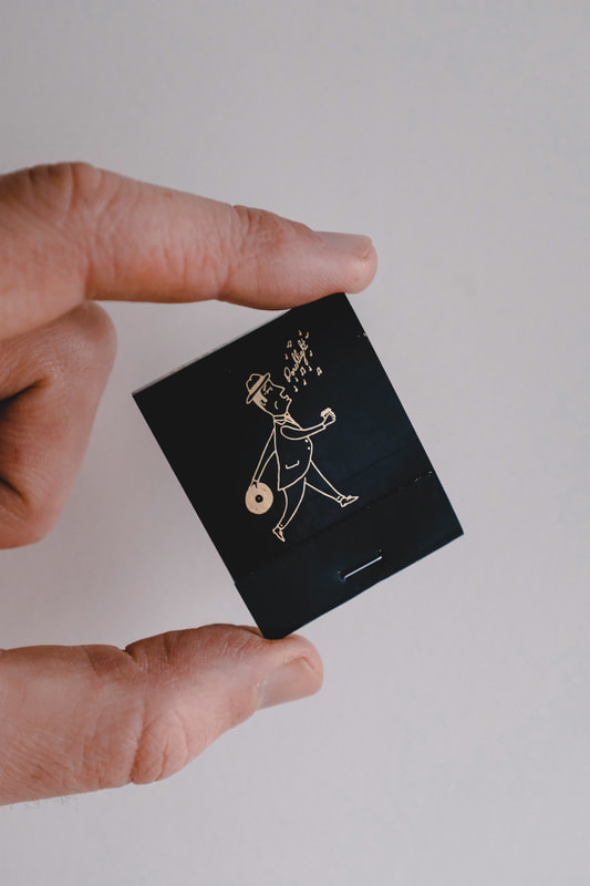
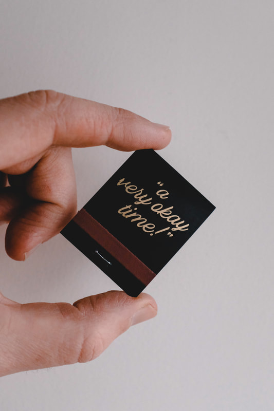
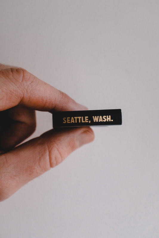
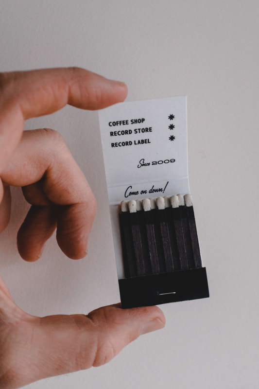
Ever since I saw my grandma's collection of matchbooks from all over the world, I've had a very big soft spot for 'em. As an adult, the varying styles of design and sometimes suggestive wordplay only made them more appealing. In the 50s and 60s when everyone was smoking, every type of shop seemed to have their own matchbooks: gas stations, dry cleaners, hotels, restaurants and coffee shops. I decided it was time to make some gold foil matchbooks for Porchlight. As a little jab at the never-ending "best in town" and "highest quality around", I decided to set the bar right in the middle and continue with "a very okay time".
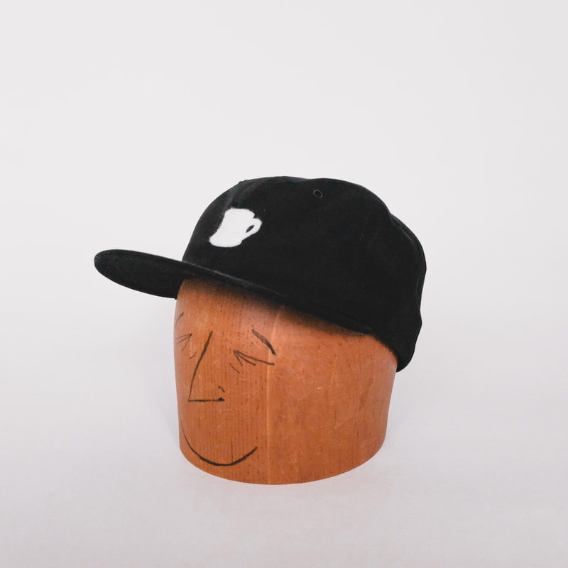
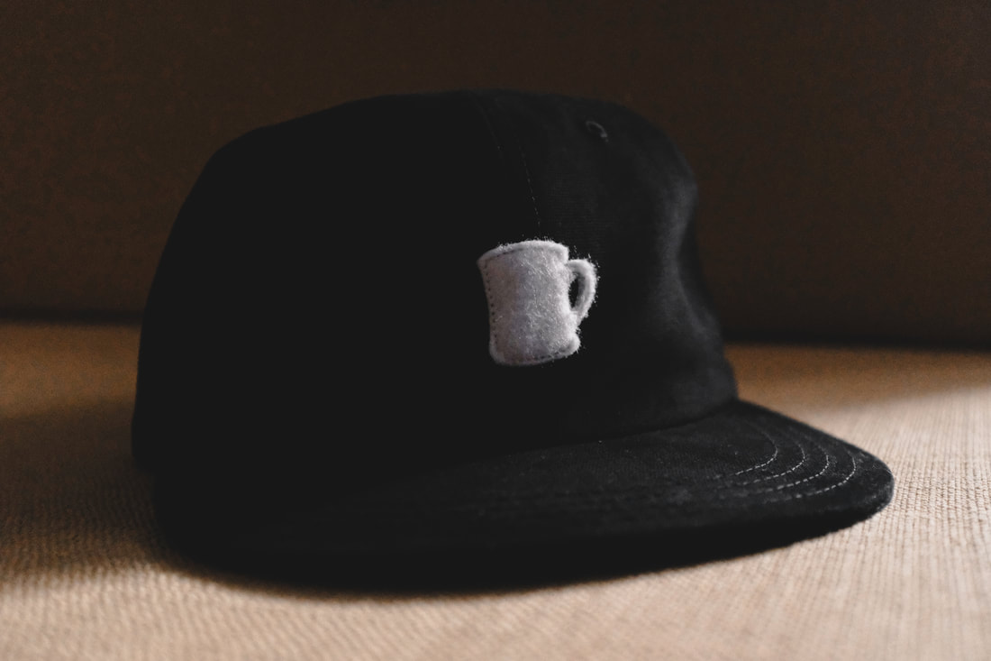
In more Porchlight merch news, I teamed up with Apparel Works here in Seattle to design a baseball cap based on the original Porchlight mug logo. Handmade here in town with 8 oz brushed canvas, a felt diner mug logo and an adjustable leather strap, these bad boys sold out within a couple weeks, but never fear–more are being made right now. When they're back in stock, you'll see them here.
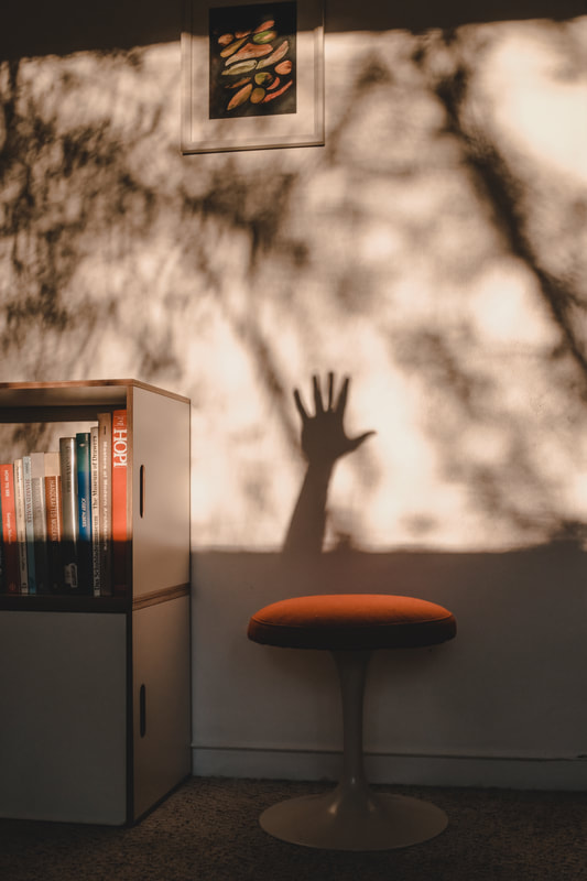
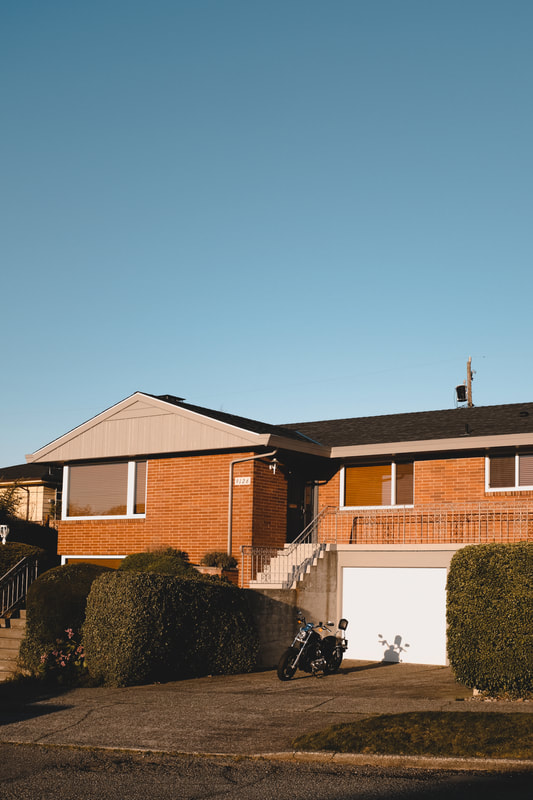
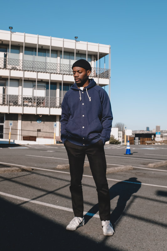
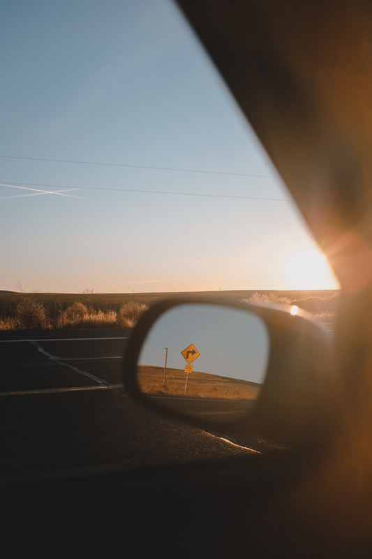
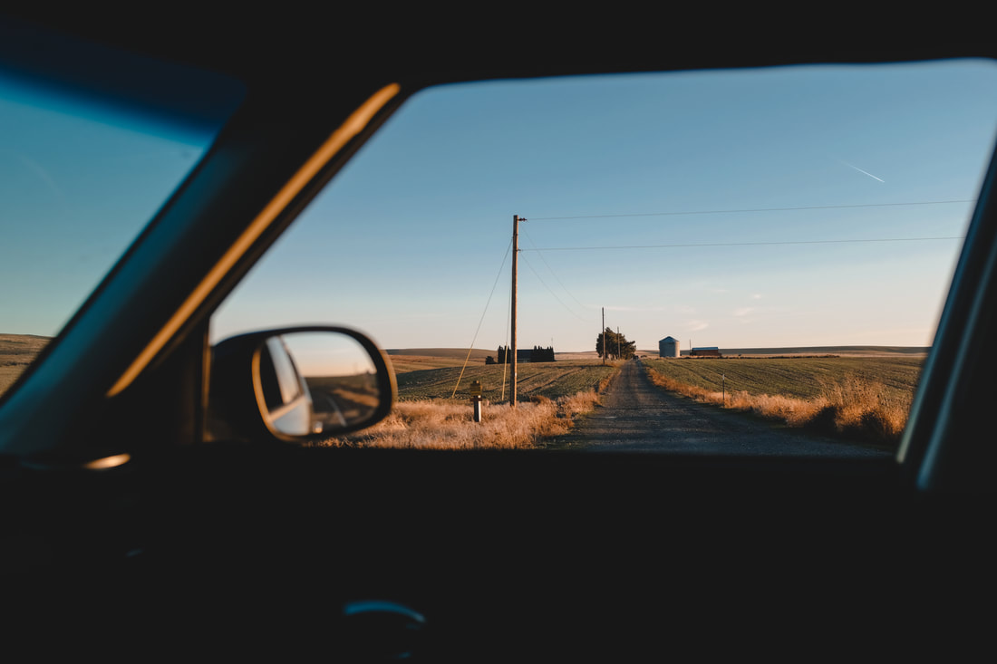
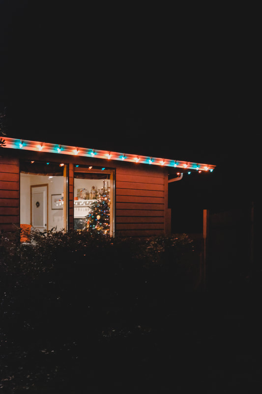
And lastly, my favorite photos that I took in the month of March.
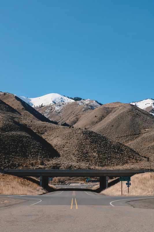
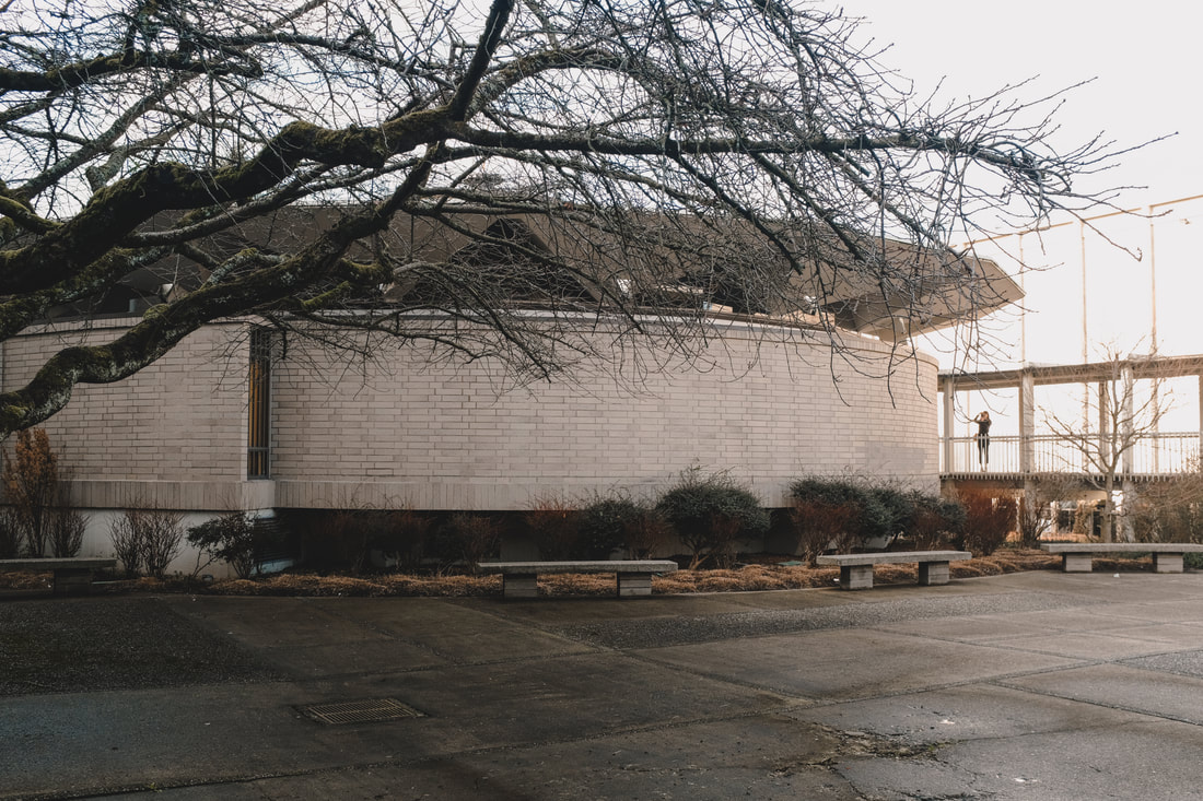
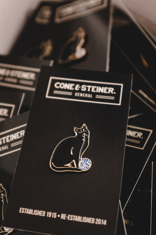
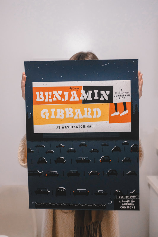
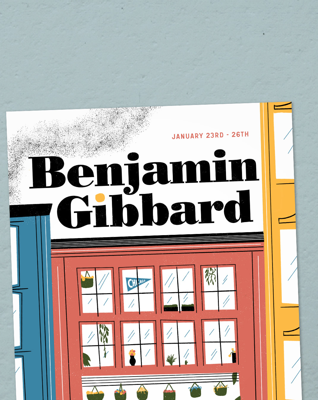
A lot of projects have fallen under the Porchlight umbrella over the years, but one of the first was releasing a vinyl LP for Tomo Nakayama's band Grand Hallway. Porchlight Records has released three of his records over the years, with a brand new one coming out in April. To celebrate the release, we're having a show at the Sunset in Ballard and I designed the poster which is inspired by my dad's old Seattle Seafair hydroplane souvenirs. 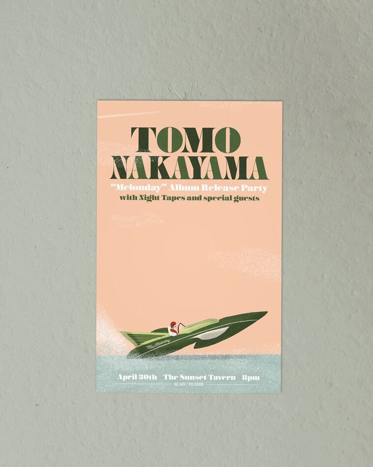 This month brought another poster for the historic Fillmore in San Francisco for an artist that isn't quite in my regular wheelhouse. Chris Lane is a contemporary country singer, which I admittedly don't know a ton about. I took some time to watch some videos, listen to some songs and figure something out that I thought he and his fans would like, while still staying in my design-comfort-zone. 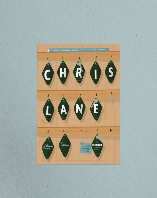 Over at Porchlight Design Co. I post photo sets from different trips around the Northwest and beyond. I recently made a quick solo trip to Boise, ID and took plenty of photos. You can find the whole set right here. 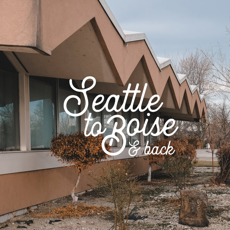 I also squeezed in a small poster for Fast Times.! and their Noise Pop happy hour in San Francisco. 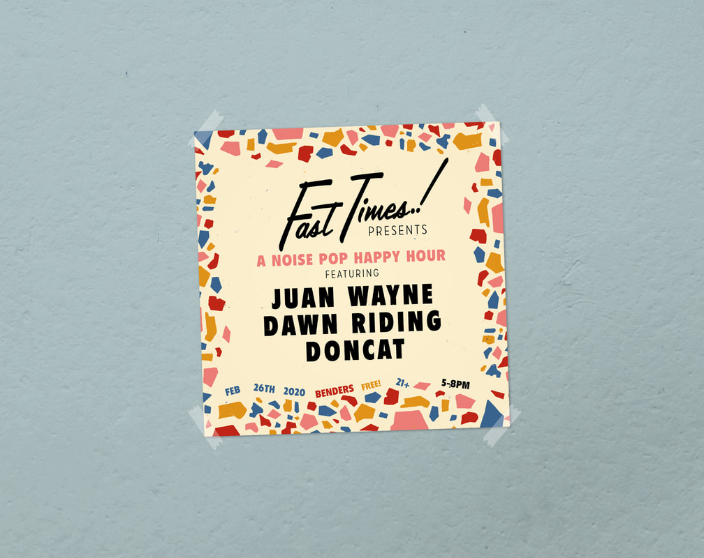 I always love working with my friends at Freeman. They make so much beautiful clothing right here in Seattle and while it's rare to have US-made clothing, it's even rarer to see it made in our city. I shot some photos for some of their new menswear pieces that were just released.  And a collection of my favorite photos from the month... January is a real garbage month here in Washington. But here are some fun posters from the month... First up is a three-color screen printed poster for the New Pornographers at The Neptune. Inspired by an old airline poster, this one shows the arm of a formal waiter serving up Mt. Rainier–it even has a festive little flag on top. You can buy a copy right here. 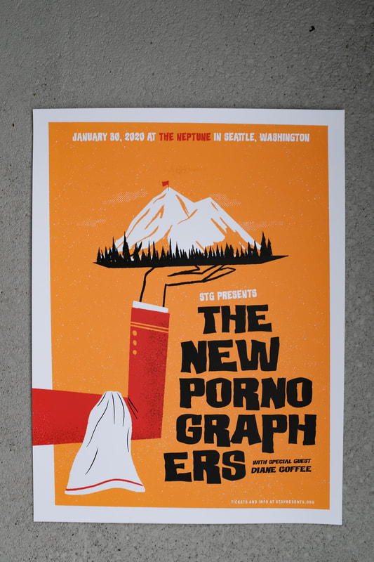 The second poster of the month was for Tomo Nakayama and Ings at the Fremont Abbey. This show had the coziest theme in the world and even included a candle exchange. 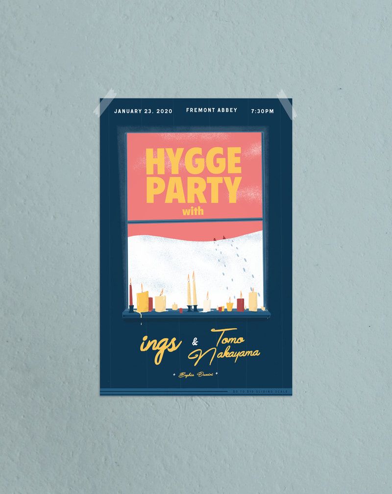 This next one is my third for design for Ben Gibbard in the last few months and one of my favorites I've designed. A while back I came up with a similar design, but ultimately I wasn't as happy with the color choices and overall design, but this one for Ben fixed that. Later in the year it'll be screen printed and available for purchase. 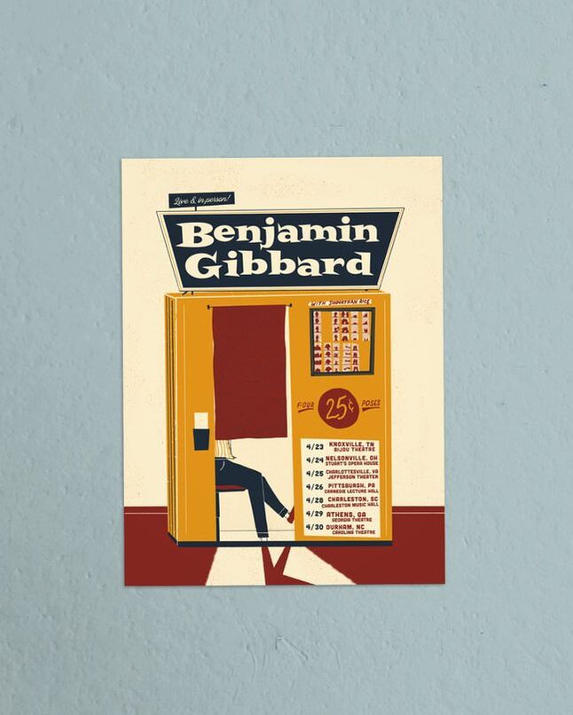 While I did grow up in the 80s, the decade generally doesn't have much influence on my design work. But this poster was for an 80s-themed evening at the Showbox and came out pretty well. 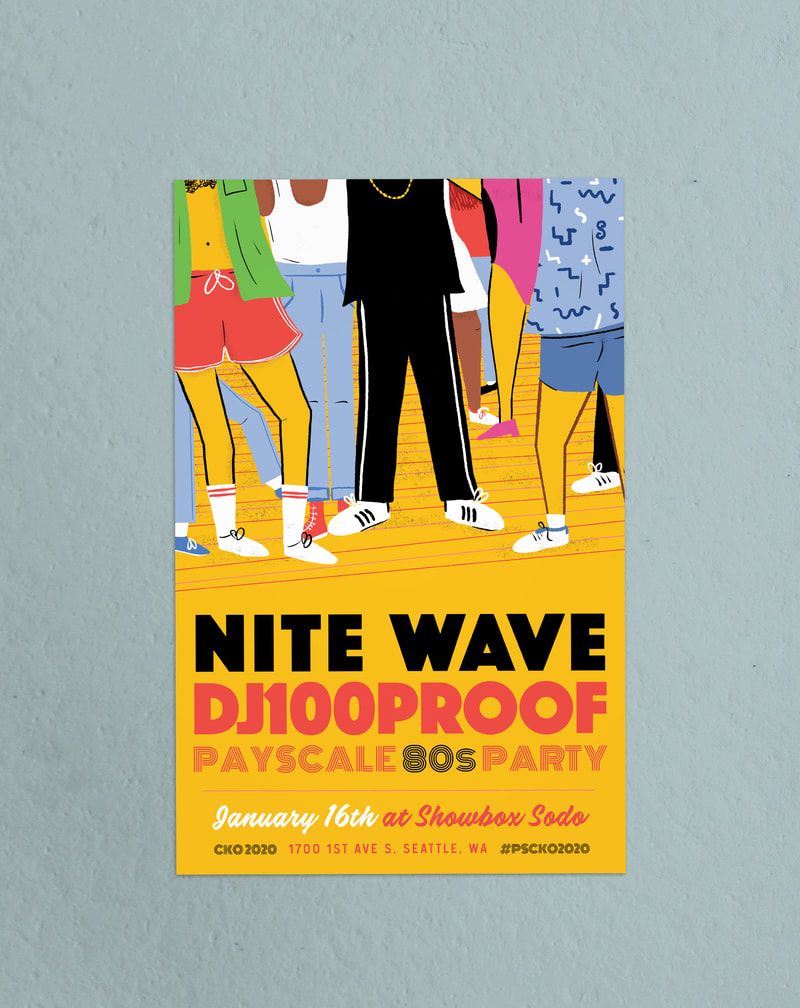 Last but not least, the best photos I took during the month of January–as voted by me. There were a few fun little projects in December, with a whole bunch more coming next month. First were two pins for Cone & Steiner, the locally-owned neighborhood market with three locations. For one, I designed gold plated cat, holding a ball of string with a semi-subtle "C&S" in it. For the other, a proud little seagull sailor in silver.
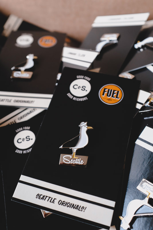
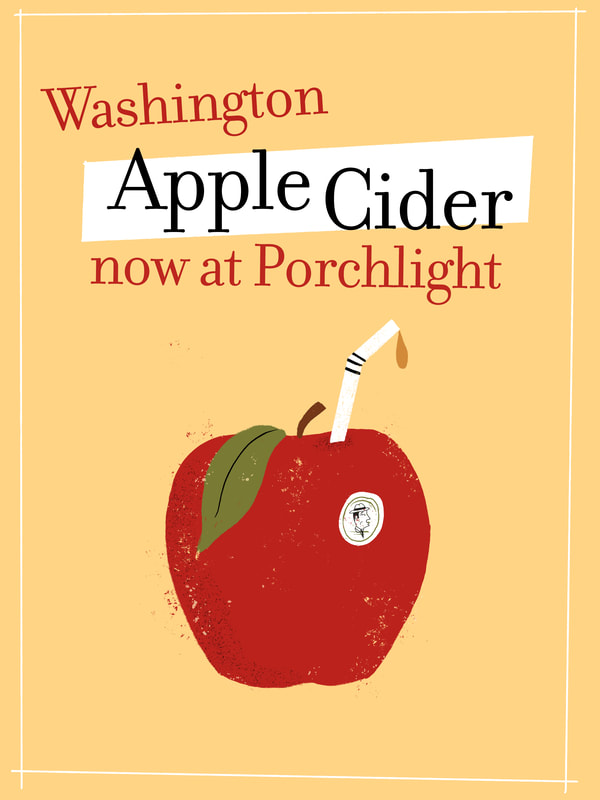
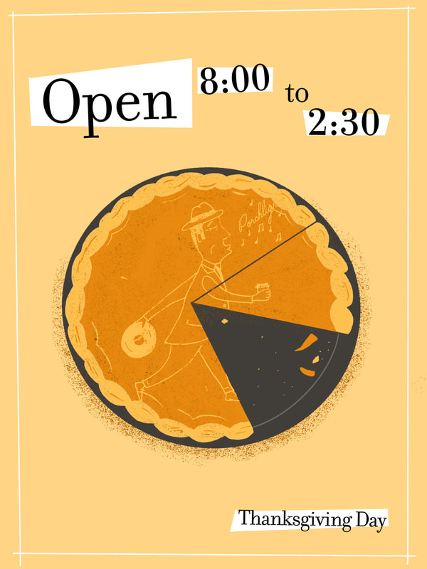
Before starting Cone & Steiner, owner Dani Cone opened a great long-running coffee shop called Fuel. She asked me to miniaturize the iconic Fuel mug as a pin to sell at her shops. 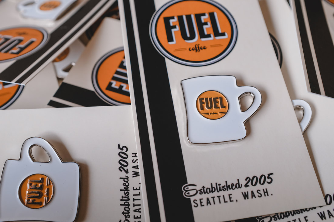 I'm constantly designing new, small things around Porchlight for physical and digital updates and recently I needed to let folks know about a couple seasonal things: our Thanksgiving hours and some brand new apple cider.
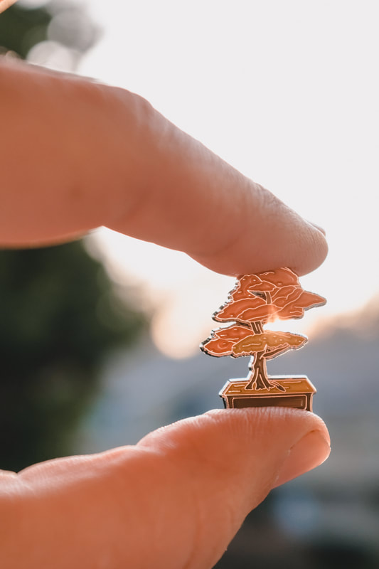
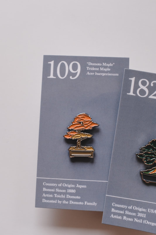
The Pacific Bonsai Museum opened in 1989 just south of Seattle. Earlier in the year I designed a pin for the museum based on one of their bonsais, nicknamed "Captain Hook". Last month, they asked me to create a new one in the same style.
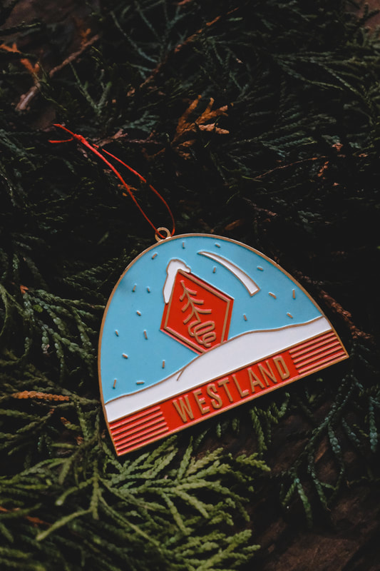
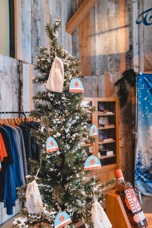
And to finish off 2019, some of my favorite photos from December. 'Tis the season for festive design stuff. First up, I designed these ornaments for Westland distillery and had them produced with my factory partners. I then finished and packaged them in house. Westland has always been a pleasure to work with in every sense and this ornament was no different. They're for sale down at their SoDo distillery and tasting room for $10.
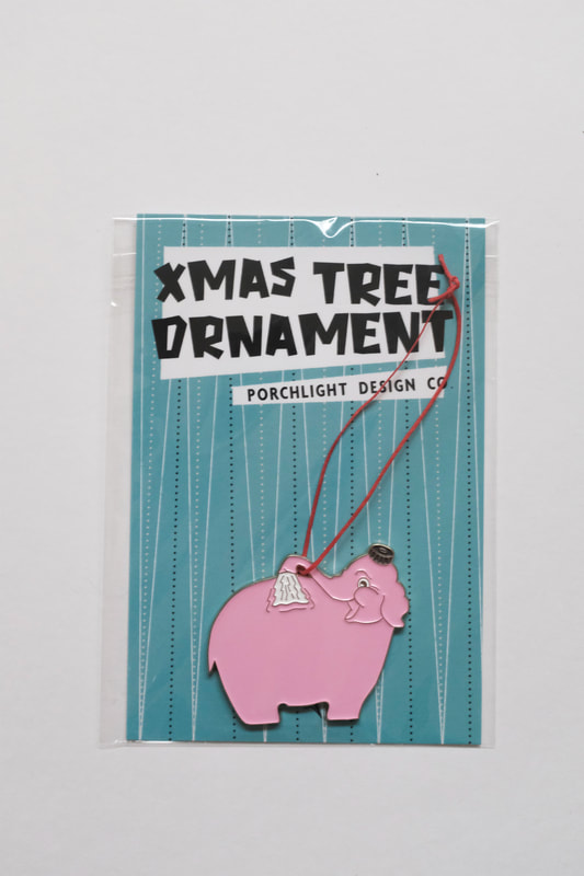
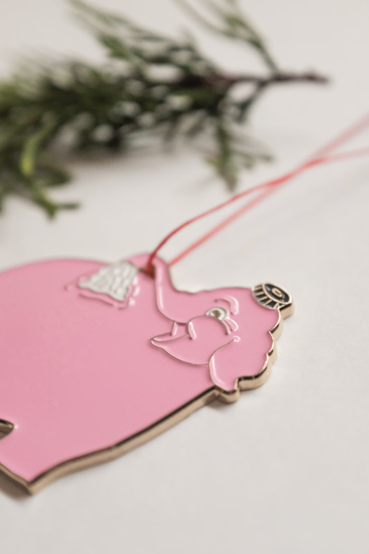
Another ornament I came up with this month was inspired by one of the greatest neon signs ever made. Also produced with my direct factory partners, it is gold plated and hand tied with festive red string. The elephant ornament is available at Porchlight and online at Porchlight Design Co. Because these are displayed prominently in-store, I wanted to make sure the packaging looked nice and professional, and could be used for past and future ornaments as well. 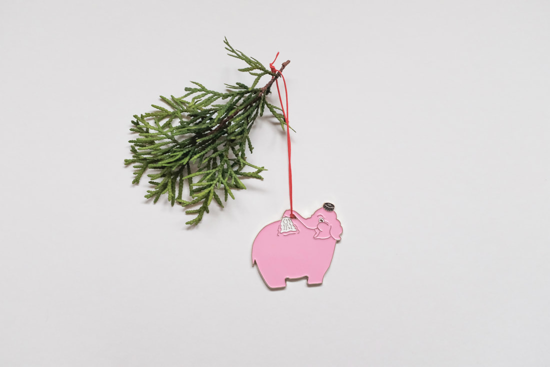
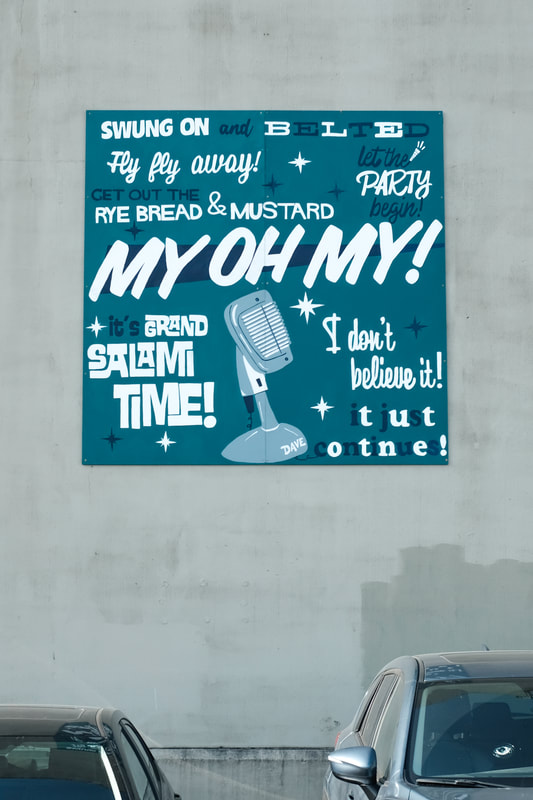
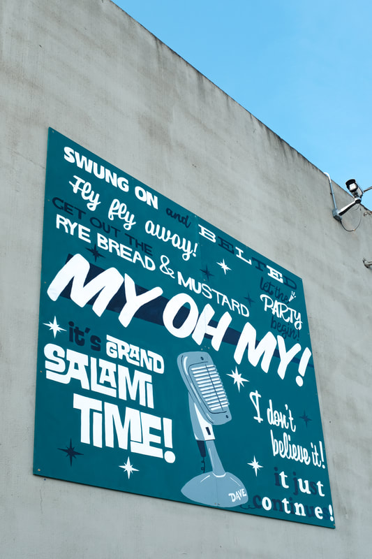
Corrie is a former teacher and brilliant cook. At the end of October she asked me to come up with some branding for her private chef business. She envisioned incorporating a wheat stalk without looking too cheesy or overused. With some unique type, stalk placement, and colors; we agreed that loved it and it didn't fall into the aforementioned cheesy category.  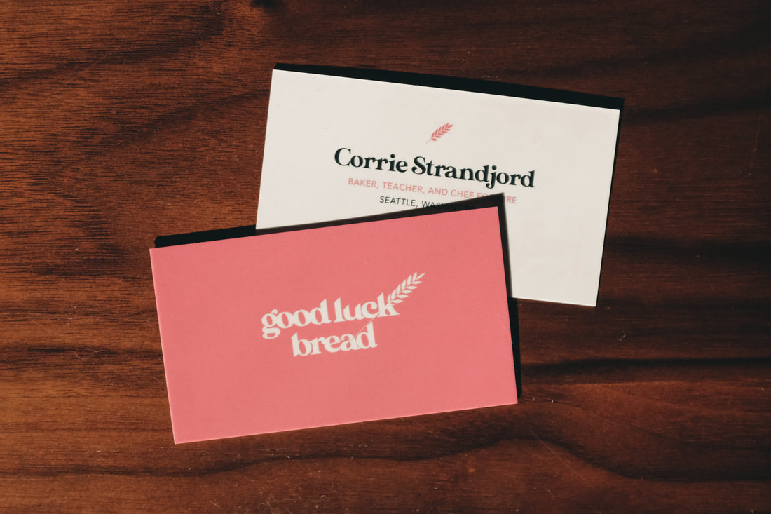 I've designed quite a few fun things for Sera Cahoone, and this fun wintery one was inspired by the Monorail and its route here in Seattle. The show is coming up on December 21! 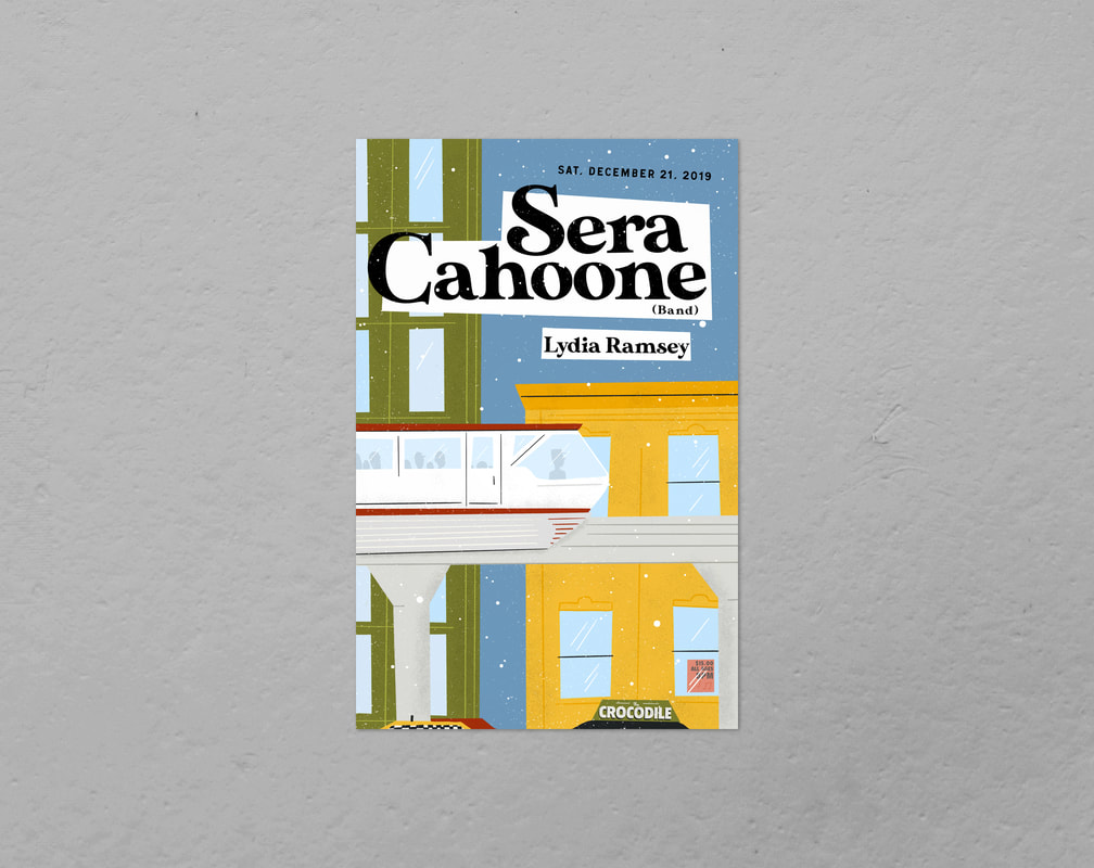 Neal Haley is a fitness instructor with a big style crush on the 60s and 70s. She's also an avid boxer who trains non-stop. To launch her personal training venture, I came up with some branding inspired by classic ringer tees of the 1970s with a color palette I knew would appeal to Neal. Taped hands are a signature of boxing and I wanted to incorporate a taped, gripping hand for a tiny bit of grittiness in a pretty easy riding design.  The grand finale of the month is something I actually designed a year ago. Urban Artworks is a Seattle-based non-profit that provides opportunities for underserved youth to partner with artists to create public art. When Urban Artworks asked if I wanted to design a small mural in honor of the late Dave Niehaus, I was beyond excited. I grew up listening to Mariner games on the radio, watching them on TV, and going to the Kingdome; so Niehaus and his voice hold an incredibly special place in my heart. I'm not much of a painter, but I designed the entire mural, then helped outline the design on wood which was later painted by some great Seattle teens. Initially the mural was set for a square wall in SoDo, but due to some building issues, the mural was moved down near the Starbucks headquarters on Occidental to a much larger wall (which makes the square mural look a wee bit small).
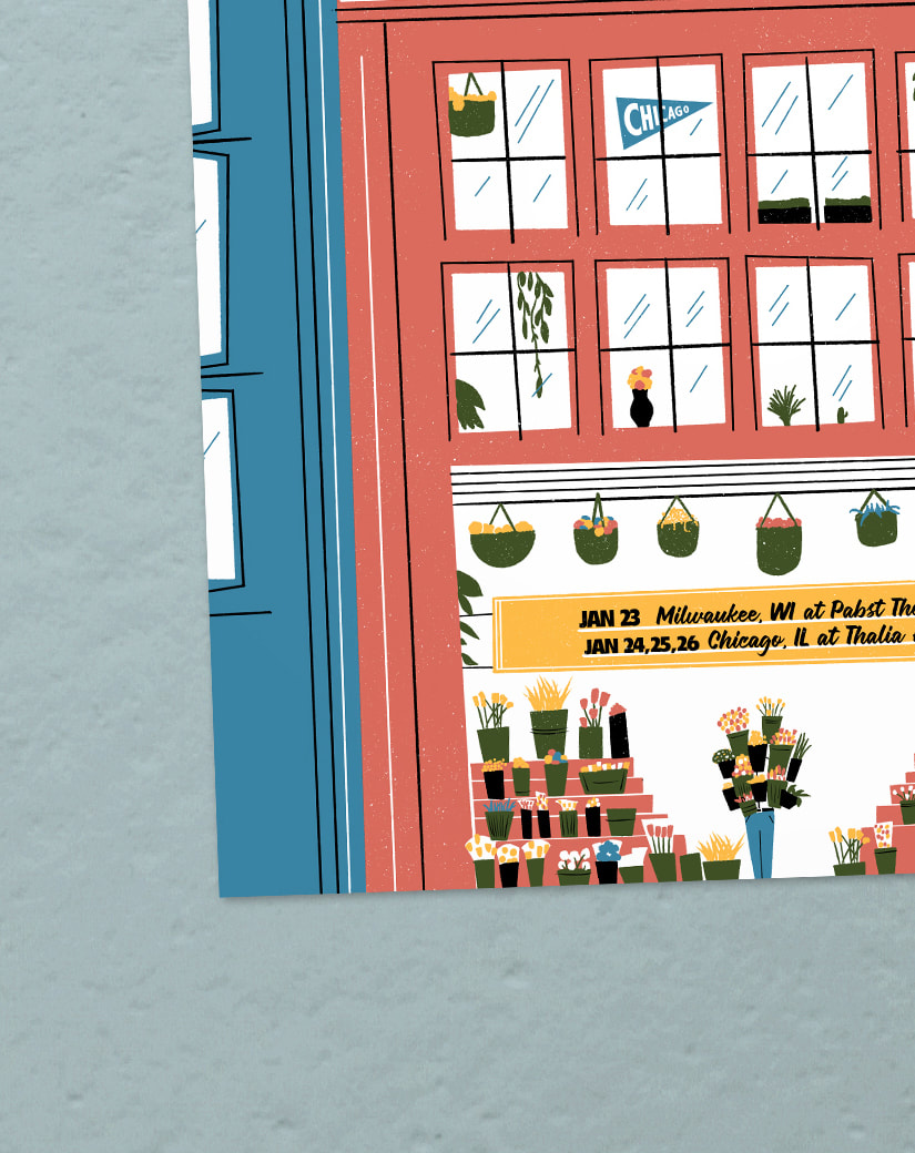
And as always, my favorite photos from the month... Early in the month, I was asked to design a couple posters for Ben Gibbard's solo shows out in the Midwest. The first shows a little flower shop on the ground floor of an apartment and some lucky person that scored an armful of plants. 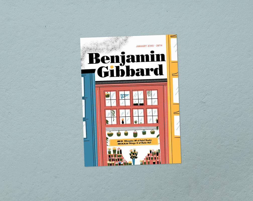
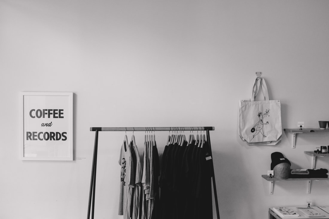
The next was a drive-in movie inspired by movie titles of the 50s and 60s, as well as children's author M. Sasek. 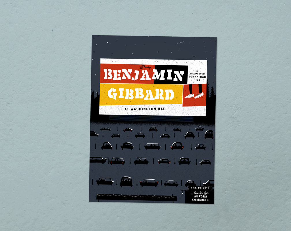 I wanted to update the Porchlight gift cards in time for the holidays, so I came up with a new design on a thick, textured card stock. 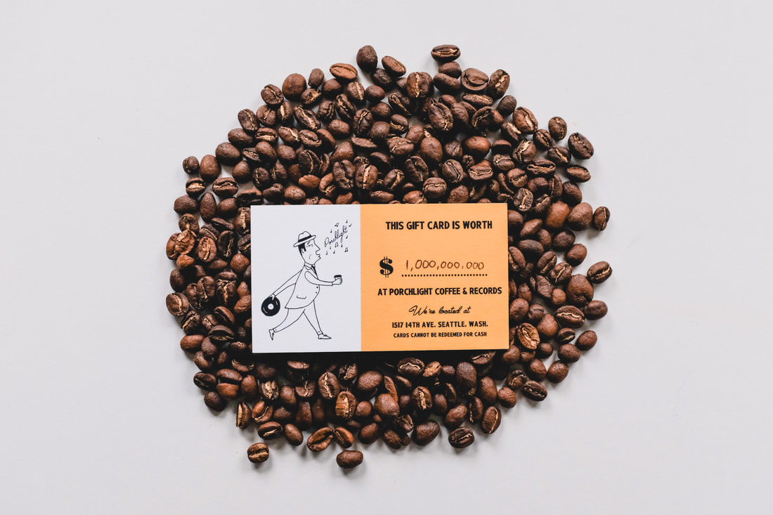 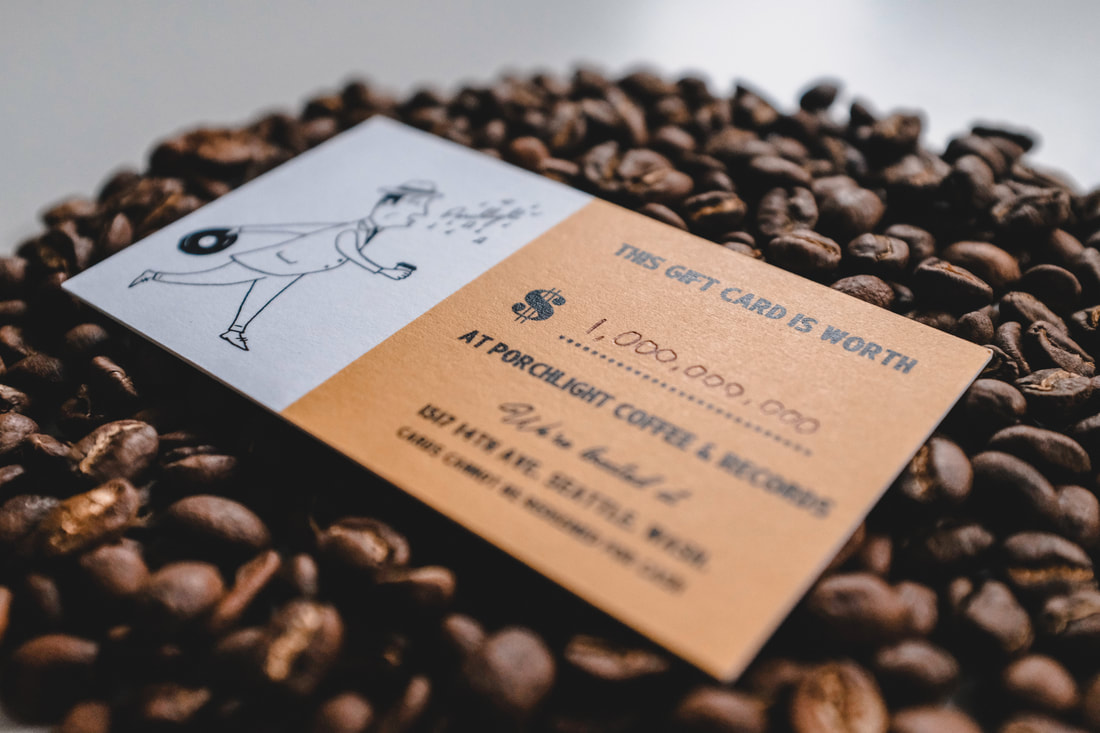 Another poster from the month was Yoke Lore at Neumos. The venue and I had decided to keep the design to two colors and they were printed by the talented Broken Press, here in Seattle. 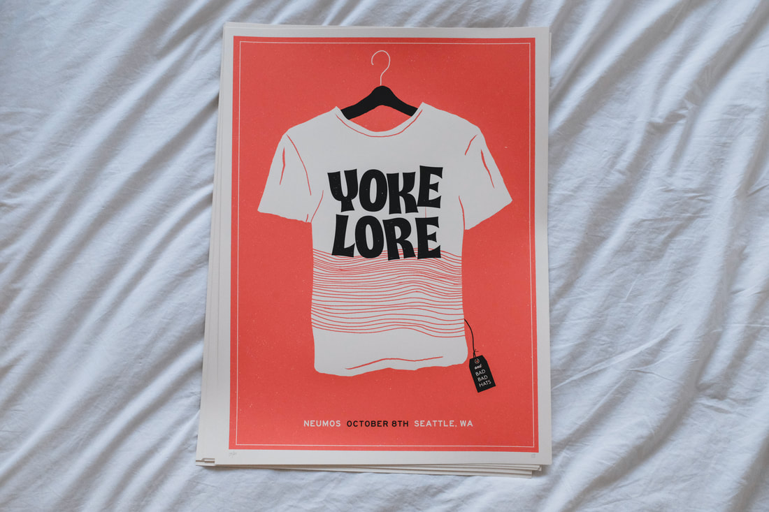 At Porchlight, we have a small display of greeting cards at the counter, all of which I've designed at various times. I was feeling antsy for a couple new designs which include the celebratory long dog with balloons and the for-no-particular-occasion seal balancing coffee dishes. 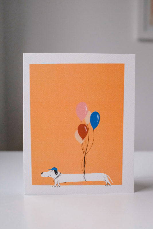 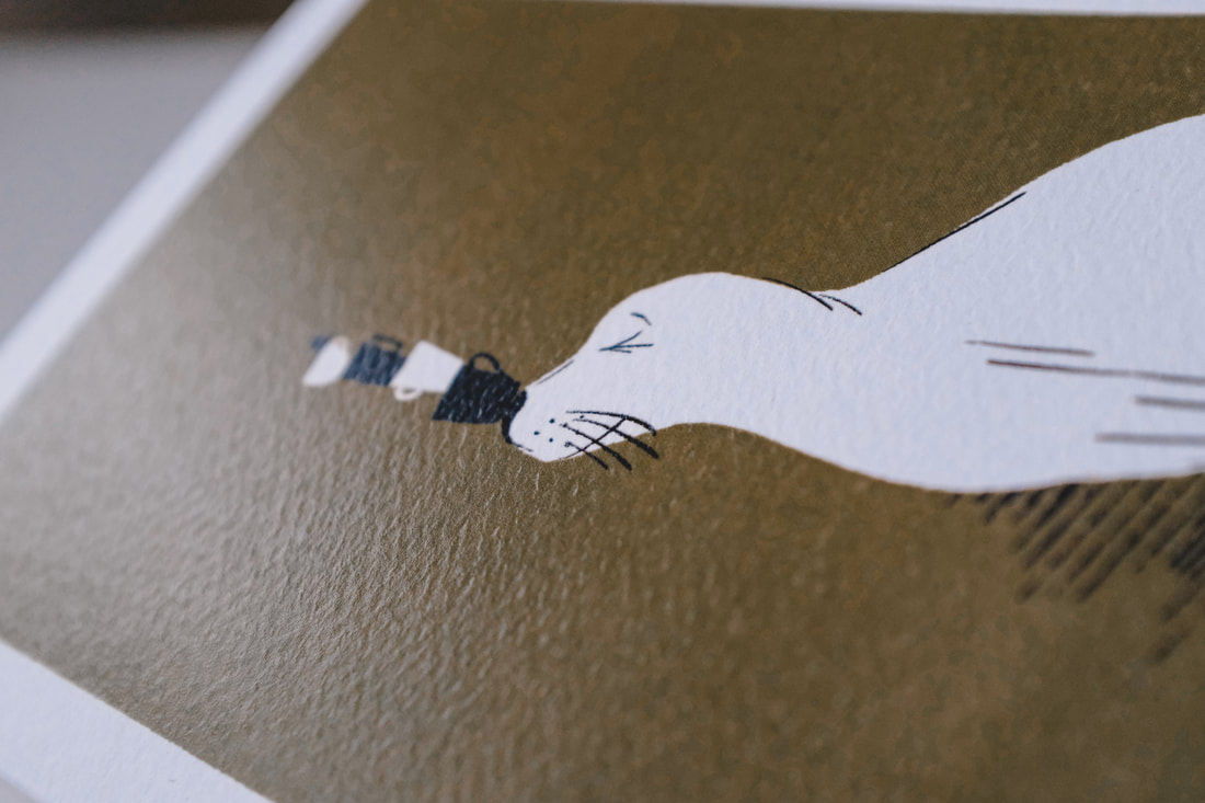 To finish off the post, my favorite photos from the month: Summer in Seattle is very, very dead now so it'll be a little easier to stay inside and work on design projects. First from September is a two-color 18" x 24" print for the sold out Cigarettes After Sex show at The Neptune. Most of the band's imagery is black and white, so I wanted to keep it simple with a two color, minimal approach. The band name itself is pretty obvious and sexual, so the design didn't need to get too literal, beyond the cigarette pack imagery. 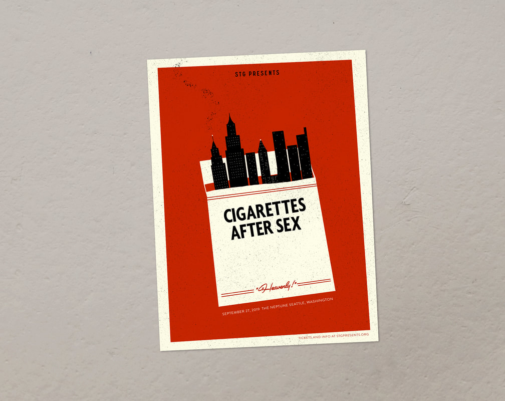 Next up, another poster—this one was for Elder Island playing at the Fillmore in San Francisco. The band has used a lot of 70s/80s audio/electronic-looking imagery in some photography lately, so I wanted to play into that for this design. 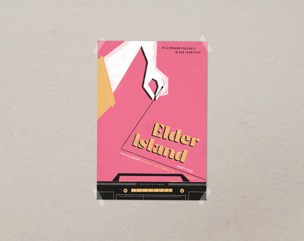 The third poster of the month is for AJJ in December. The show is being put on by The Vera Project, but at the larger Neumos on Capitol Hill. Back when I played music, my band played with AJJ here in Seattle at a couple DIY spaces, and down in their hometown Phoenix. In the earlier years of Porchlight, they played an all-ages in-store as well, so I was happy to do this poster when the Vera Project asked. My illustration style isn't perfectly aligned with the bands on the bill, but I think everyone wound up happy with my weird laundromat illustration. 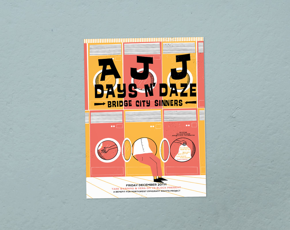 The nice boys of Cataldo have a really great new record out called "Literally Main Street". This year I have done a handful of designs for them and this Cat-aldo shirt is one of my favorites. The idea was the band's, so I can't take full credit. 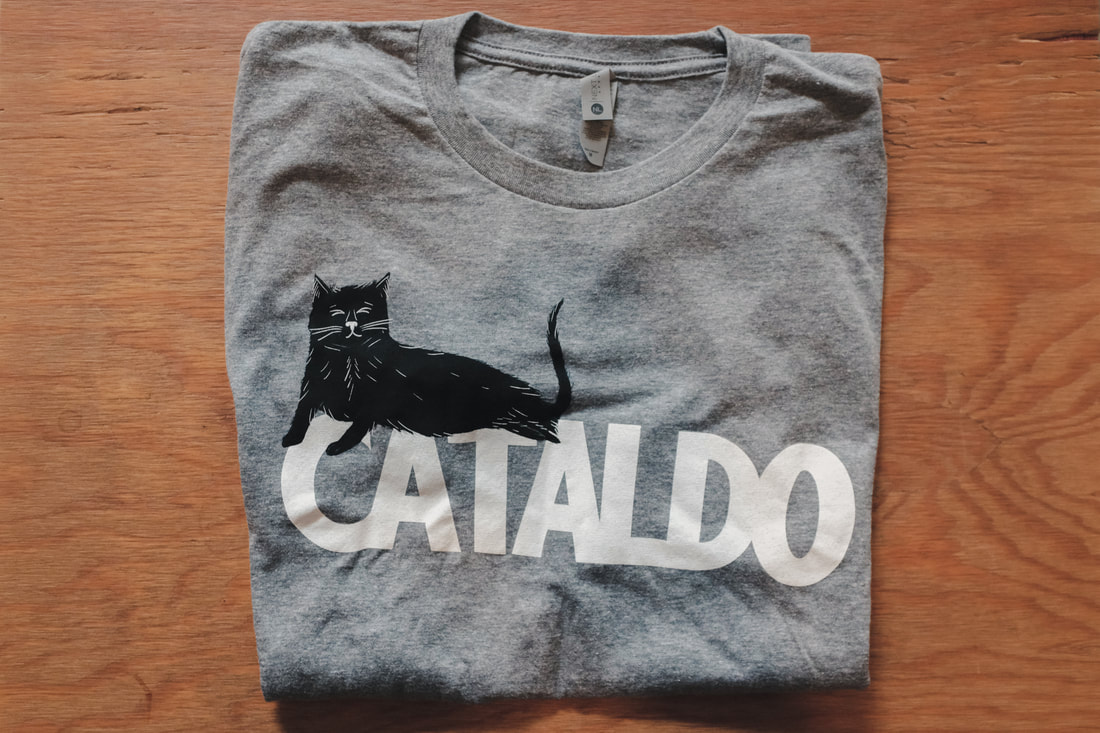 The nice folks down at Pacific Science Center let me go in and take a ton of photos of the Minoru Yamasaki-designed courtyard (possibly my favorite spot in the entire city). To read more and see all the photos head right here. 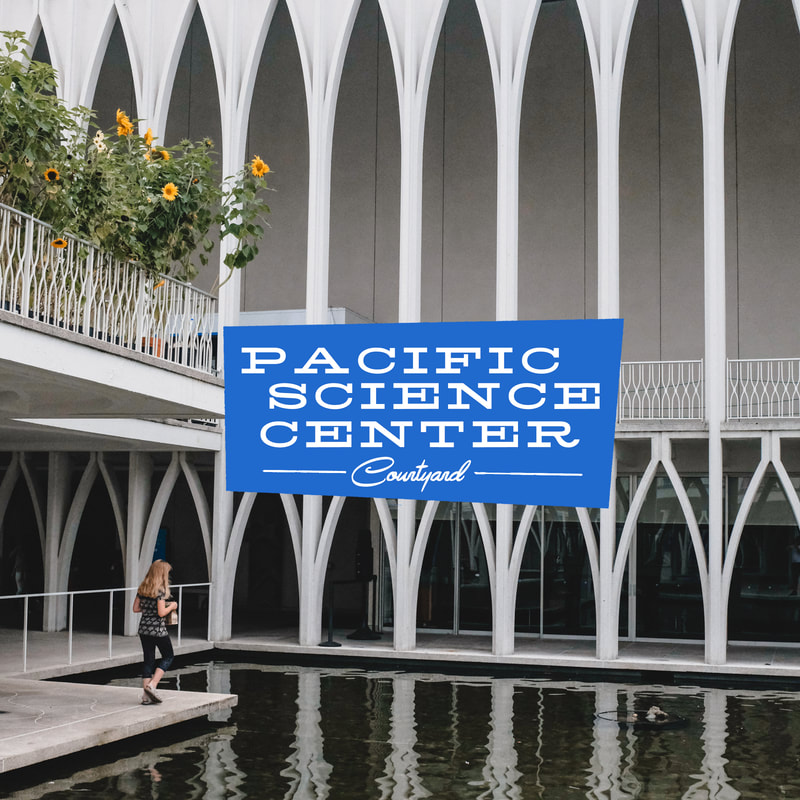 Over a decade of Porchlight, I've designed around 6 or 7 different diner mugs that are available to purchase in the shop. This time I went a very, very serious route... 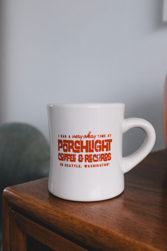 September also brought a new round of Clif Bar pins—a few thousand of 'em. The folks at Clif Bar are really great to work with and always make the process super smooth. 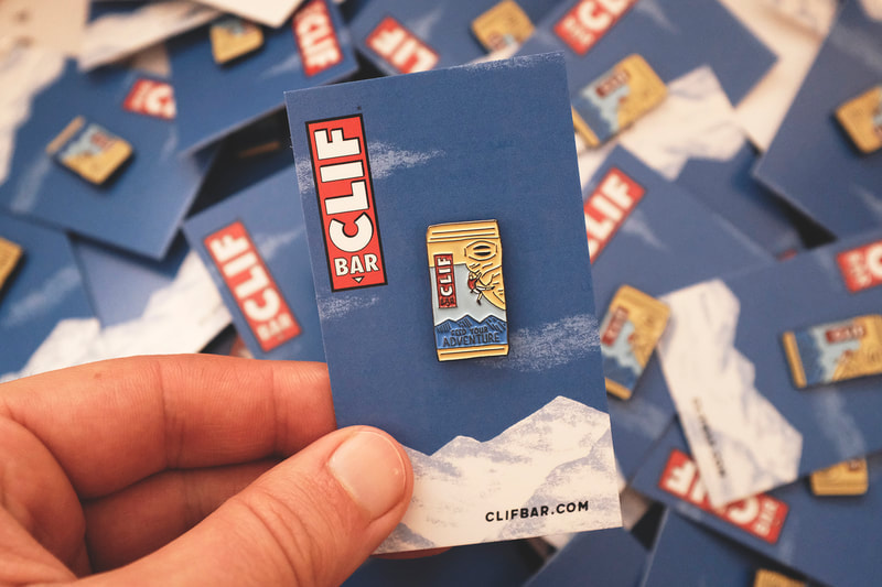 Lastly, my favorite snaps of the month. A few are from an Ebbets Field Flannels photoshoot I helped out with (if you're curious about those sporty NFL photos). The folks behind the long-running Sasquatch! started a brand new festival called Thing. It featured Kurt Vile, Jeff Tweedy, De La Soul, Violent Femmes and more at Port Townsend's Fort Worden. The sold out festival was a big ol' success and I was lucky enough to design a tiny piece of merch for it. A focal point of Port Townsend is the iconic Point Wilson lighthouse. The folks at Thing asked me to create an enamel pin that represented the city more than the festival itself, so I decided to use the lighthouse. As a fun addition, the backing card was made to reveal a flying bird once the pin is removed. 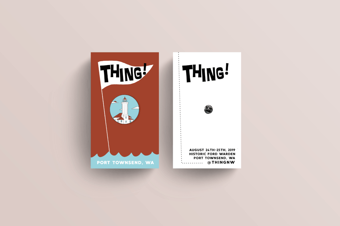 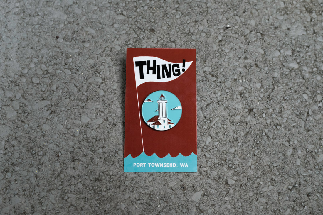 The main reason anyone follows my Instagram, is just for photos of my fluffy orange cat Junior. For a new slipmat design, I decided to give the people what they want--a two-color screen printed slipmat featuring a curled up orange cat. It's available via Porchlight Design Co. 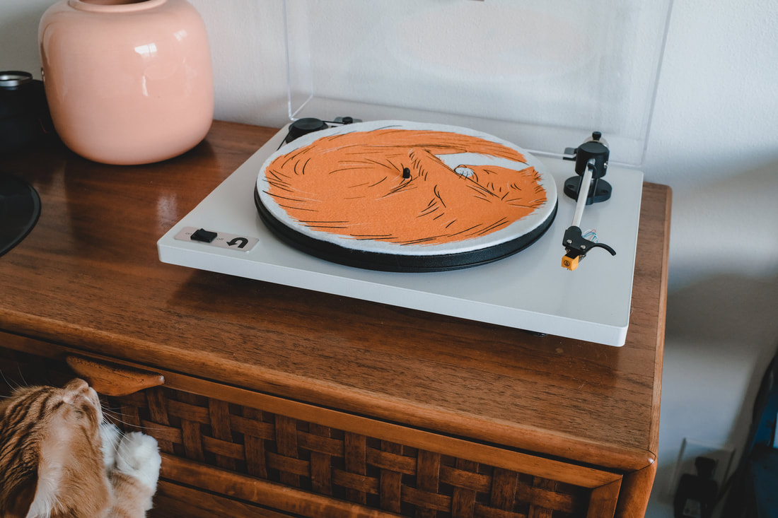 Musician Jeremy Elliot is transitioning his music and giving it a bigger sound, so he and his management asked me to come up with a logo. Along with some desert imagery and branding influences, they showed me some of the new music and this is what I came up with.  Earlier in the year, I released Visitors, a collection of maps and brochures of Washington from decades ago. The cover features a confused traveller and I created some stickers of his image to throw in with online orders. 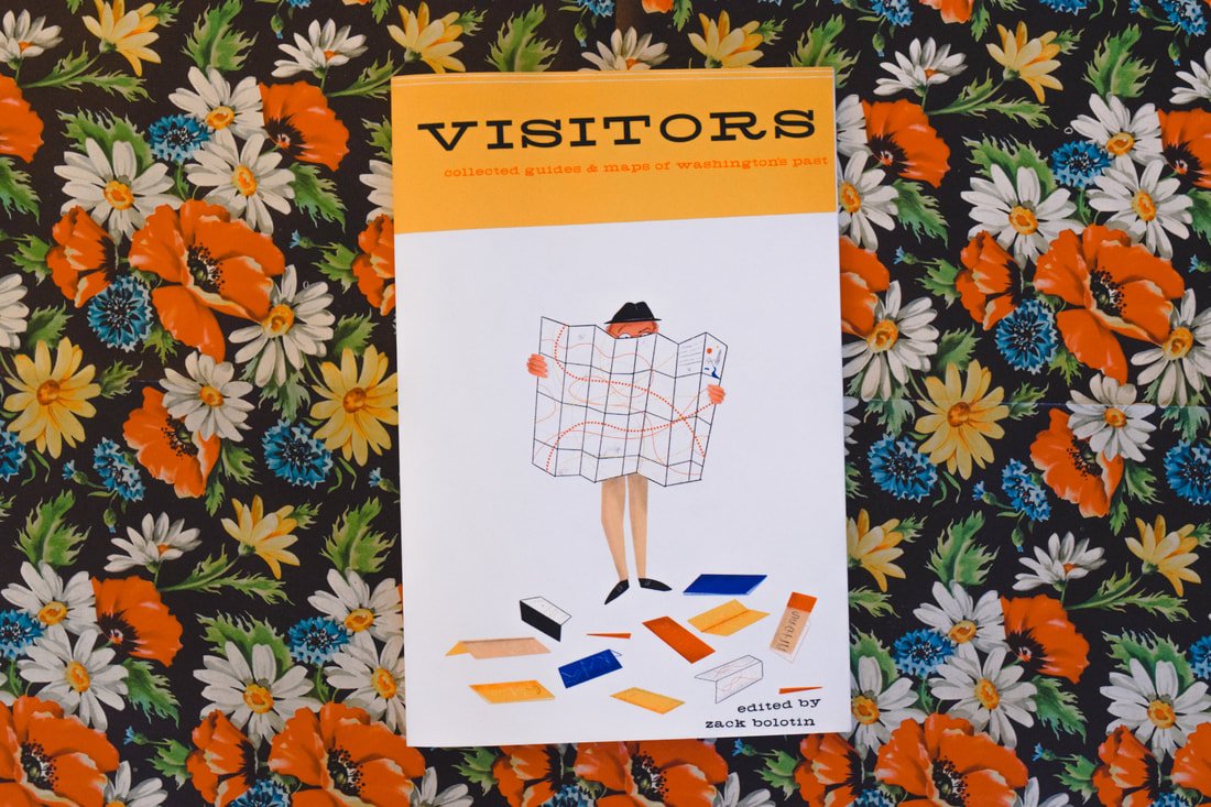 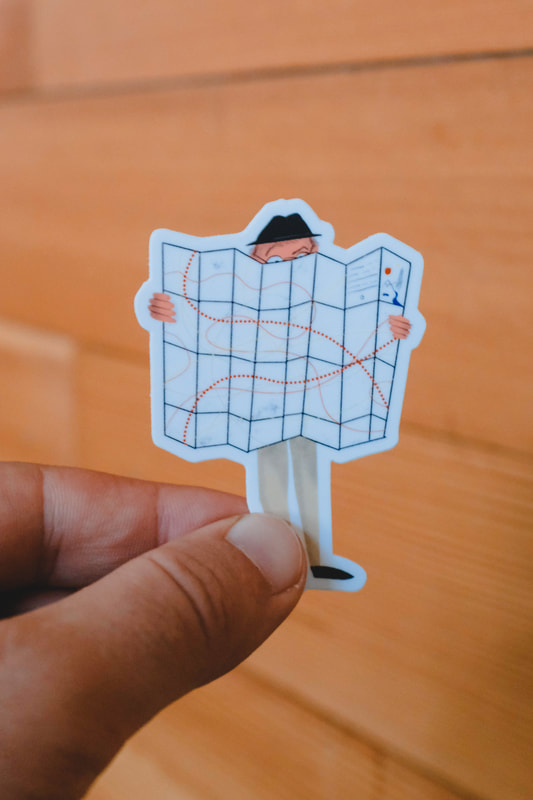 And for the monthly photo recap, my favorite photos from August: First up is a reprisal of the "Coffee & Records" design I had originally made for crew neck sweatshirts. This month, I brought them back to Porchlight on super comfy tri-blend t-shirts for Summer. This was also the first time I decided to go with custom printed tags on the tees. Since I'm in the process of consolidating Porchlight merch over with Porchlight Design Co. it seemed like a good time to make the tags applicable to both. These are available at Porchlight and online at porchlightdesignco.com! 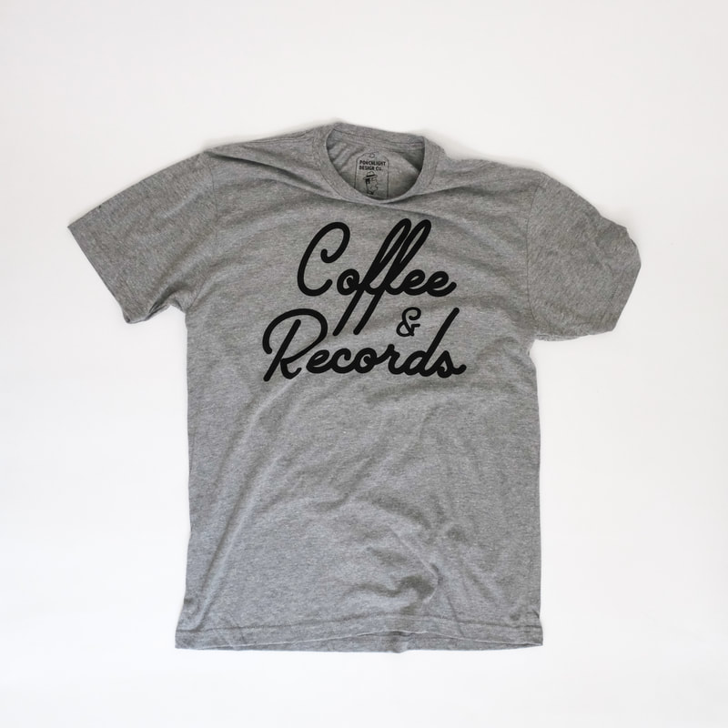 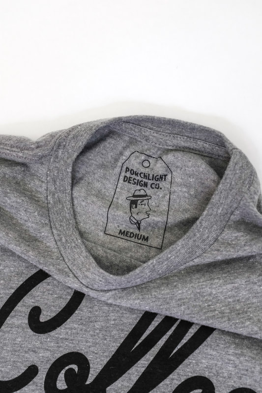 Next, a logo and business cards for my pal Rachel Demy. She is a wonderful photographer and specializes in tour photography, giving insight into green rooms, tour buses and side stage. She's taken great shots of Death Cab, Chance The Rapper, Jenny Lewis, The Shins and more. Rachel's initials are R.A.D. and without being too obvious, I wanted to incorporate the initials into her name, so you can see that it obviously spells her name, the logo goes from "r" to "a" with a connection down the "d". 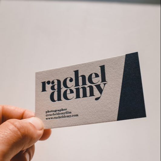  Another logo I created was for Part-Time PR, a small firm focusing on punk, indie and DIY bands. The branding is very different from the one I designed for Rachel and shows a little more playful, gritty imagery. 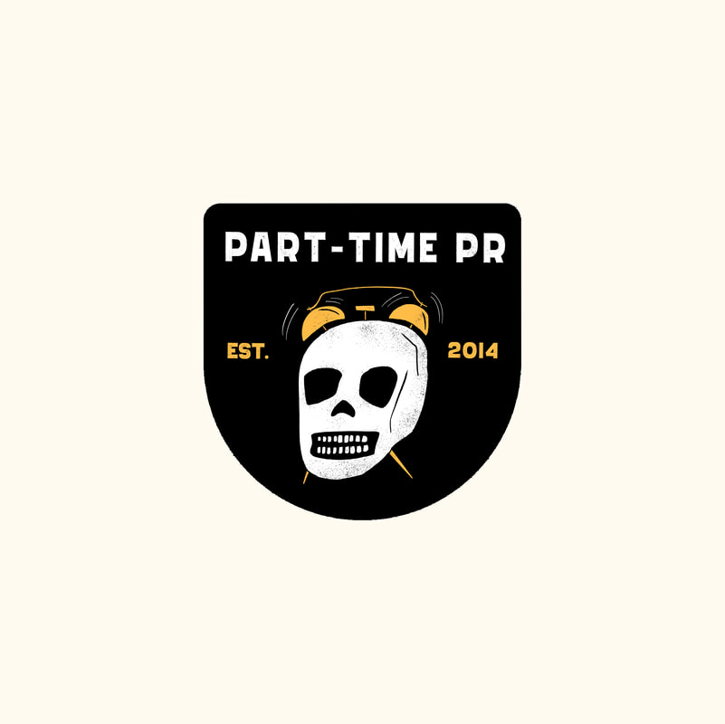 To continue celebrating 10 years of Porchlight, I spent two days giving away enamel pins of Dandy Man, the coffee-and-record-toting happy guy. The miniature man was pinned to a celebratory birthday candle card.
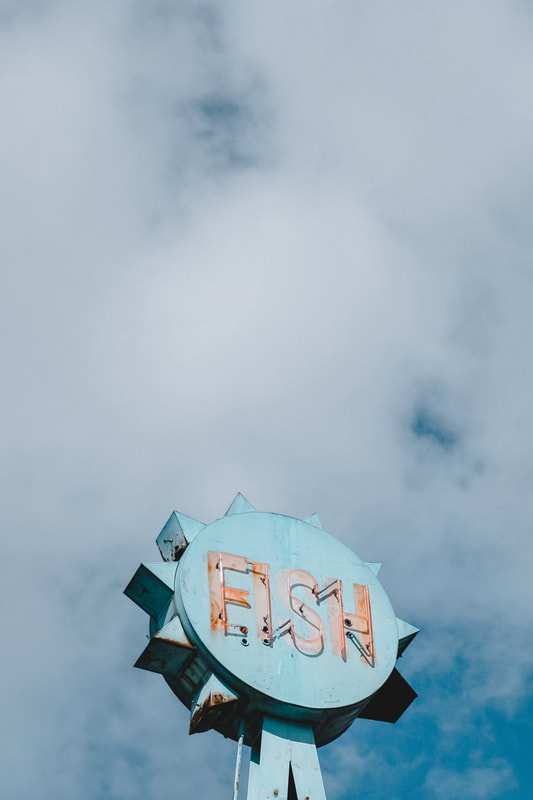
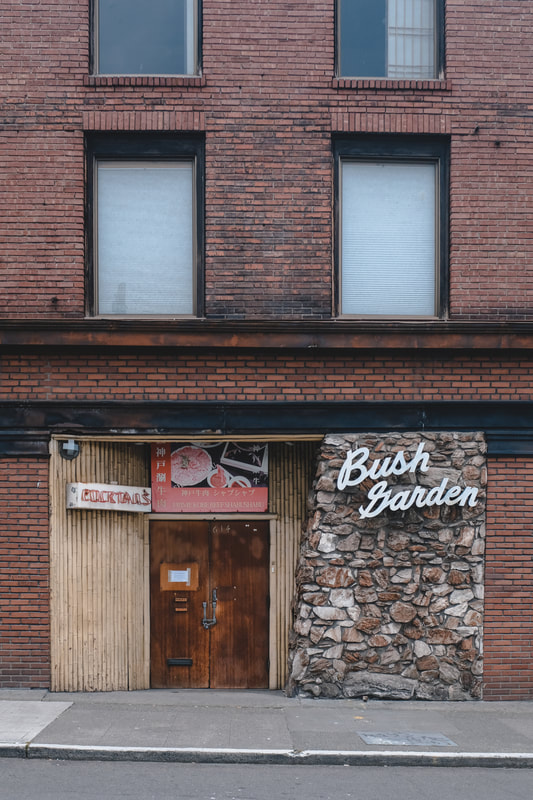
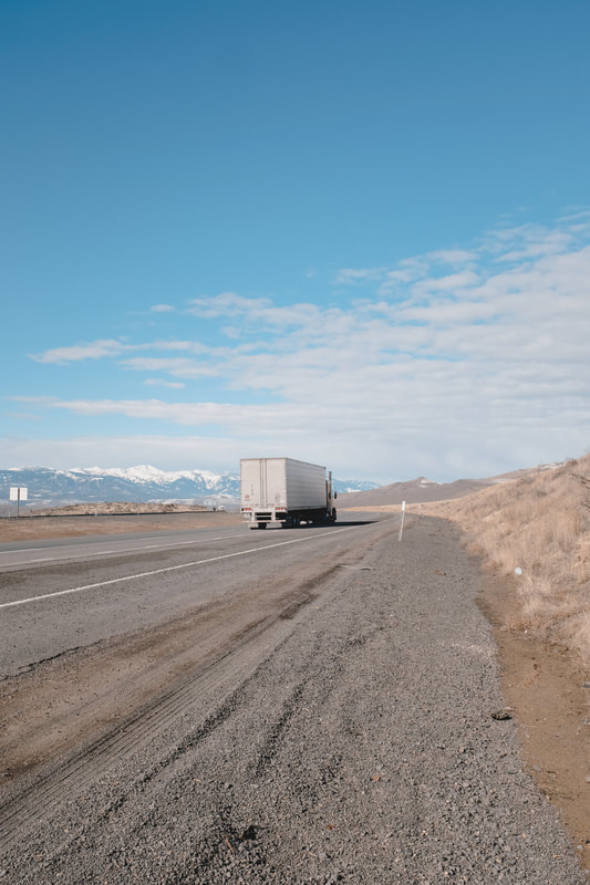
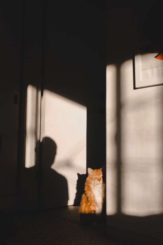
 As always, my favorite photos from the month: |