|
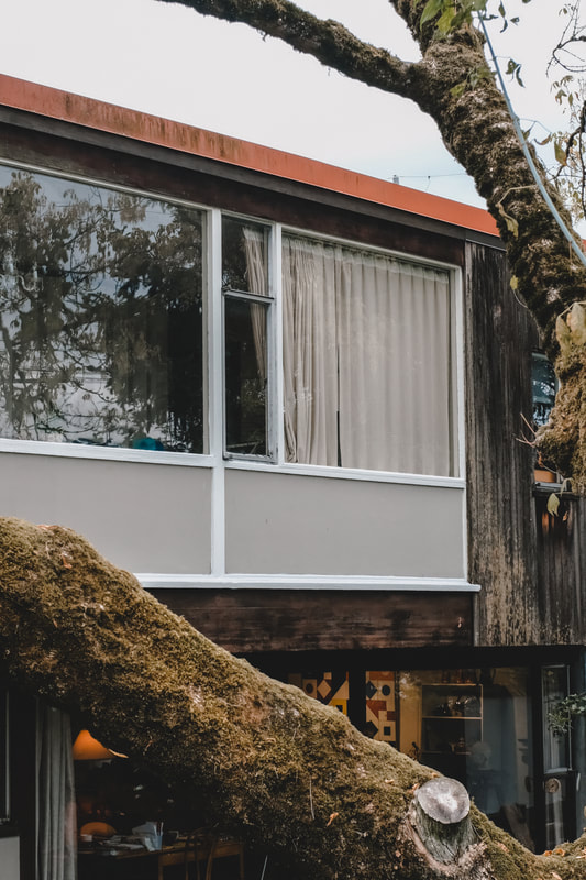
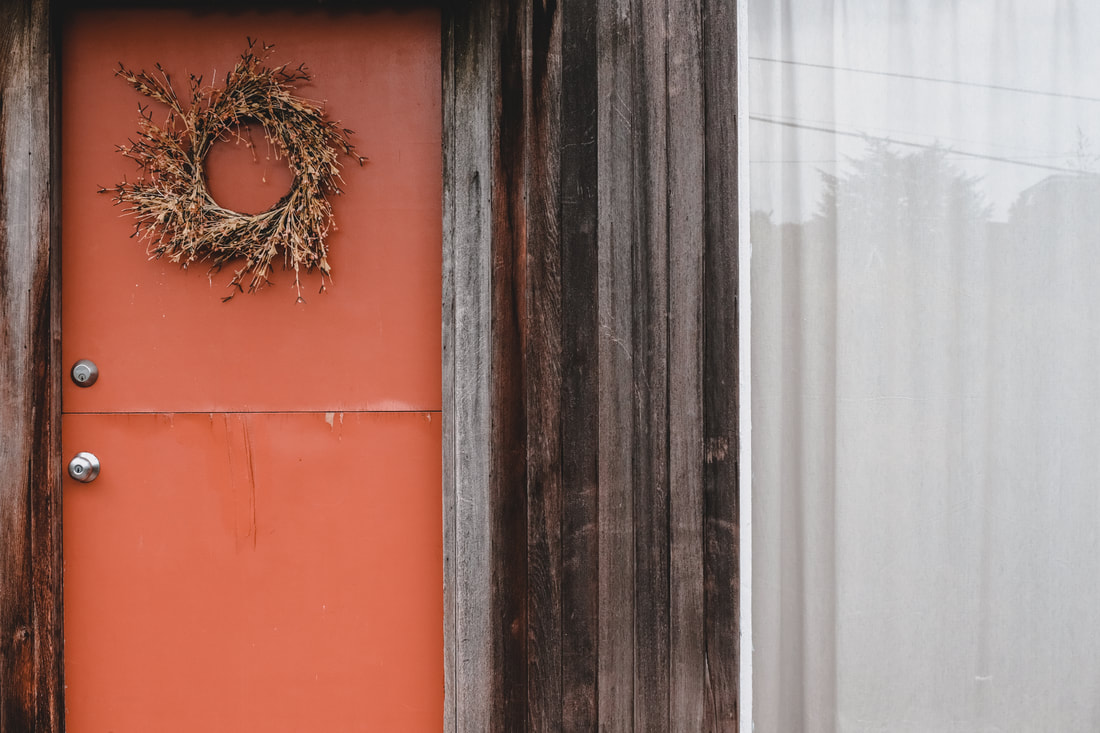
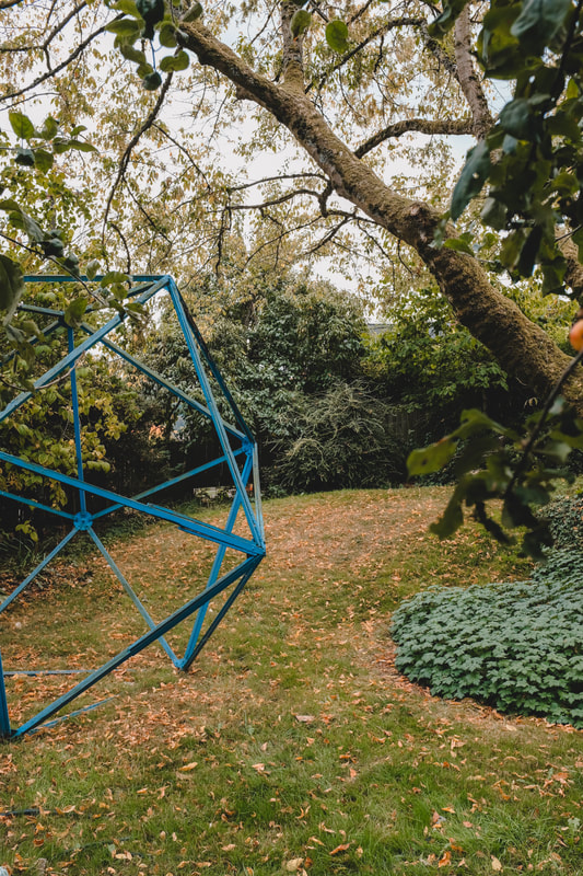
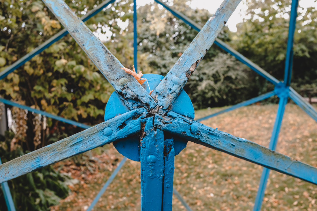
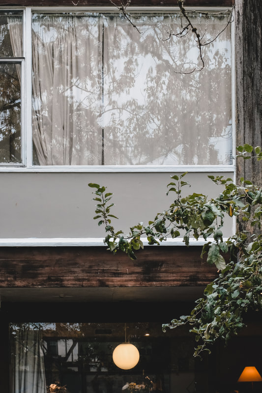
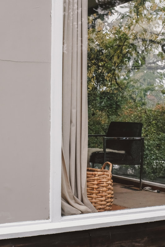
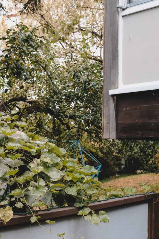
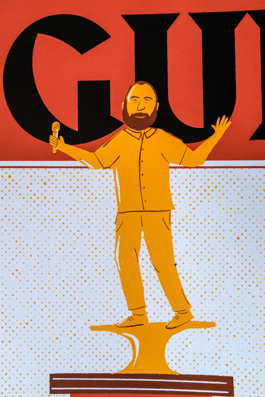
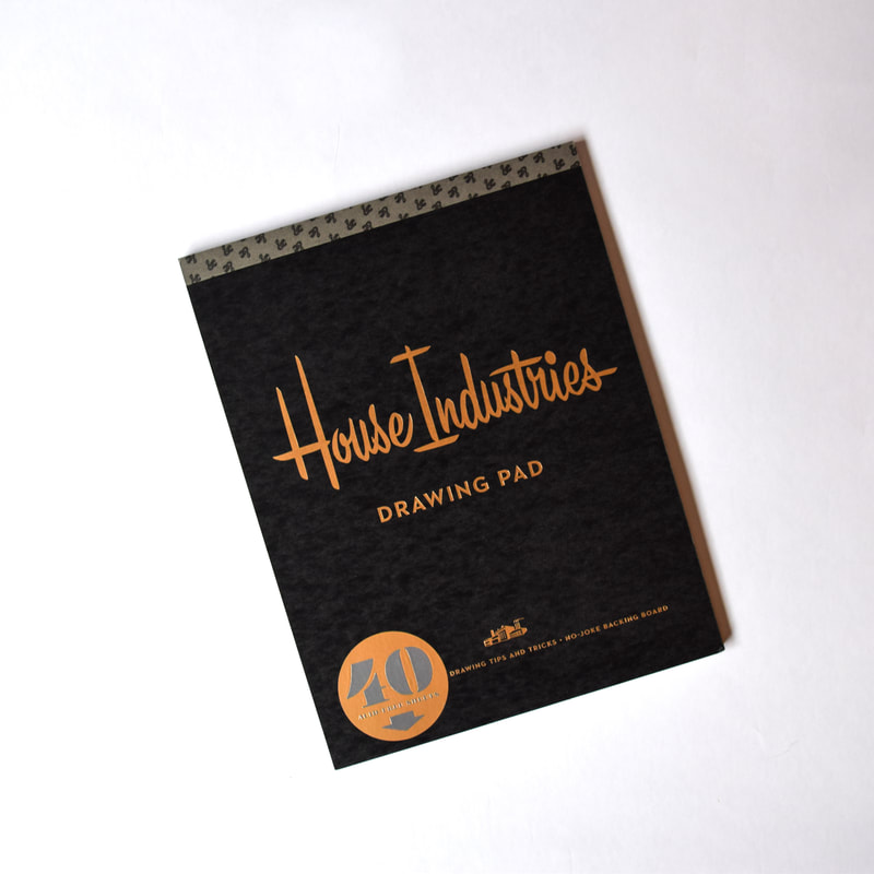
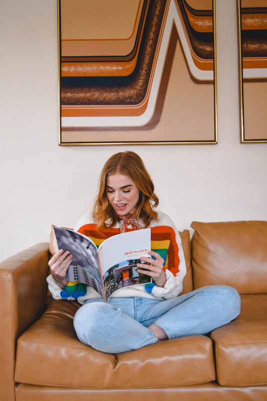
A big June highlight is the release of Mid Seattle Volume Three. For each issue, I include an enamel pin and postcard in the orange/red/white color scheme of the Mid Seattle logo. I made a quick promo video to show the pin and interior pages of the new volume, and recorded a super brief instrumental soundtrack to go with it. In June, Cone & Steiner asked if I would have a little Porchlight Design Co. pop up at their Pioneer Square location. I designed the poster and organized a Happy Hour and Mariner game outing to go with it as well. 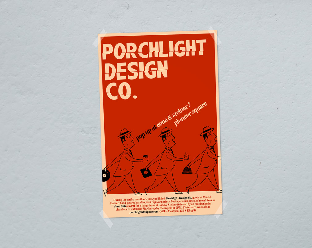 Whenever I get to make stuff for Cataldo, it's a good time. Eric asked me to help with their lyric video for "They Don't Know About Us". The lyrics and illustrations were meant to look like a high schooler's sketches, done in scratchy ballpoint. I also lettered the video's titles and credits. KEXP premiered the video right here. As an exclusive for the Porchlight Design Co. pop up at Cone & Steiner, I designed a Dave Niehaus/Mariners-inspired "My Oh My" enamel pin. The shop is in super close proximity to the ballpark, and a lot of attendees stop in C&S before games, so it seemed like a good fit. 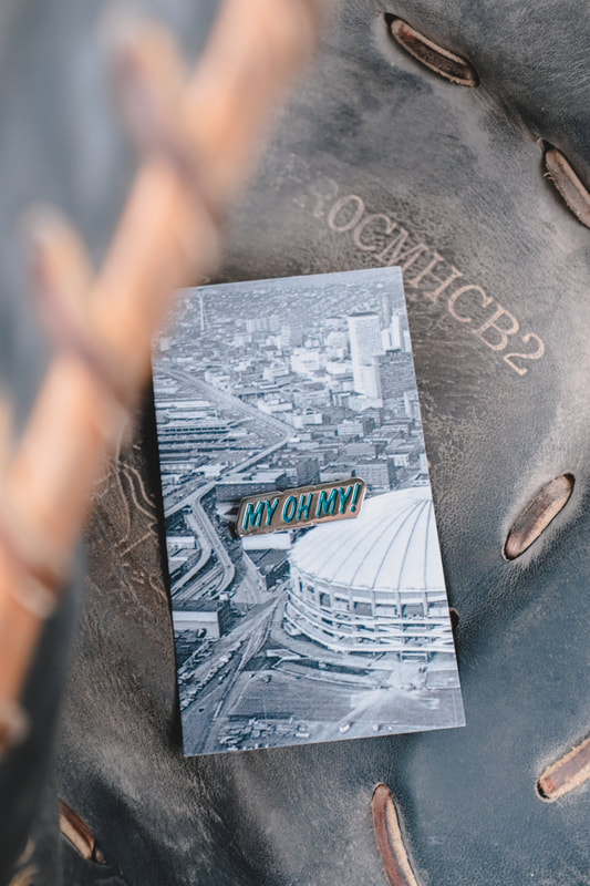 I also designed new labels for the candles I make for Porchlight Design Co. Over the years I've had a couple different label designs for these, and this brand new one is sure to stick as my favorite. The final June design was for the Spanish Ballroom in Tacoma. The poster will be used for a monthly DJ night featuring Sub Pop founder, Bruce Pavitt. Umbrellas are probably overused in Northwest-based designs, but when it's raining records, I think it's okay. 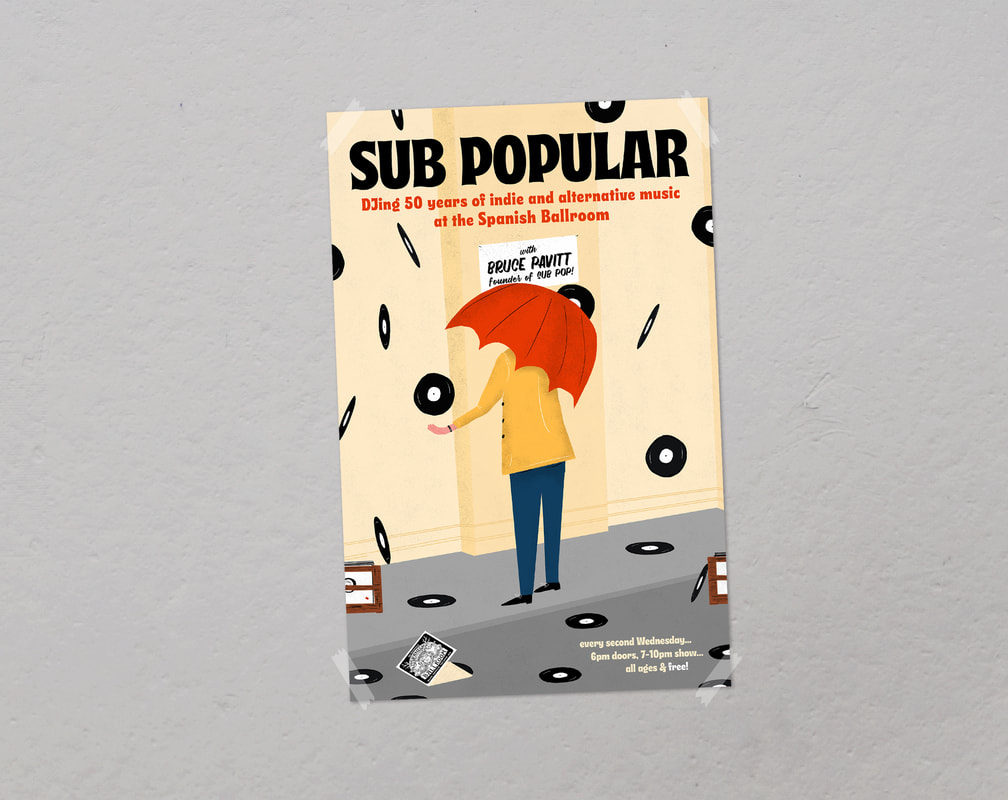 Last, but not least, my favorite photos from the month: One of my favorite people/musicians to design for is Sera Cahoone. Whenever I'm designing for a client, I'll ask if they have any imagery in mind for their poster and luckily Sera and I are always on the same page. She mentioned the flicker, a bird in the woodpecker family, and I snuck it into the signage of a mid-century building. The show is coming up June 21 with some great openers as well. 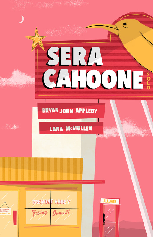 RIght before Dave Hause was leaving for a European tour, I was asked to come up with a shirt design to take on the road. Dave and co. had an idea for fireflies in a jar, loosely based on one of his songs and this two-color print is what I came up with based on the idea. 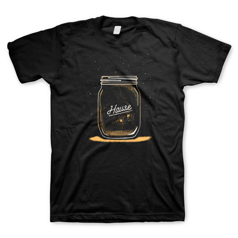 Next up, some more fun stuff for Cataldo. I designed these two-color shirts based on the red Volvo wagon I put in their show poster in March. To go along with their new album and shirts, we stuck with the teenage, post-high school theme and came up with an 18" x 24" art print filled with pieces of younger years such as an old iPod, rolling papers, a lighter and pocket knife. And here are some of my favorite photos from the month: Last fall, I sent a copy of the first Mid Seattle along with a letter to now-retired architect Audrey Van Horne asking if she'd let me take photos of her home for the next issue. The house that she and her husband John designed in 1953 is one of my favorite residential buildings in the city. It has huge windows, but still feels private. It's classy and elegant while still feeling genuinely lived-in and Mr. and Mrs. Van Horne added little touches of playfulness that make the entire home so well-rounded. I was beyond excited to get a call from Audrey Van Horne and quickly found out how warm and welcoming she is. Her home is only a couple miles from Capitol Hill in the Portage Bay neighborhood, so it was a quick trip down the street. We chatted for hours in her living room. She told me about her old office, we talked about Architecture West (the now-defunct magazine where my grandfather worked) and the geometric structure in their yard that her grandchildren played on. The one request she asked of me was that I show her the photos before I publish them. A few weeks later I brought her a one-off volume that showed all of the edited photos I took, with 5 or so in consideration to be published. We looked through it together, she pointed out some of her favorites, and smiled a bunch. Since only four photos were ever published, I wanted to share the rest. The highlight of April was designing a poster for comedian Tom Segura and his five-show stint at the Moore Theater. Playing on a few of his jokes from his Netflix specials and affinity for sports, I designed a three-color screen print of trophies featuring the man himself. 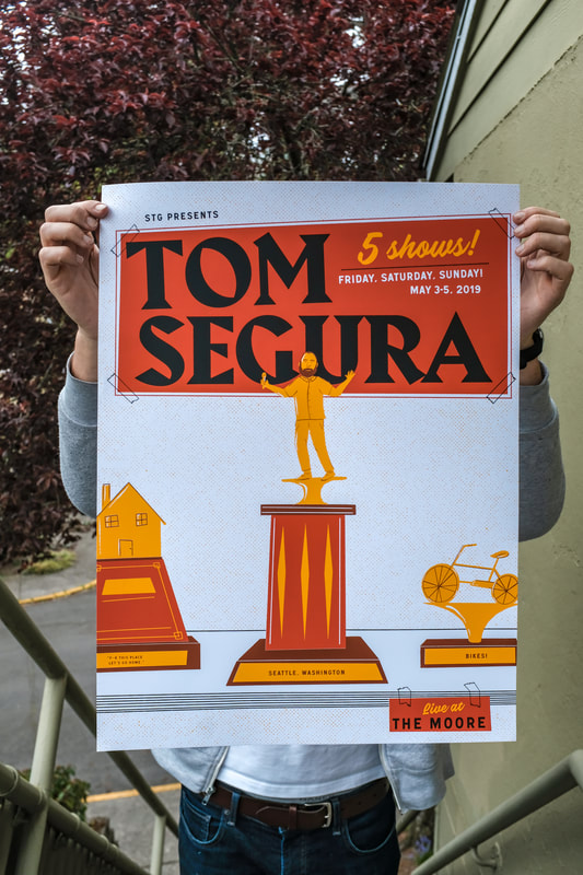
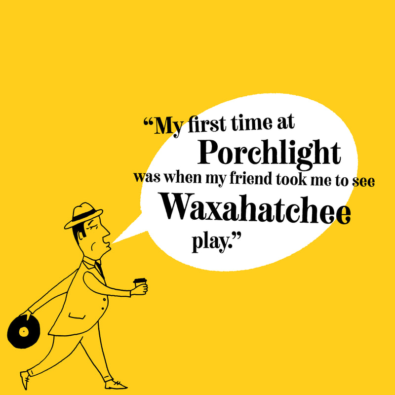
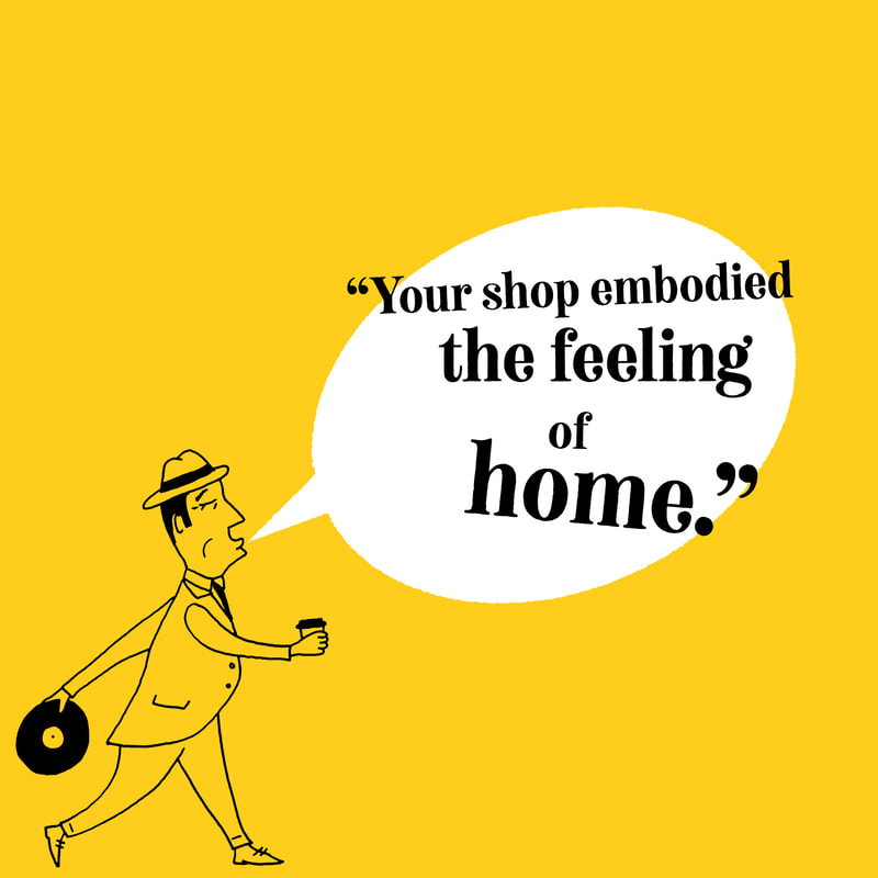
Every April, record stores around the world celebrate Record Store Day and at Porchlight we do the same. To promote the holiday, I had to create some marketing material for the shop. For Urban Artworks' annual gala, we reprised their paintbrush logo pins in new colors. Urban Artworks is a wonderful non-profit benefiting teens and the arts. 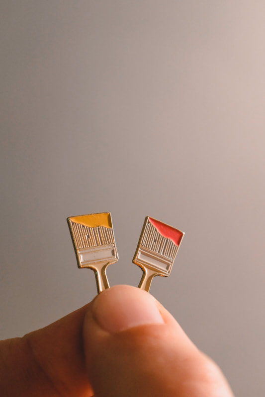 And a handful of my favorite photos from April: This Spring has brought a cool string of collaborative work with Cataldo. The new Cataldo album comes out in a few months and it's spectacular. Eric Anderson is the man behind the band, writing heartfelt songs and consistently cranking out wonderful music. The new record is heavily steeped in Eric's (and our collective) early 20s, so most of what we've come up with represents that. Look for t-shirts, posters and videos in the next couple months. 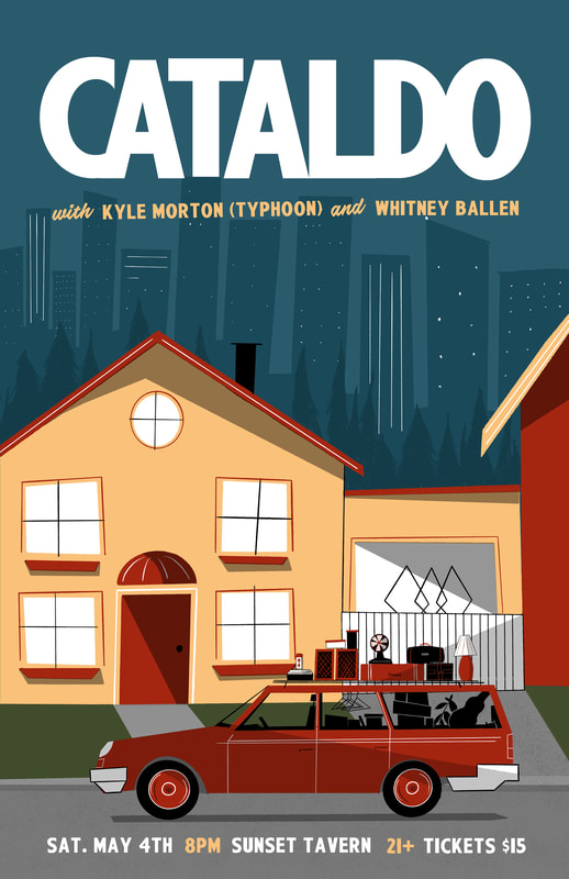 Another great human in Seattle is out on tour supporting a new record--Telekinesis aka Michael Lerner. Michael and I share the same affinity for mid-century design so I wanted to come up with one pin design that represented that. The color scheme of the hyphen sign pin was inspired by some 1960s Disneyland advertising. The glasses are little replicas of the ones he wears himself. 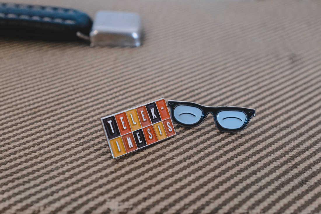 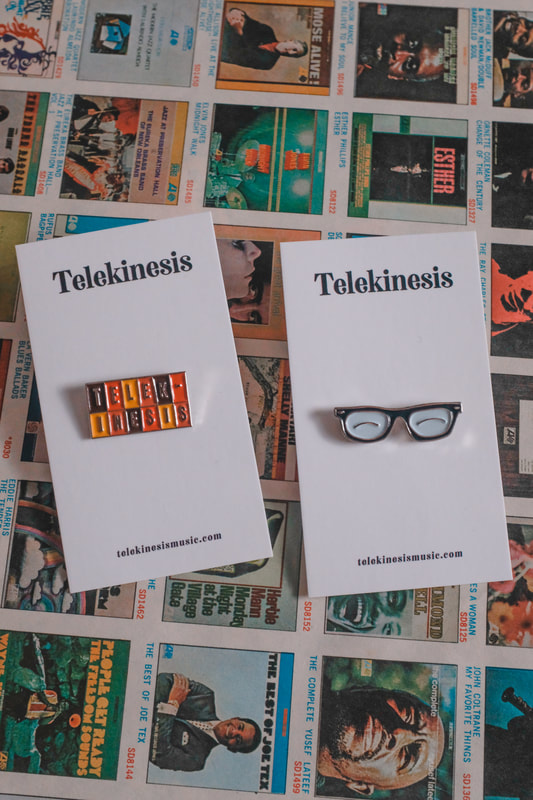 Hey I made it onto TV! This month I was featured on Seattle Refined, weekday show on channel 4 KOMO. The show highlighted Porchlight as well as all the enamel pins that I've designed for businesses, bands and other organizations. The show also had me design and deliver pins specifically for the show. You can still see the whole episode and read about it here. 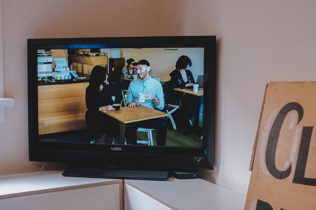 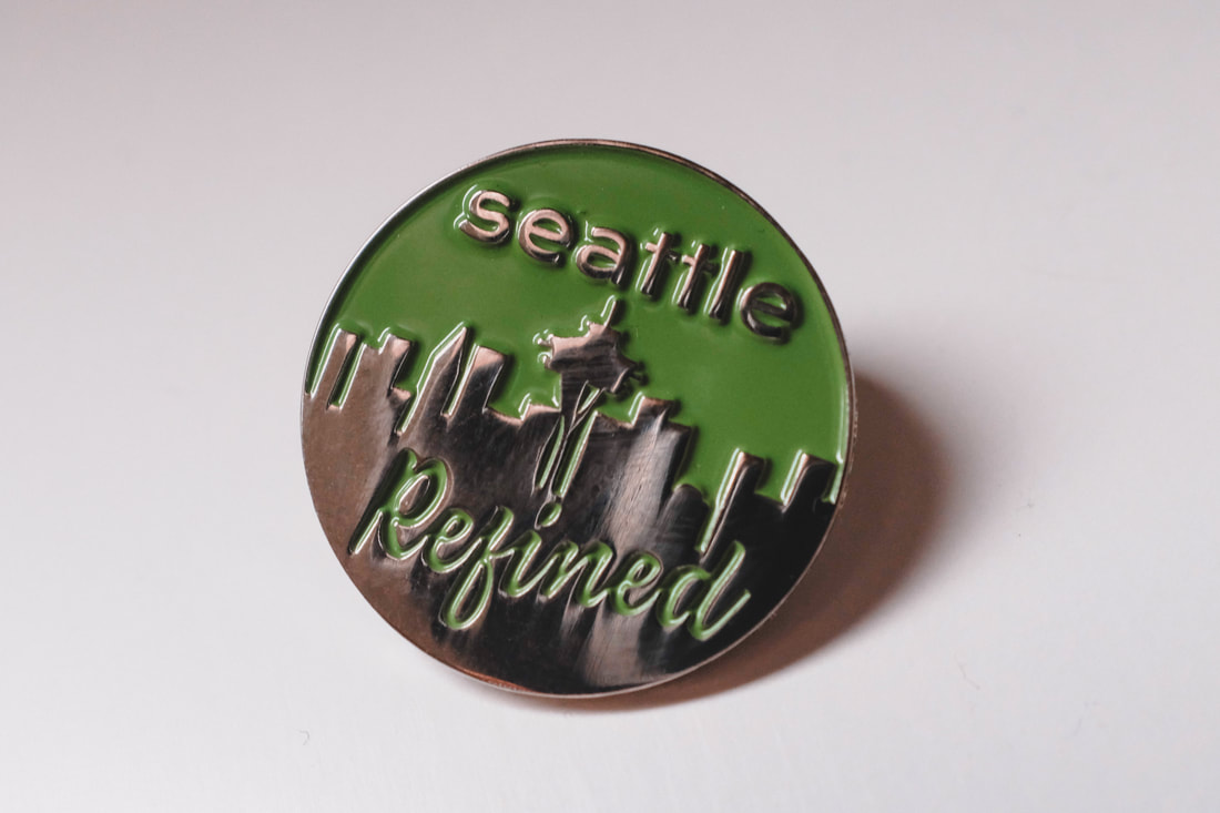 To celebrate the fact that Porchlight has been up and running for a decade, I've been designing material to remind folks all year long: window decals, posters, quotes from customers etc. Here are a few examples so far. 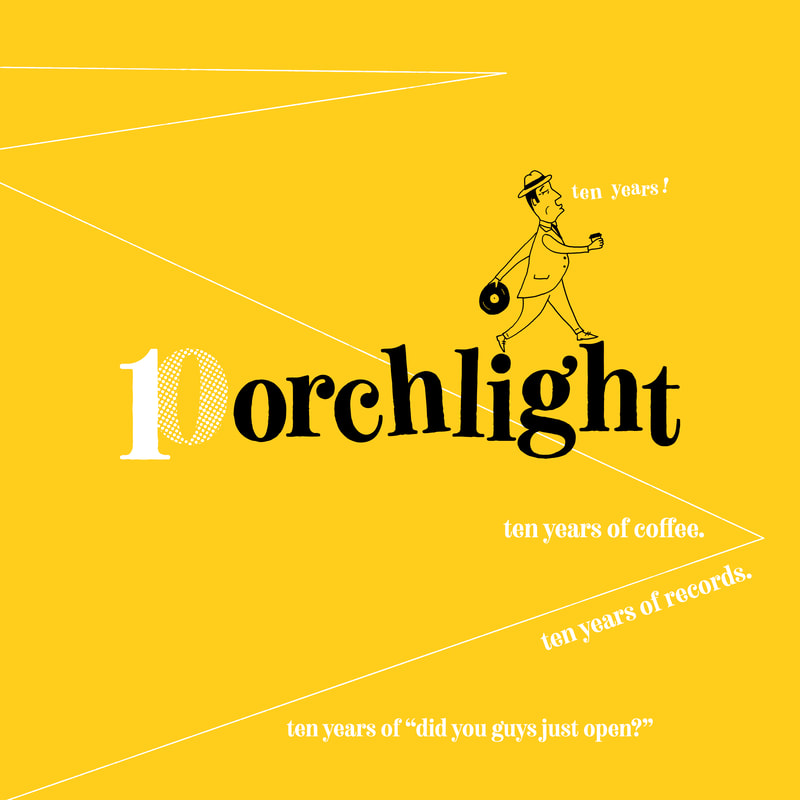
 Lastly, here are some of my favorite photos from the month. 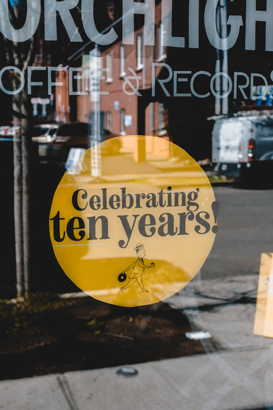 "How did you open a coffee shop in Seattle?" That question comes up more regularly in my life than "What's the wi-fi password?" The simple answer is that since day one I've been responsible for and hands-on with every single aspect of the business. I work the shop, unclog drains, run social media, deliver cold brew to wholesale accounts, design every window decal and punch card, run payroll, curate art shows, file taxes and do every single chore that I ask of my employees.
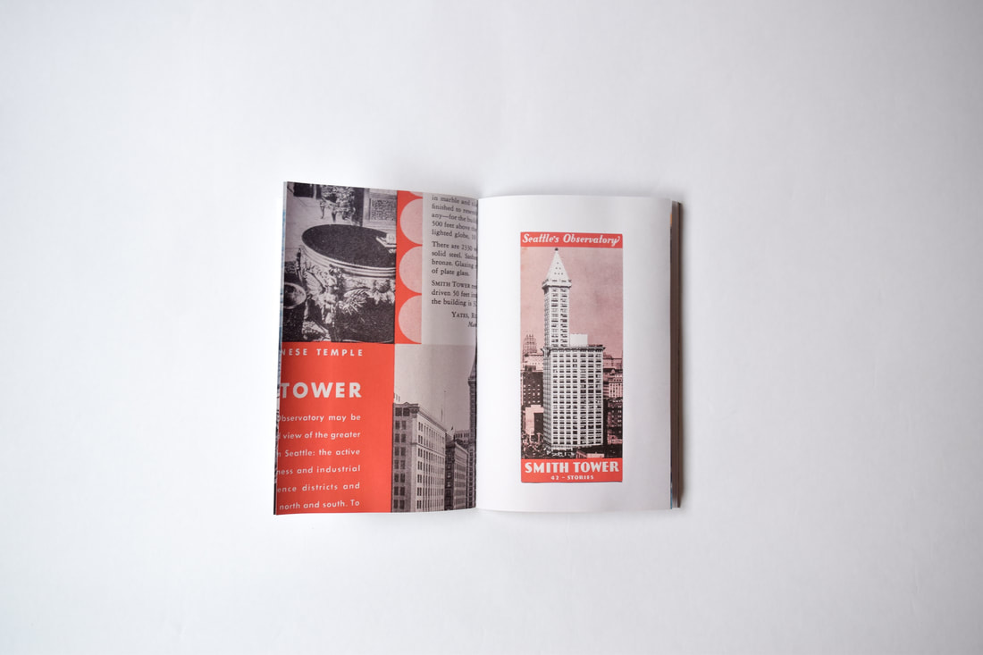
While putting the 10 Year decal on the window this afternoon, the irony wasn't lost on me that ten years later I'm still doing all the same chores I took care of in 2009. I think a lot of folks have a vague idea that a successful business is one that multiplies over time while the owner or owners distance themselves from the day-to-day tasks until they wind up behind a desk. There are plusses and minuses, but staying small and staying hands-on is actually a positive when it comes to understanding your business while still making a decent living. Spending my teens to early twenties heavily involved in DIY punk isn't necessarily helpful or applicable to business (more anti-business than anything) but it also created a desire to make space and goods more accessible to more folks. Capitol Hill is an expensive neighborhood, and for better or worse, Porchlight is always one of the last shops to raise prices despite our own cost increases. In an effort to keep things more accessible and attempt to keep costs down while staying profitable, I am a manager, barista, delivery driver, graphic designer and window washer--and that's a-okay! A lot of coffee shops these days start up with well over $100,000. They follow traditional business plans, have investors and usually enough funding to last them through months or years of poor sales. When I opened Porchlight, I didn't have any of that. My opening costs were the financial equivalent of a used car, then I worked 70+ hours a week until I could afford to work 60 hours a week--then 50 and so on. Slowly, I upgraded from used makeshift countertops to custom ones, then a better espresso machine and grinders. I actually ran the shop for two years without an ice machine until I could afford to buy one. The 6AM trips carrying 7-11 ice bags were not fun. That being said, I didn't learn all of these things by myself. I asked a lot of questions of friends, family, Herkimer Coffee (who are the most knowledgable friends/family in the coffee world) and learned when to bow out (see plumbing and electrical work). Another aspect of all this that I frequently bring up to folks is that you should never try to swoop in and capitalize on a neighborhood just cause it's booming. I love Seattle, went to school and worked on Capitol Hill, played music with friends that also lived in the neighborhood and the neighborhood was good to me. When you open a business in the place you call home, the neighborhood wants to support you. I felt that in 2009 when I was getting the hang of it all and I still appreciate it to this day. When a well-financed business comes to cash in on a bustling part of town, neighbors notice. Stick to what you know. If you scrolled to the bottom to find out the answer to the question, it is as simple as "Do all the work you can, stay hands-on, ask questions and buy some merch from the touring bands." A successful business doesn't have to have multiple locations, silent partners or $100,000 in startup money. February was a fun one. First off, I designed a three-color poster for the Sharon Van Etten show at the Neptune. The show was fantastic too. 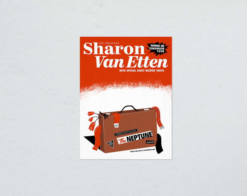 I also released a small book/bound zine of collected vintage maps and brochures from Washington State called Visitors. I illustrated the cover and took care of all the photography as well. It's available for purchase at Porchlight Design Co. 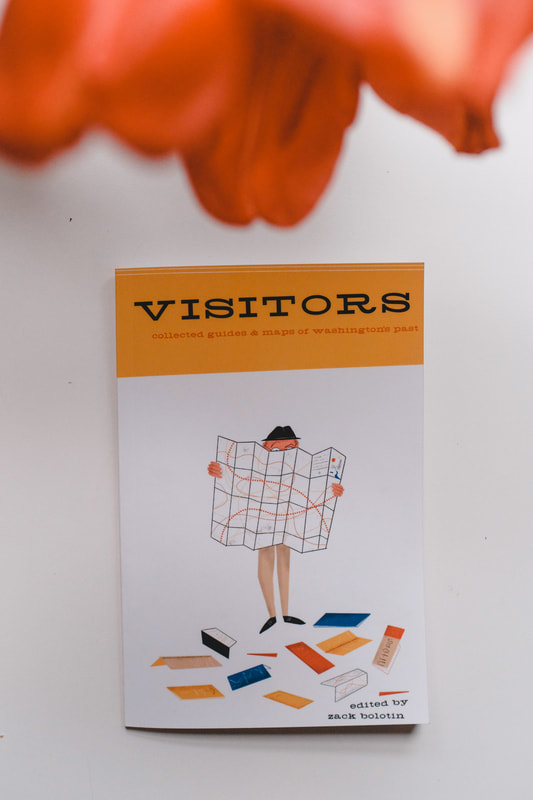 In an effort to start consolidating some of my creative outlets, I created Porchlight Design Co. Until now, Close By had been the offshoot of Porchlight as a Northwest-inspired online retail shop, but to avoid confusion and simplify the Porchlight brand, I decided to change to Porchlight Design Co. Using the Dandy Man logo I created for Porchlight Coffee & Records, I used a version of him for the Design Co. The majority of the products are designed in-house, but some books, prints and hardware are made by other folks.  A while back I decided to start carrying a small selection of greeting cards for our merch section inside of Porchlight. Tons of folks grab a card while getting their coffee, so I try to add a design or two every now and then. I added some non-holiday cards--one with happy faces and the other features a peppy "HELLO!" 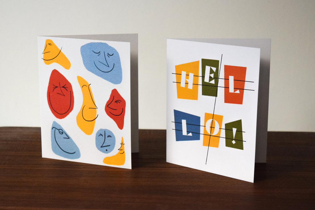 This month I also designed a shirt for my old buddy Michael, aka Telekinesis. He and I grew up playing on the same soccer team as preteens and reconnected as adults as we both wound up involved in the arts. He's an incredibly sweet dude and his band has a great new record out. Luckily we are both mid century modern fans, so we devised this design together. This t-shirt will be available on his upcoming tour to promote his new album, Effluxion. 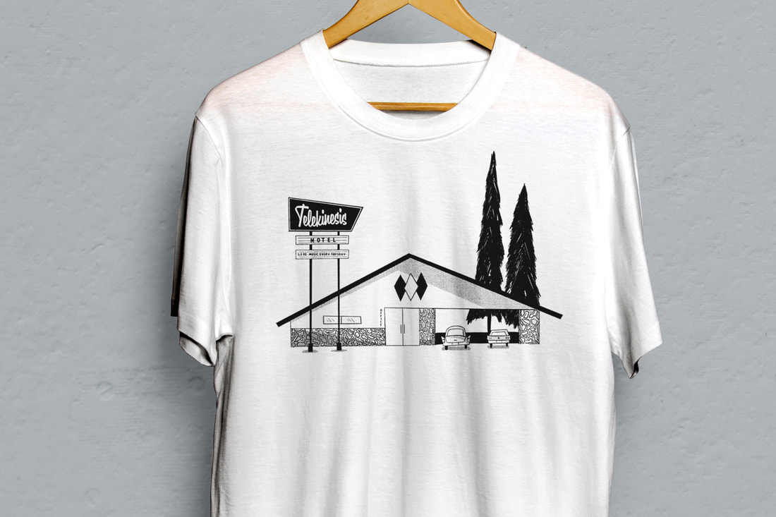 February brought a lot of snow days in Seattle, as well as some fun projects. Here are my favorite photos that I took around town during the month. The main highlight of the month is the release of Mid Seattle Volume 2. This new volume includes a whole new batch of photos, as well as an index of notes relevant to each building. The cover photo is the home of architect Audrey Van Horne who, along with her husband John Van Horne, built the house in 1953. She was generous enough to let me visit with her for a few hours and take some photos. This issue was paired with an enamel pin based on the well-known Seattle car wash sign. Porchlight Slipmats are found online, at Porchlight, and other shops across the US, Canada and Japan. The new design is a spaceman floating in space, surrounded by rockets, spaceships and Earth. Hopefully he won't drift too far. 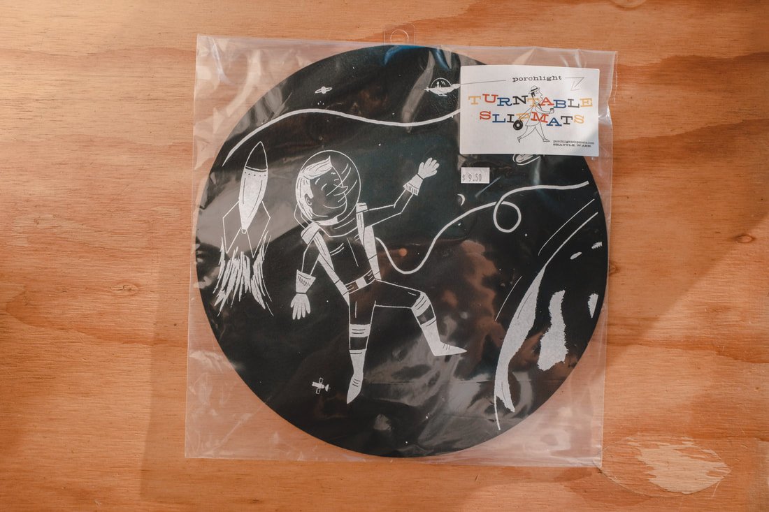 I also revived an old sketch of Squints from the Sandlot and turned him into a one-color screen print. You can find it for sale over on Etsy.  Lastly, a recap of my favorite photos from January: This design was for a super small run of tote bags to celebrate the five year anniversary of the city-favorite wine bar, Le Caviste. A friend who happens to work at Caviste got in touch asking me to design it as a surprise for the owner, David. Inspired by David (a true salty dog) and vintage clothing labels, we decided on this two-color tote design--all in French. Sadly, the totes are not available to the public and only a limited number were produced. Big thank you to Ink Knife Press for printing these. 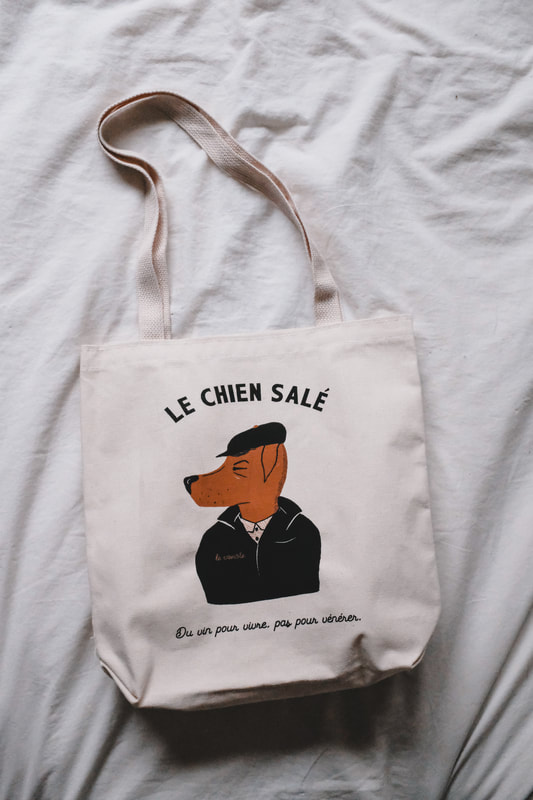 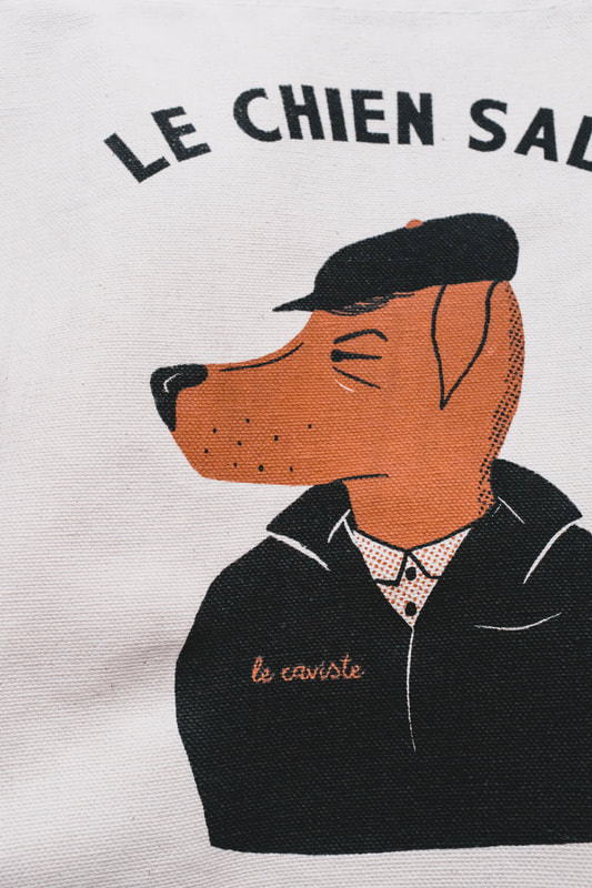 Sera Cahoone is one of my favorite folks to make posters for. This solo speedboater was an idea I've had for a bit, but wanted to save it for something special--and Sera approved. 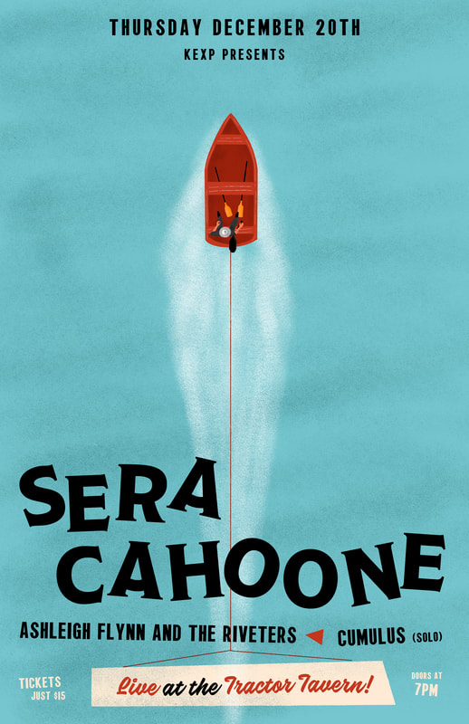 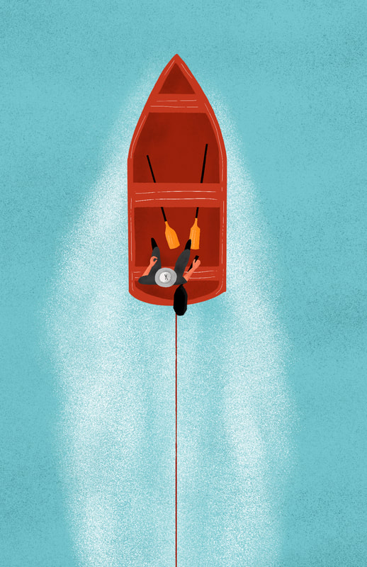 Generally, I think it's a little presumptuous to give the gift of one's own art, but I made this for my dad and it is very up his alley, so it was a safe bet. Plus parents aren't allowed to tell their kids if their gift is a dud. If you're unfamiliar with Mold-A-Rama, it's a plastic souvenir-making machine that began in the 60s and became quite popular at the Seattle and New York World's Fairs. A few dozen still operate throughout the US today. My illustration is based off of one of the machines at the Seattle Fair that my dad attended as a kid and mold I featured is modeled after the Monorail that was available in 1962. 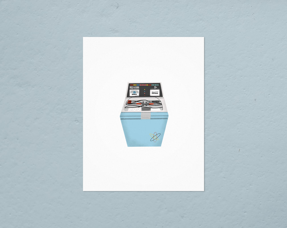 A month or so ago Seattle Magazine got in touch to ask me about designing pins and a page full of my pins are now out on newsstands. 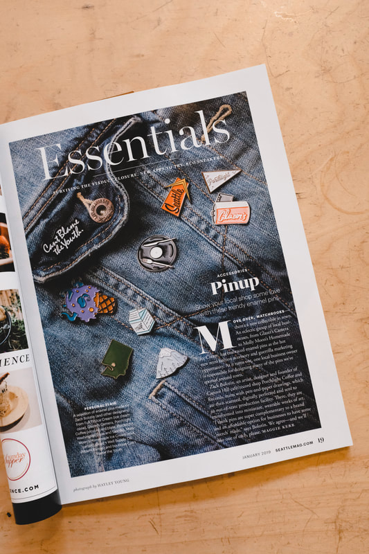  I tend to take a lot of photos with my Fujifilm and here are some of my favorites from the month of December. For the last 9 years of Porchlight, these two things have been a constant and sometimes it's nice to pay homage to 'em. These prints are available via the Porchlight Online Store. Early in November I also contributed a print to the Artists For Progress group show benefiting Northwest Immigration Rights Project and Everytown. The theme of the show was "Truths Are Lies, Lies Are Truths". All pieces were auctioned the night of and my piece, "Viewer" found a new home. 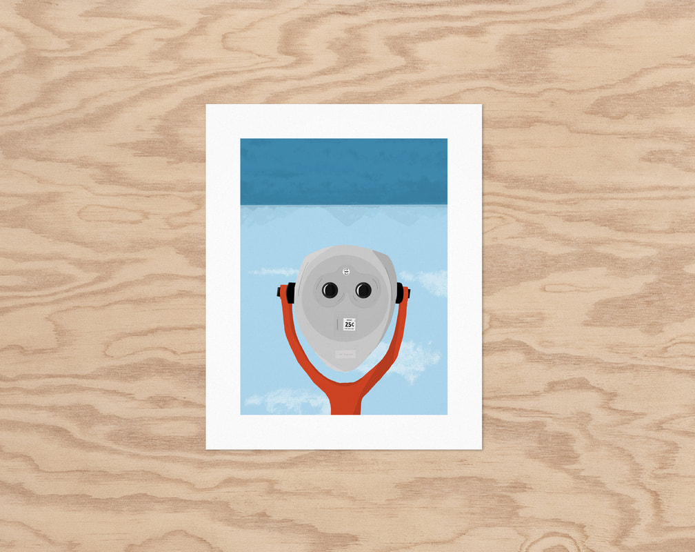 As the proud owner of a beat up 1982 Datsun pickup truck, I've been plotting this little ornament all year. After thoroughly Googling whether or not anyone had made a "Dogsun" joke before, I came to the conclusion that I was a true pioneer and visionary. These guys are available via closebyshop.com 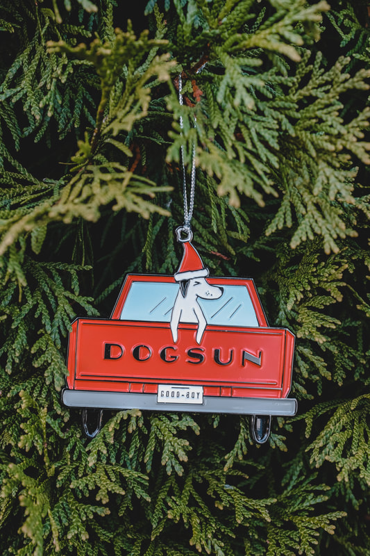 A few years back I started making candles that are sold via closebyshop.com and at Porchlight. This month I made a limited run of "Campout" candles--Cedarwood, Pine, Rosemary and Spruce blended together using all natural essential oils and soy wax. The labels are matte black on a glossy black glass vessel. 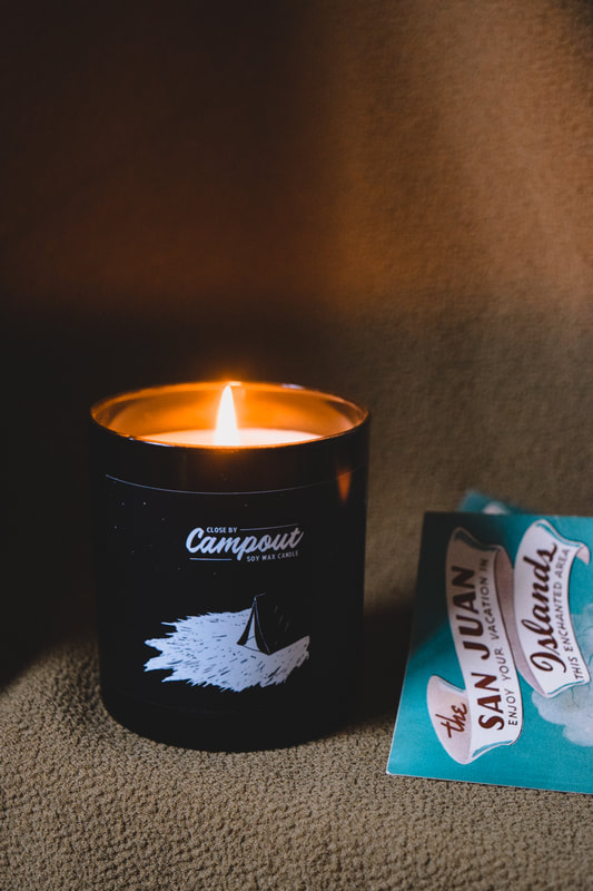 Lastly, here are some of my favorite photos from November... |