|
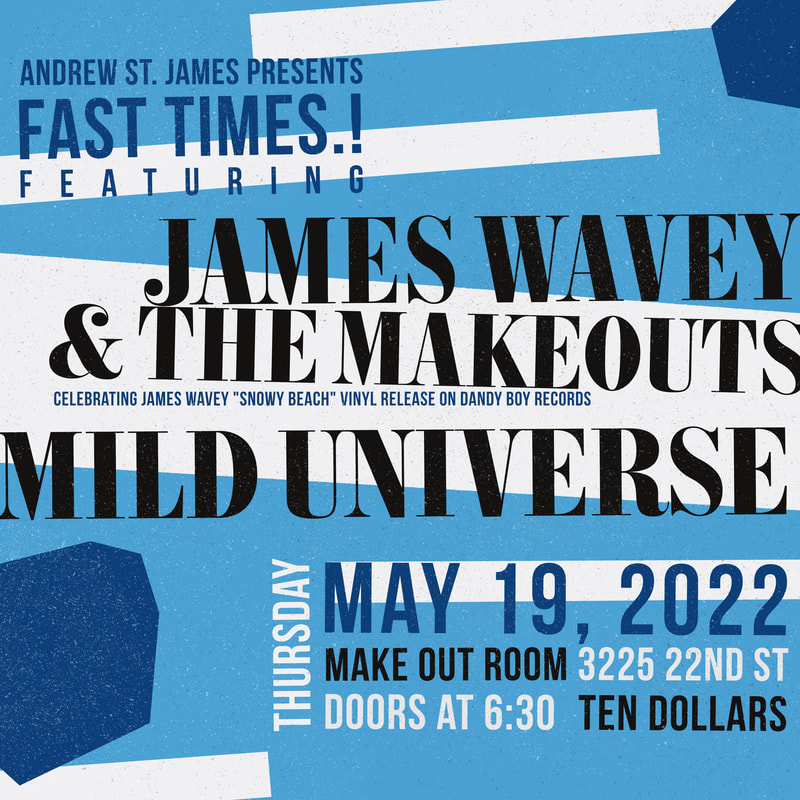
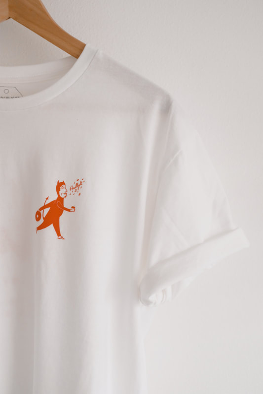
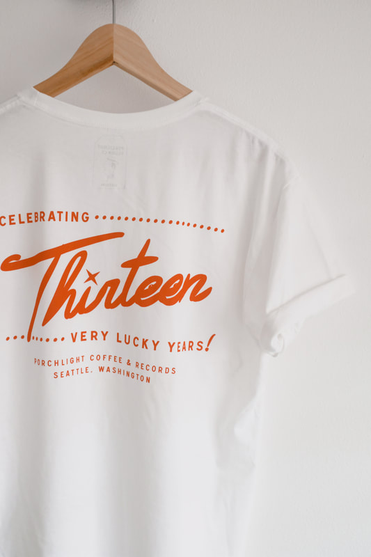
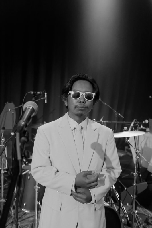
The slow catch-up of recaps continues... First, I did some branding for East West Machines, a project of Night Owls Print shop in Houston, Texas. As veterans of the print world, Night Owls continues to grow beyond screen printing and into providing other print and apparel shops with the machinery they need. The project called for a single color logo printed directly onto the machinery. Learn more about the company at East West Machines. 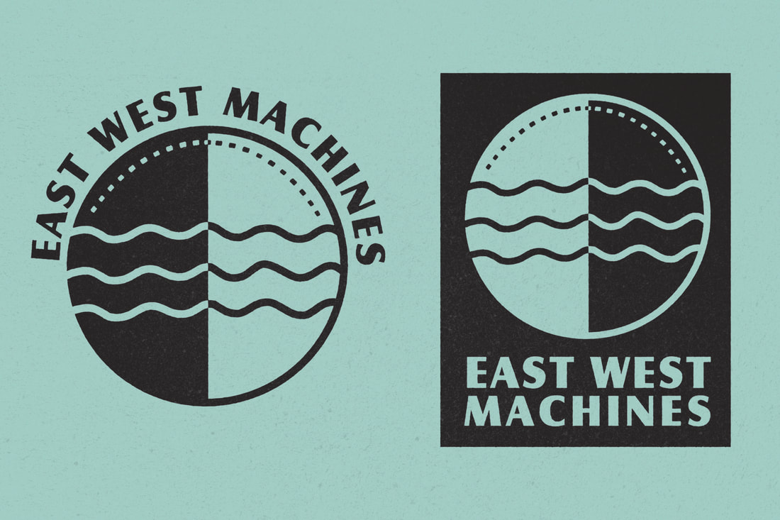 I was lucky enough to design a poster for the young pop star Olivia Rodrigo. Her show here in Seattle at WaMu sold out in seconds. This run of posters was only available internally to the tour, with a small number available at Porchlight Design Co. 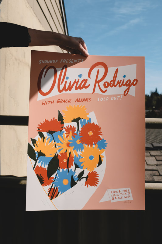 Next, a series of square posters, used mostly as digital content for a Fast Times concert series in San Francisco. 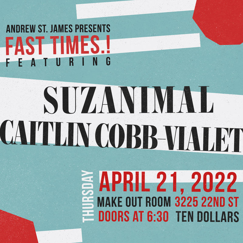 Porchlight just recently turned lucky THIRTEEN. To celebrate, I designed some limited edition commemorative tees! You may notice the Porchlight Dandy man is wearing his lucky devil suit to ring in the thirteenth year.
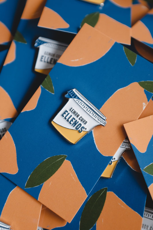
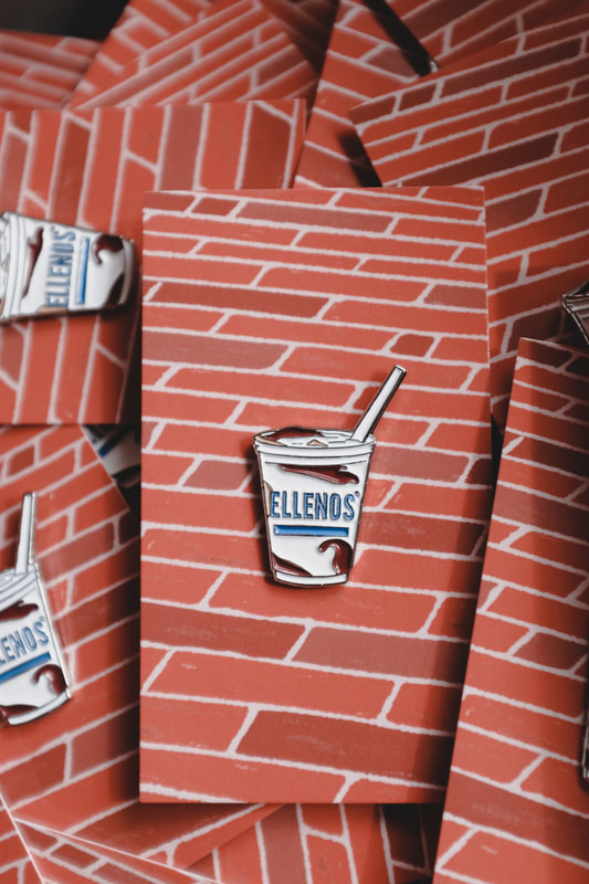
Ellenos Yogurt has been taking the greek yogurt world by storm and even competes with ice cream as a delicious dairy dessert. Ellenos started here in Seattle but recently expanded to Los Angeles. A few months back they asked me to create some enamel pins for them based on two different styles of their greek yogurt. If you need pins designed and produced, just let me know!
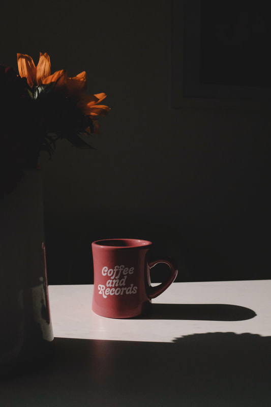
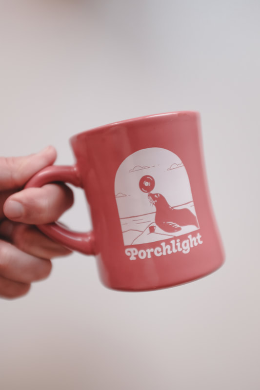
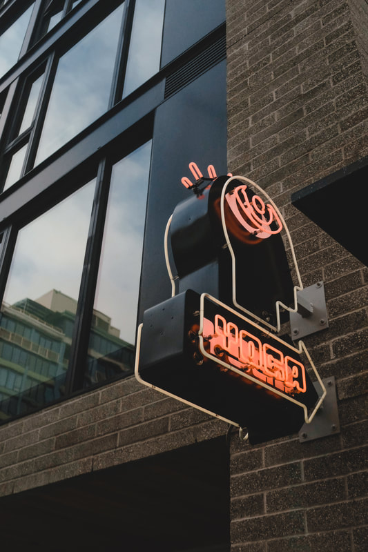
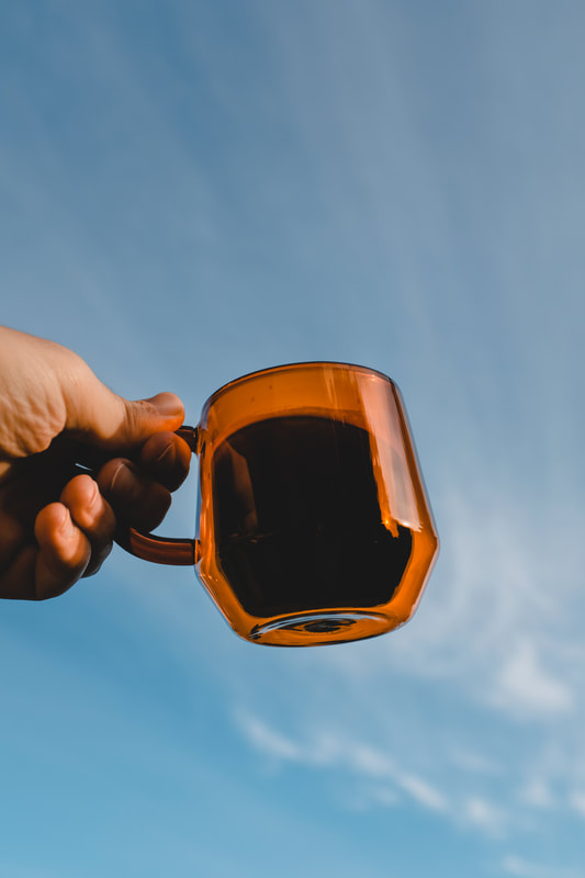
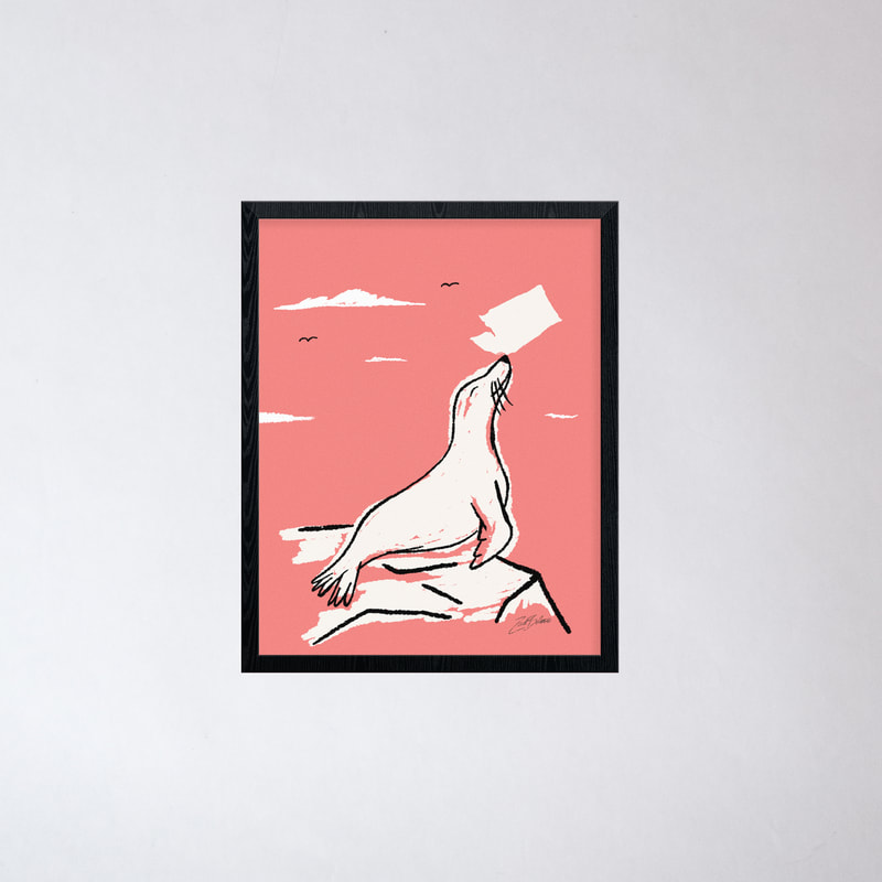
These posters were designed for the Fillmore and their sold out Palace show. The venue has a rich history of show posters, so it's always a pleasure to be asked to create a poster for 'em. 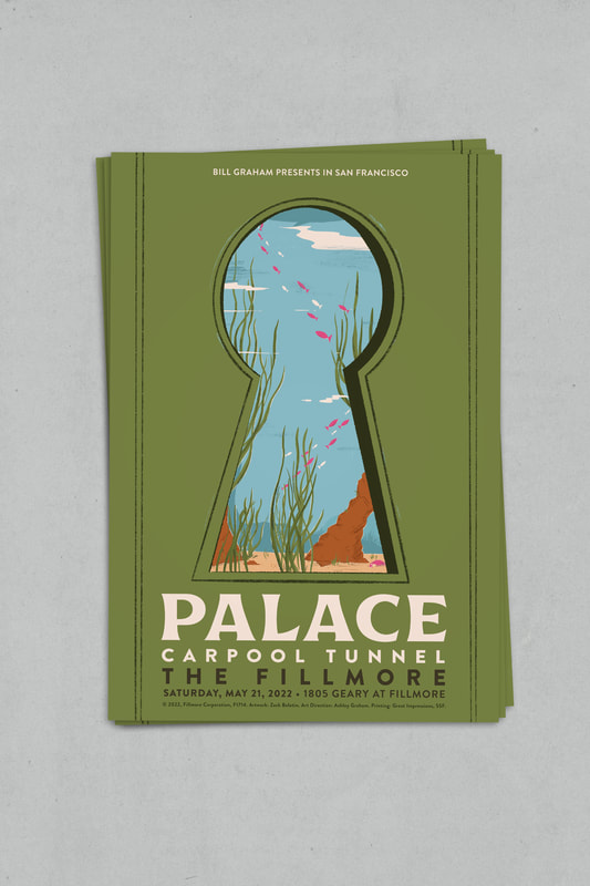 Of the number of diner mugs I've designed at Porchlight, this one might be my favorite. A coral pink mug, with a seal balancing a record. You can find it right here at Porchlight Design Co. or in-store at Porchlight Coffee.
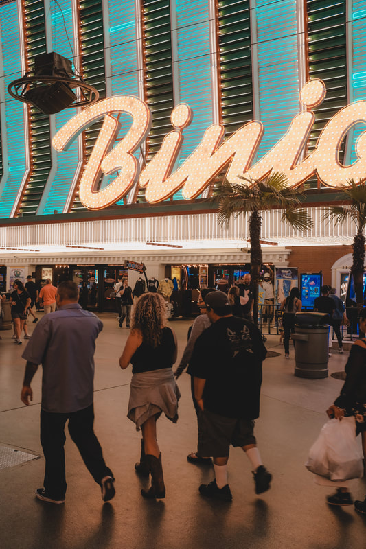
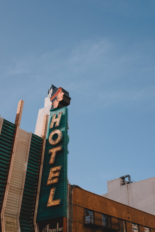
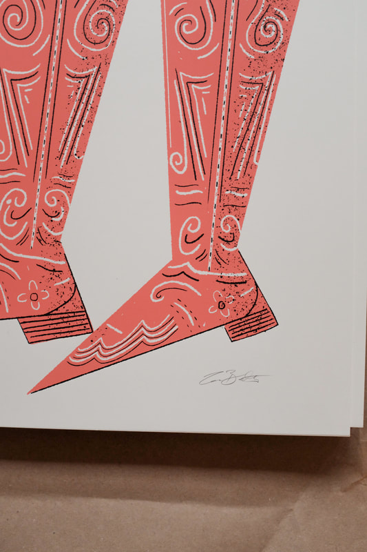
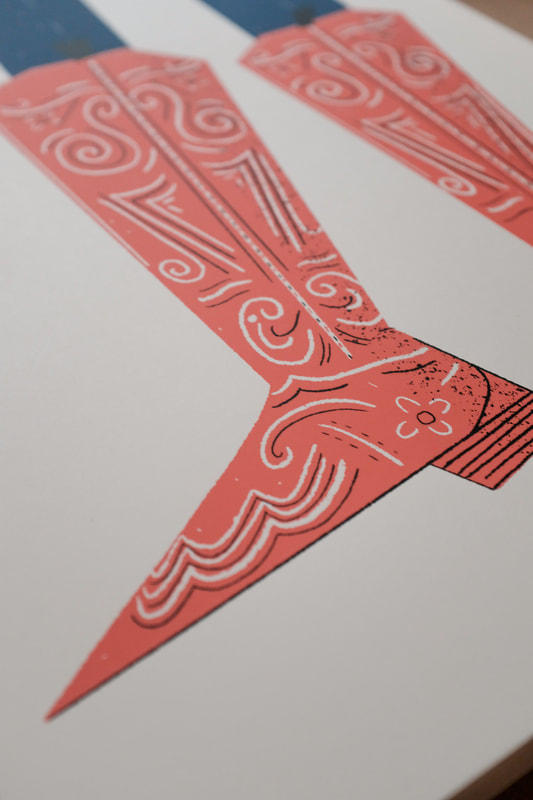
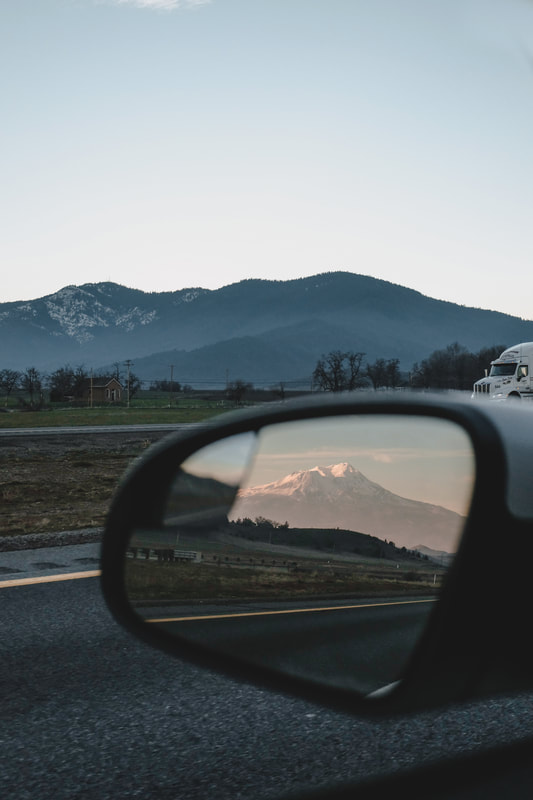
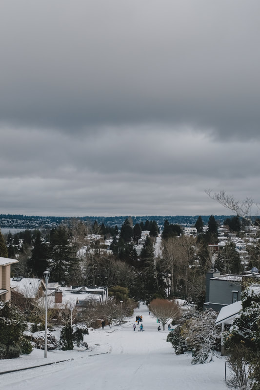
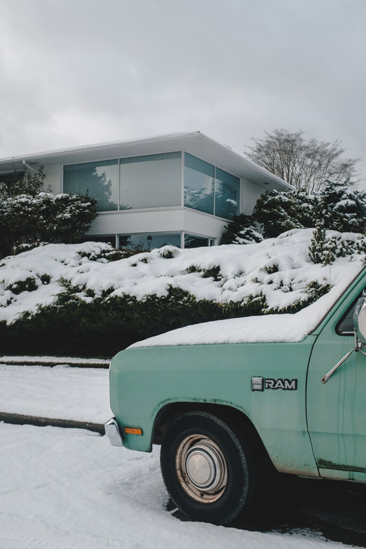
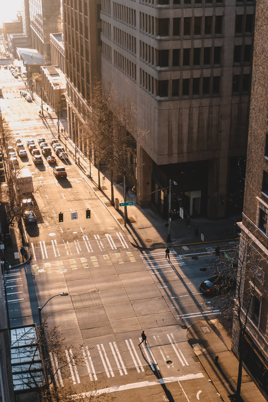
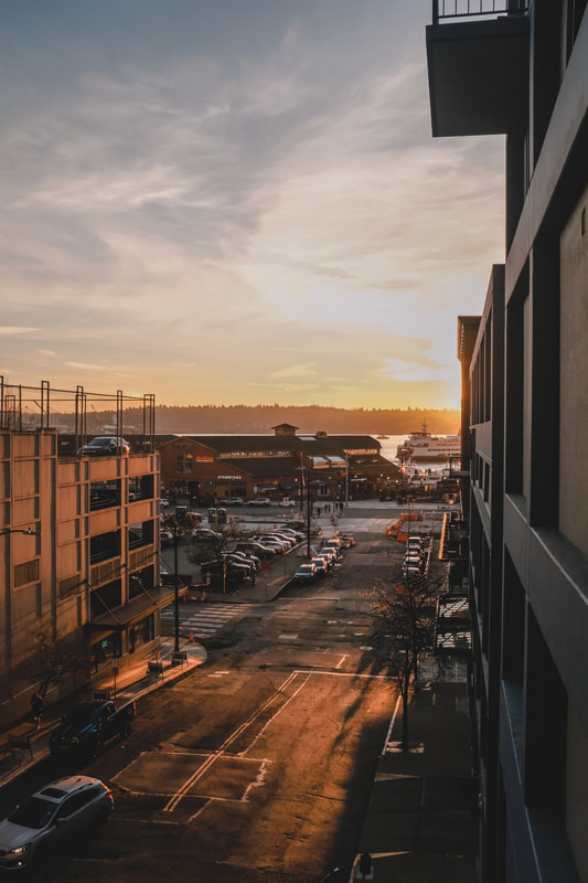
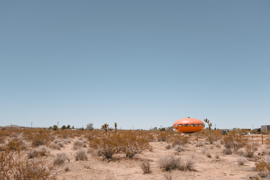
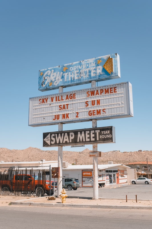
And lastly, a few of my favorite photos from April + May. Still playing catch-up getting to these monthly recaps, so here is a slightly condensed February and March. First off, a poster for one of my all-time favorite bands since high school—Jawbreaker. Their "borrowed" Morton Salt girl imagery has long been associated with the band, so I played on that, with a close up of the very recognizable girl and her umbrella. These prints were limited and available in small numbers. A few are left at Porchlight Design Co. 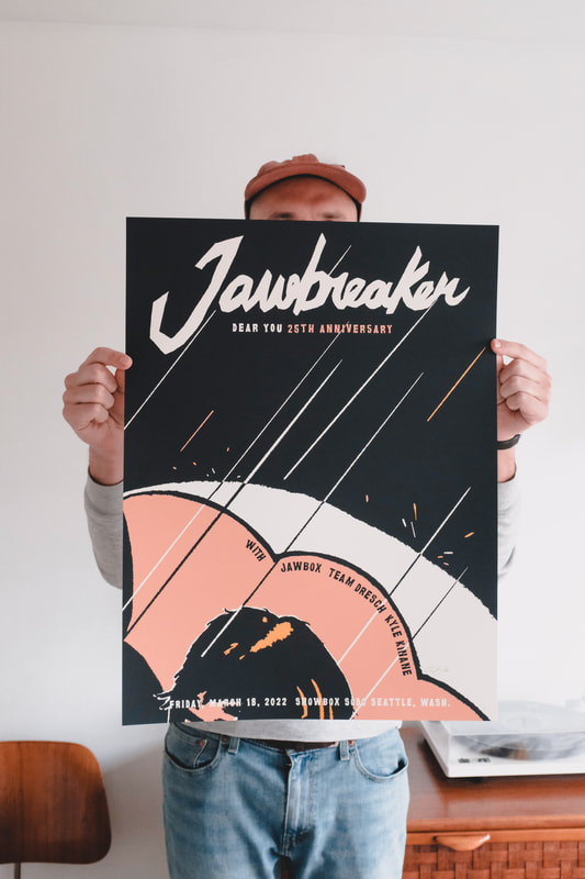 These posters were designed for local soul guys The Dip and they're two shows at the Showbox. The band has a few copies remaining via their webstore. 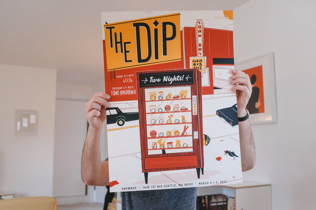 This next print was a cowboy-inspired one for all those that need some pink on their walls. The print is available exclusively at Porchlight Design Co. 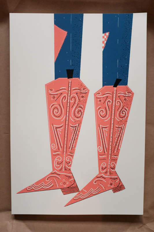
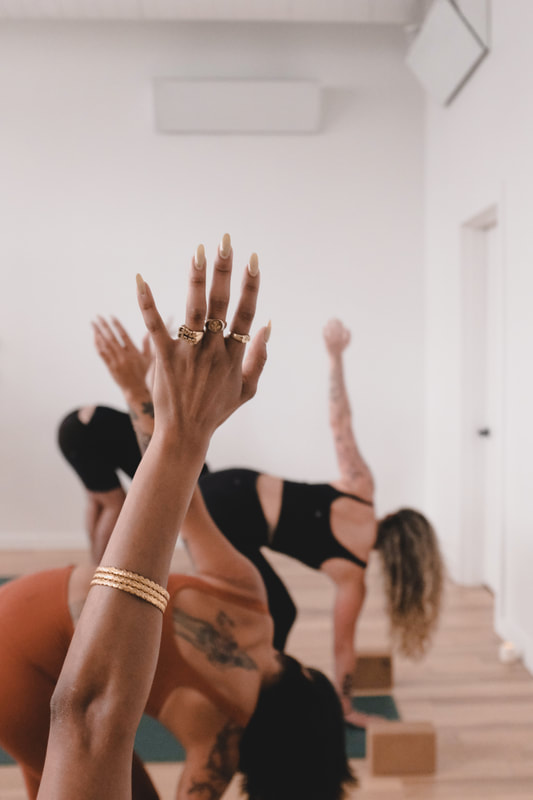
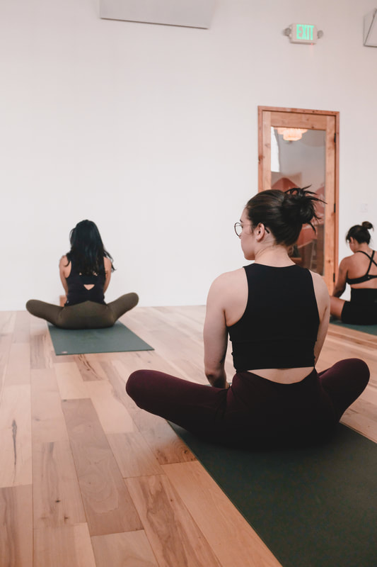
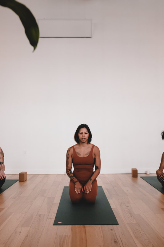
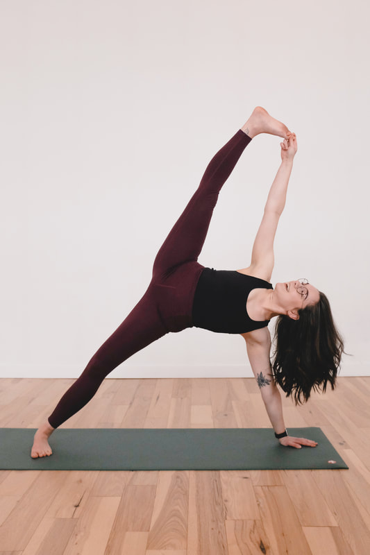
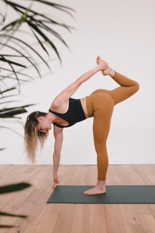
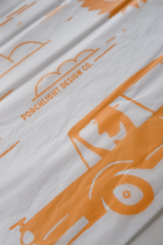
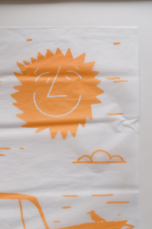
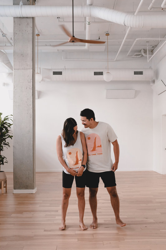
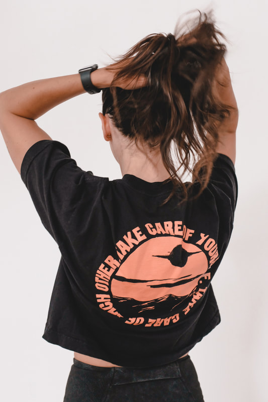
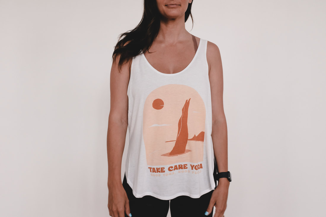
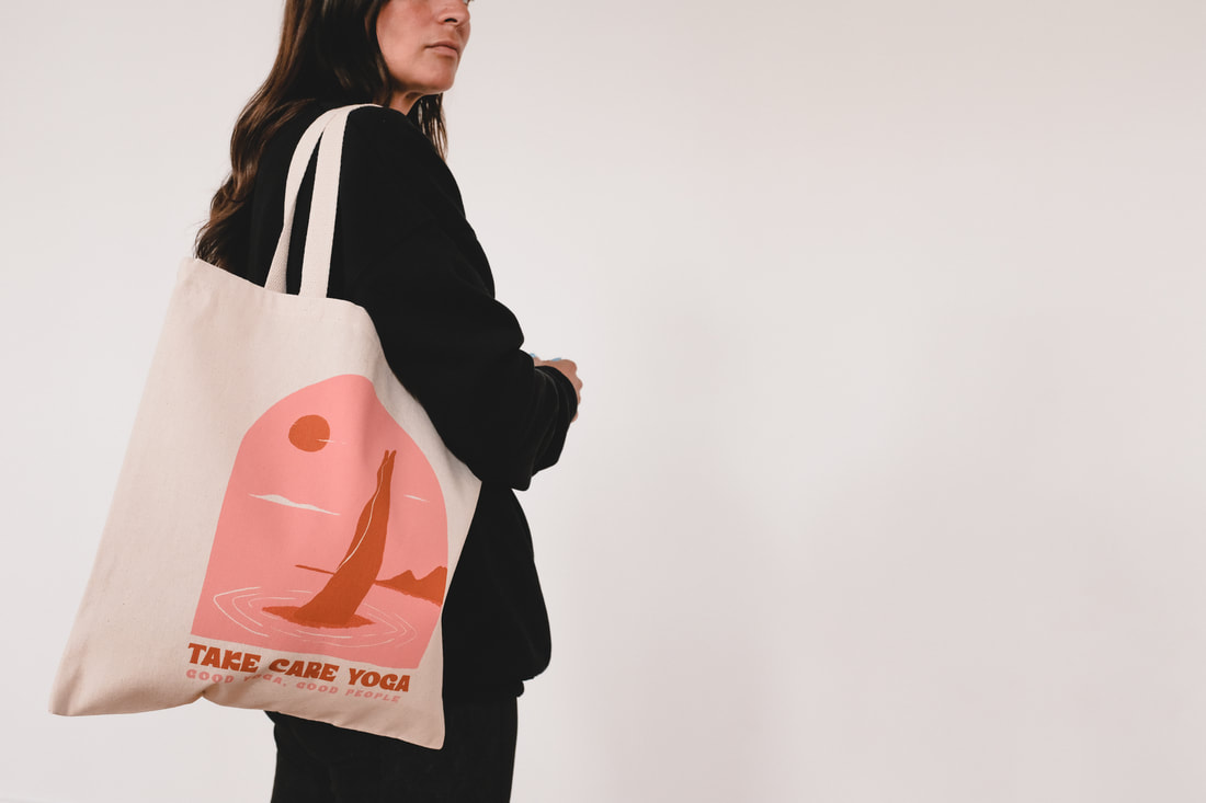
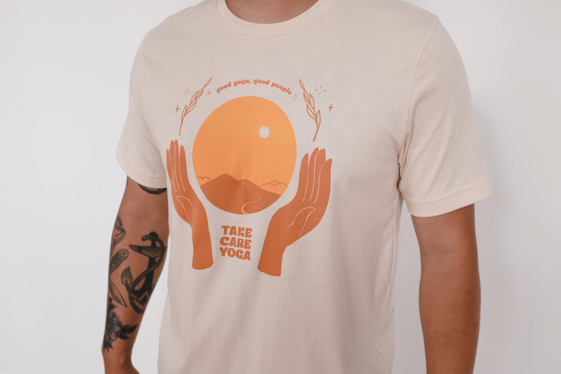
Over the years I've come up with various designs for Take Care Yoga, a community-based yoga studio in Seattle. Recently they asked me to take some photos for their marketing and social media use. Here are a few of my favorites. With so much mail order going out these days, it's important to house it nicely. I designed some sunny tissue paper to accompany all these orders. 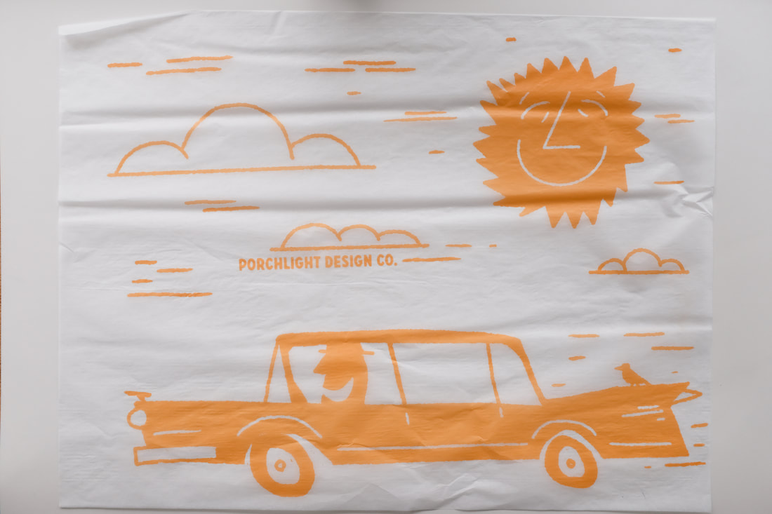
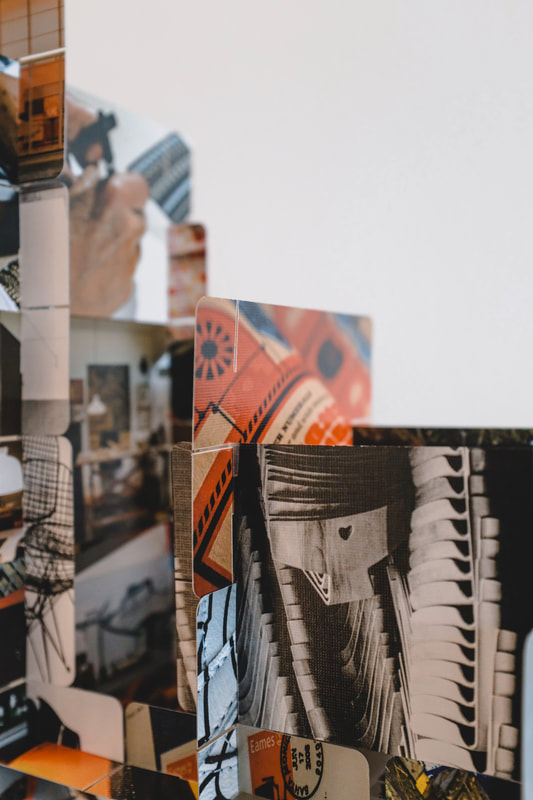
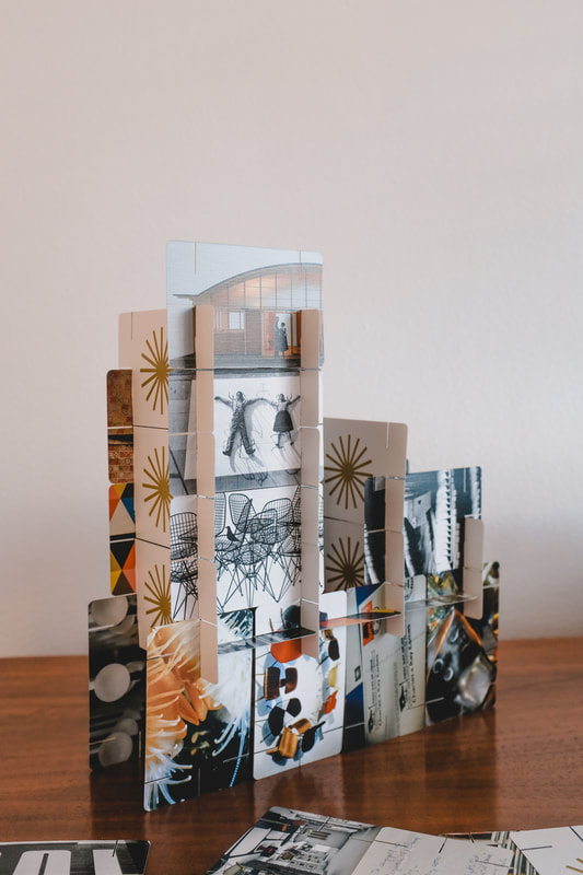
I also took some time to paint a little figurine. I've always been inspired by Alexander Girard's wooden dolls and this was my simplified iteration. 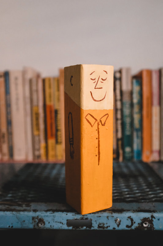 Lastly, a few of my favorite photos taken in February and March... January brought some fun ones. I spent months in late 2021 helping out with the iconic Eames Office House of Cards. I was tasked with laying out the cards using historic Eames Office photos and I also created the House of Cards packaging from scratch to match previous iterations from years past. This deck contains 54 cards celebrating different memories from 80 years of the Eames Office. Each card has multiple slots so that the cards can be stacked in countless ways, perfect for children and adults alike. 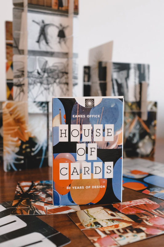
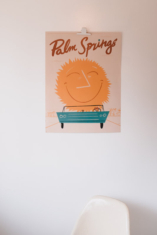
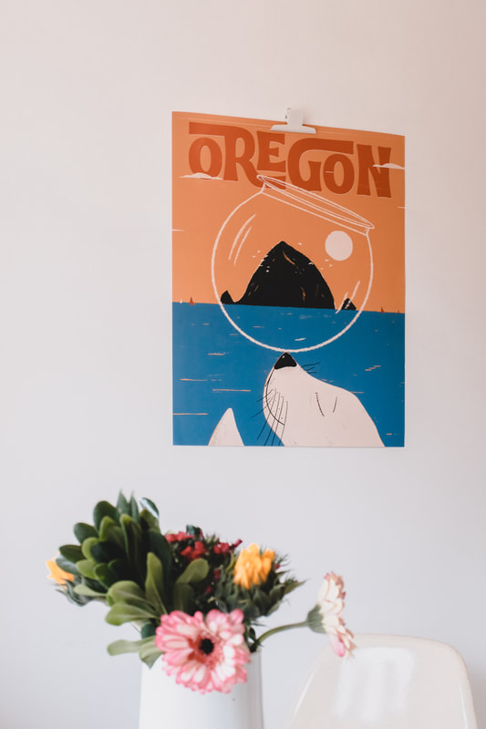
Inspired by travel posters of the past, I created three posters for places that I love—Seattle, Palm Springs and the Oregon Coast. They're available at Porchlight Design Co. 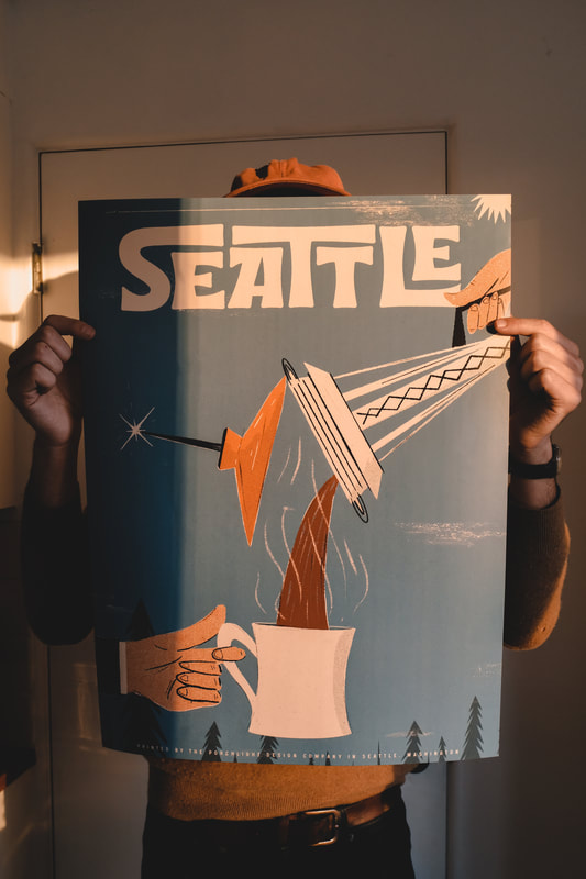
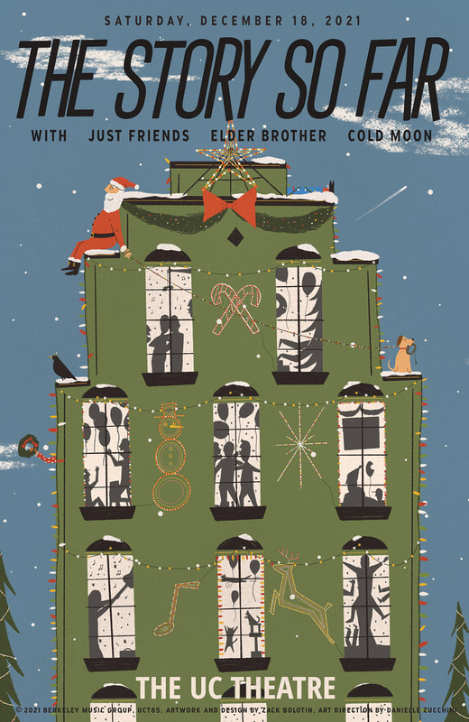
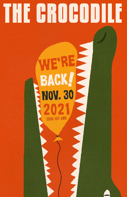
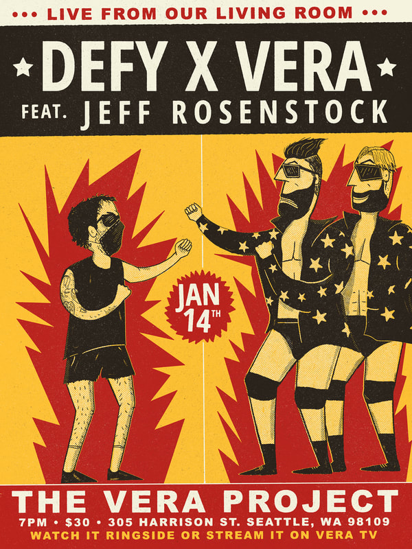
This month also brought some subtly branded Jesse Butterworth posters. Instead of the traditional show poster or band poster, we decided on more of an art print with "JB" illuminated in the windows.  Next is a square show poster for Fast Times Presents! 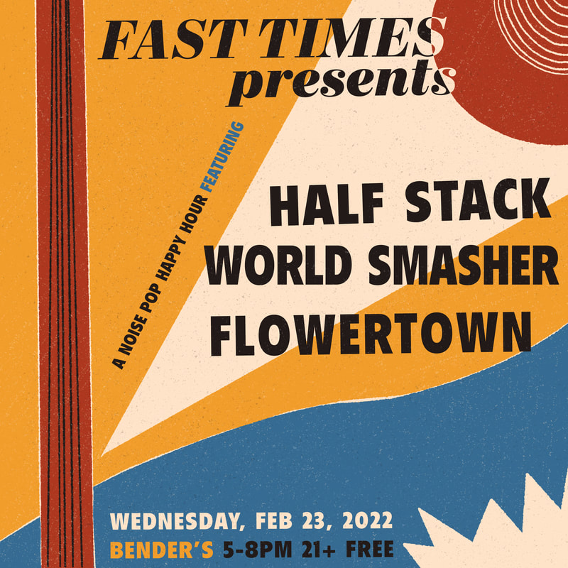 Lastly, some branding for Marketing/Sponsorship company The Dugout. At the helm is a Philly Phanatic, Jay Cox. The Dugout has worked with Trans-Pecos Music Festival in Marfa, Topo Chico, Mr Moxey's Mints and more. 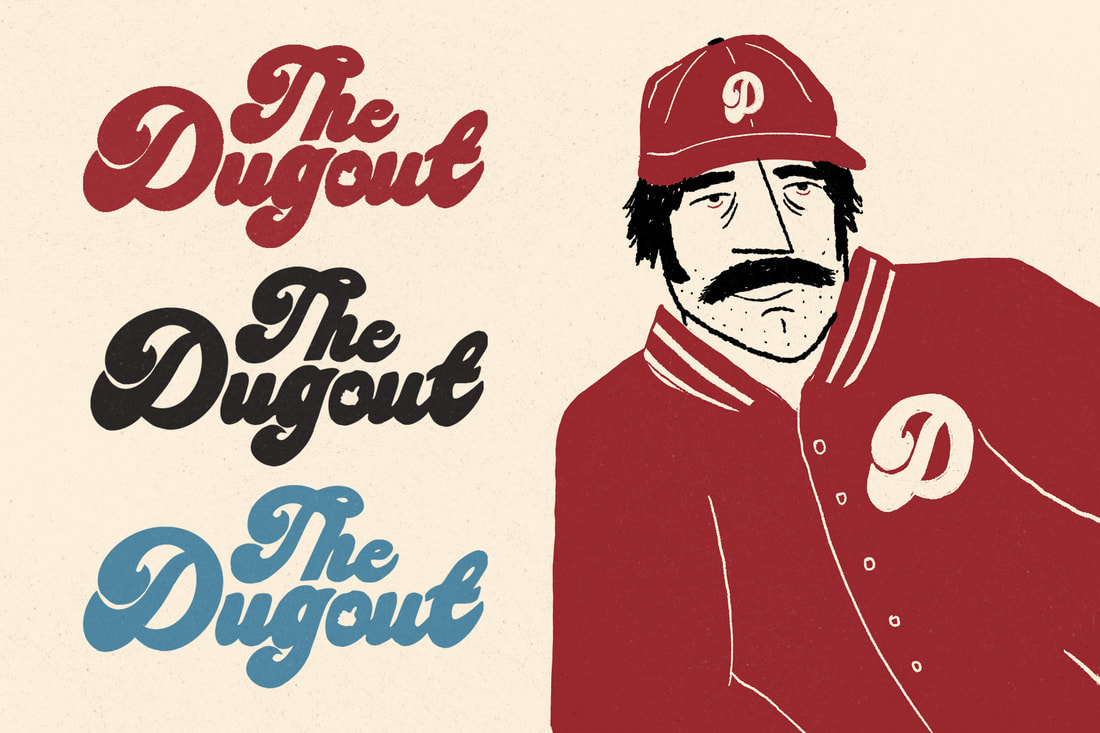 And of course...a few favorite photos from the month. December brought some fun stuff. I provided the artwork for Death Cab For Cutie's cover of Darlene Love's "Christmas (Baby, Please Come Home). Inspired by the first lyrics of the song—"The snow's coming down, I'm watching it fall". I focused on a snowy scene in an eyeball. Barsuk Records released the single and you can listen to it everywhere. 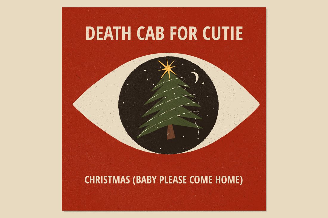 The month was busy with show posters as well. First, a poster celebrating the return of the Crocodile. Second, a show poster for Jeff Rosenstock at The Vera Project alongside a wrestling match! Lastly, a hometown holiday show for The Story So Far at UC Theatre.
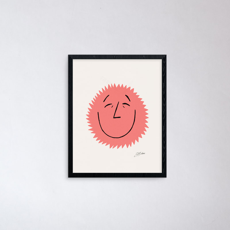
 One of the biggest questions of our lives... Keychains are available at Porchlight and online via Porchlight Design Co. 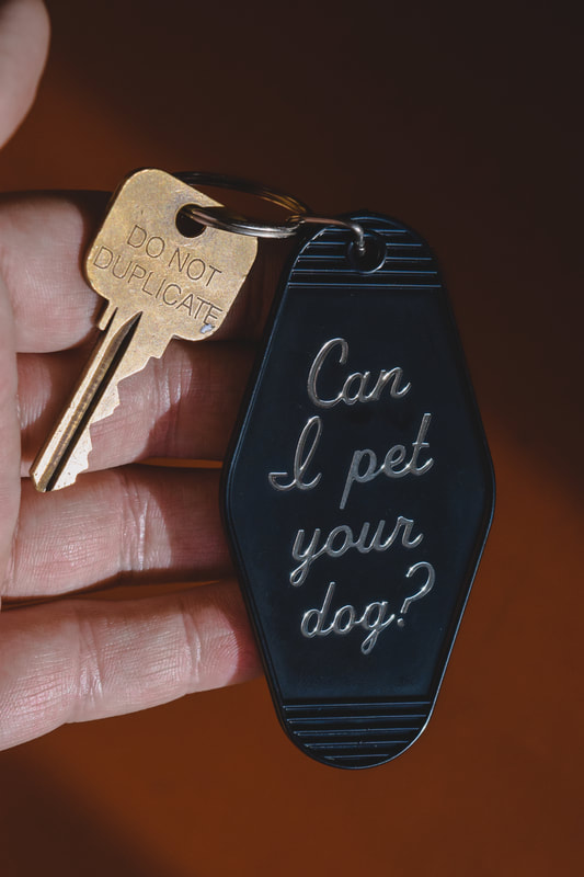 Inspired by airline posters of the past, I designed a small Seattle poster using a 35mm slide from my book Washington. It's available via Porchlight Design Co. 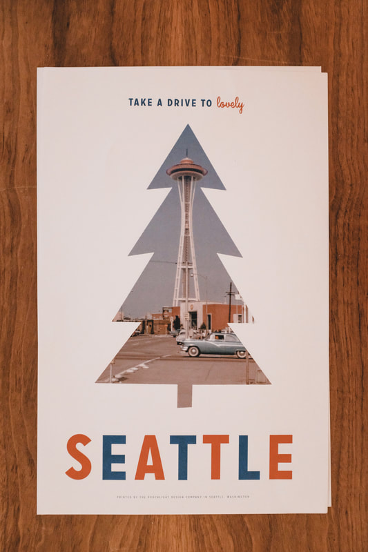 Lastly, a three-color art print as an ode to pink bathrooms everywhere. Available via Porchlight Design Co. 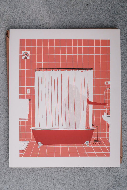
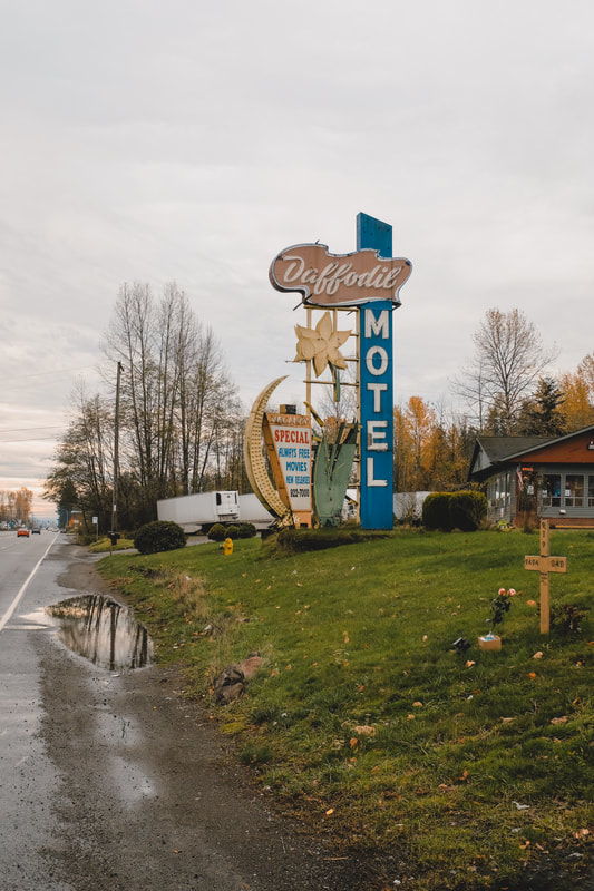
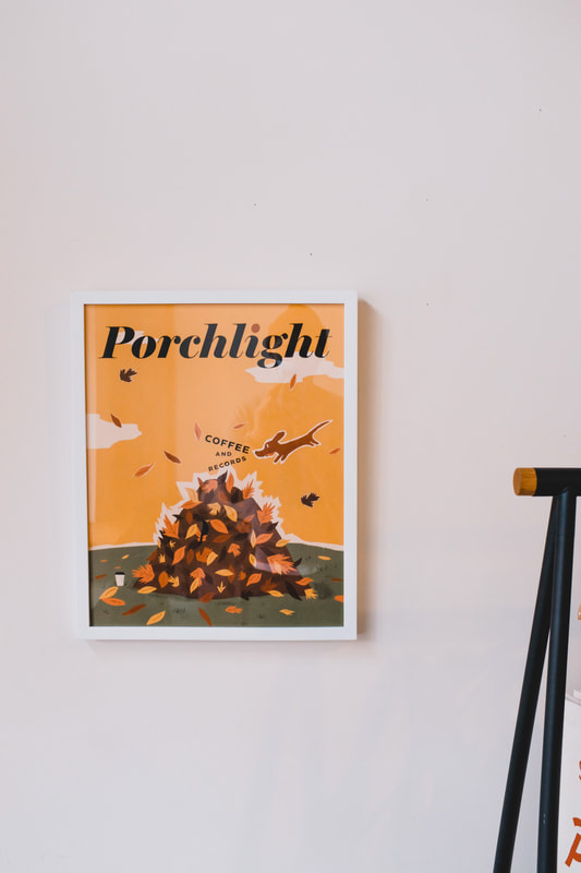
In early November I designed the new seasonal Fall poster to put up at Porchlight. It features a very happy dog and a very unsuspecting pile of leaves.
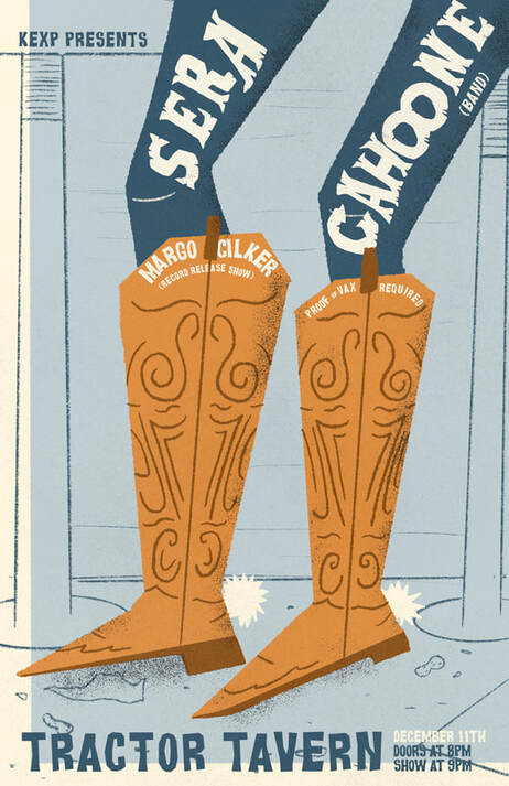
I also designed a poster for the wonderful Sera Cahoone. Her show was at the Tractor and we decided on a cowboy-themed print to fit the mood.
Over the summer. I released some music for the first time in many, many years. The second video from the album is for the song "Headless". It's a layered video of grainy flowers and toy cars trucking along that I filmed and edited at home.
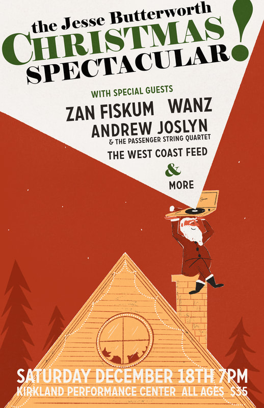
Next, a holiday poster for Jesse Butterworth's big show in Kirkland.
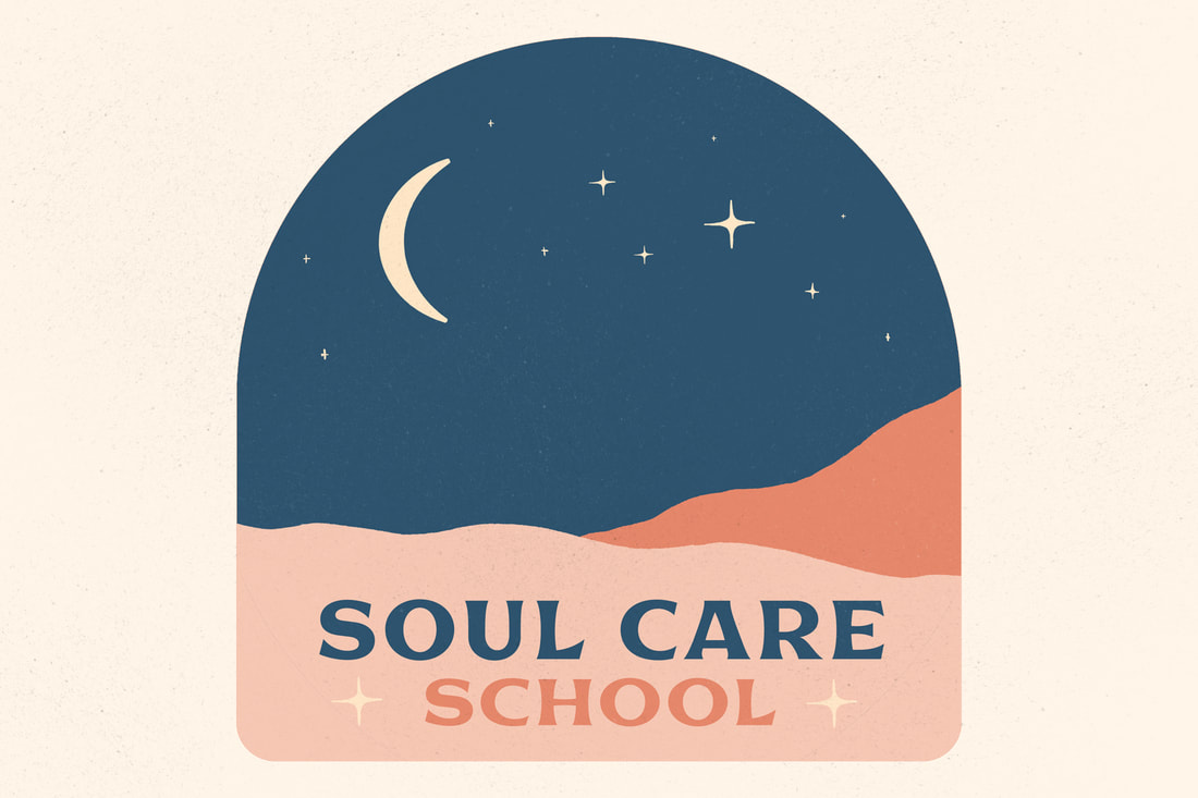
Anna and Jasmine joined forces to create Soul Care School, a yoga training business, and asked me to create a logo for them. We all agreed that this combination of colors and imagery fit the mood they were looking for.
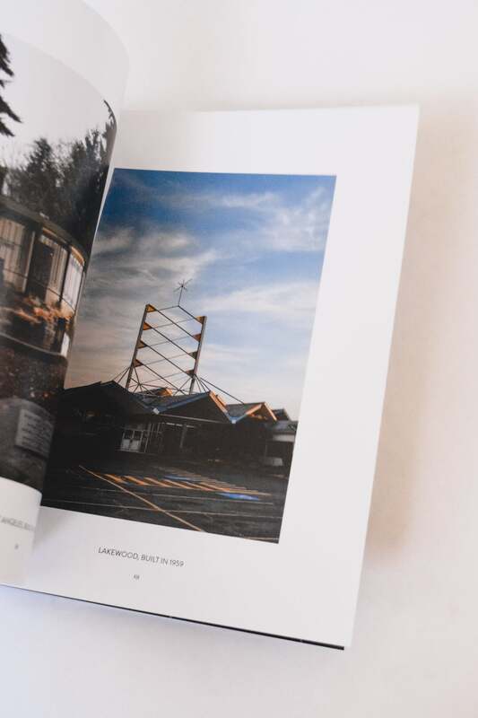
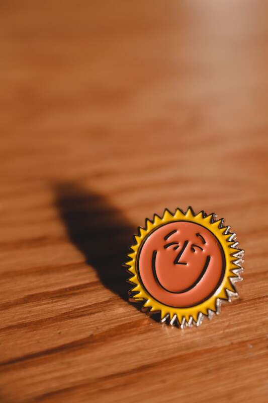
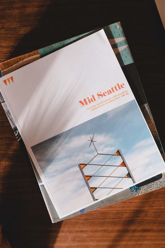
November brought a brand new volume of Mid Seattle. The cover features the spire of Bowlero bowling alley, designed by Marshall Perrow in the Tacoma/Lakewood area. Volume 6 includes a very happy enamel pin to go along with it.
Lastly, a few of my favorite photos of the month.
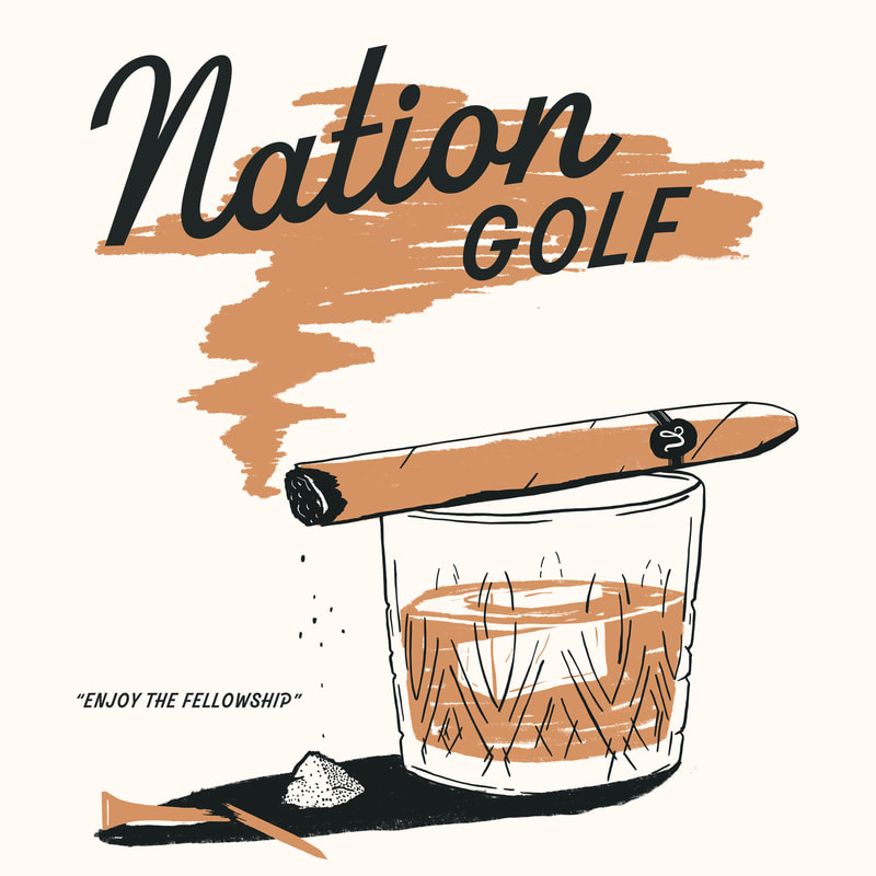
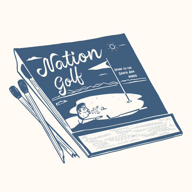
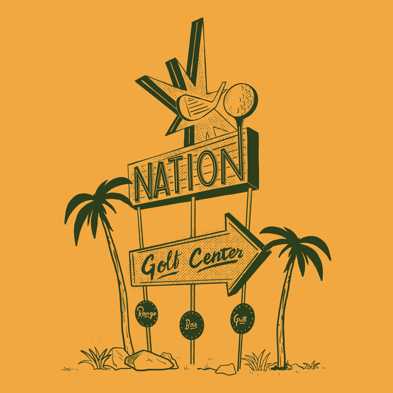
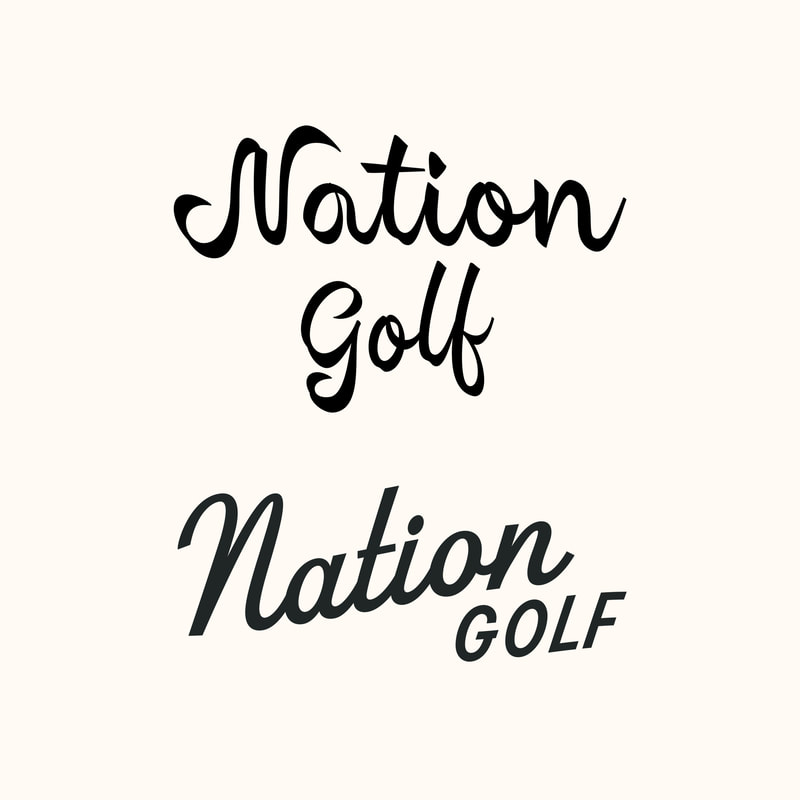
October brought some new can designs for the pals at Neshaminy Creek Brewing. The first is somewhat self explanatory—"Opposing Bookends" and the second is based on the brewery's nosey neighbors—"Sultana Sandra". If you're on the East Coast, drink 'em up! 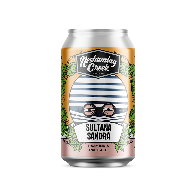 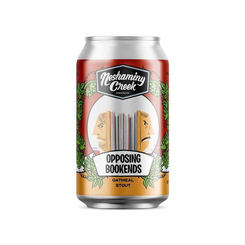 These totes may look great, but sadly they sold out VERY quickly. Thanks to everyone that grabbed one! 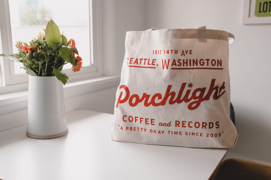 Every few months I design a new seasonal poster that hangs on the wall at Porchlight, for October, I brought out this spooky guy. 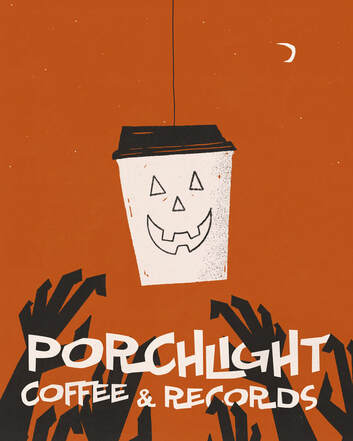 In October, I also did the Monster Mash... At Fantagraphics, Robin Edwards (Lisa Prank) curated a very fun Monster Mash themed art show. "Listening Booth" was my contribution... 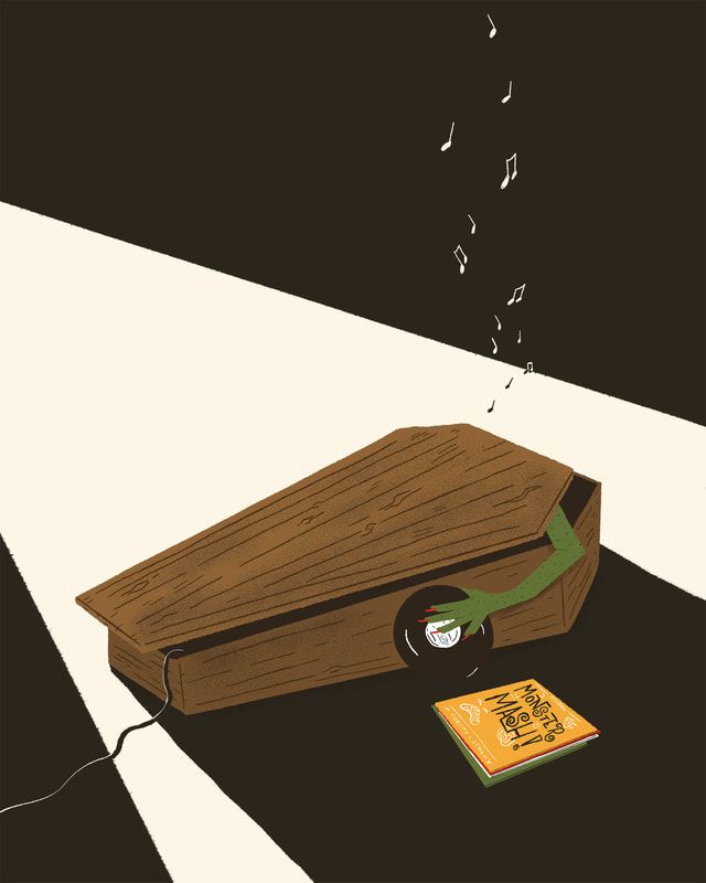 And lastly, my favorite photo from the month of October: 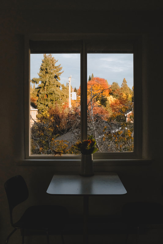 September brought a fun custom project–a wedding "show poster" for a couple in Chicago. The soon-to-be-newlyweds are big fans of the Northwest, Midwest and some of the bands I've designed posters for, so they wanted a poster that combined these things and looked like a concert poster. I drew inspiration from old travel posters to combine their love for the two regions along with their love of travel in the form of an illustrated paper airplane. 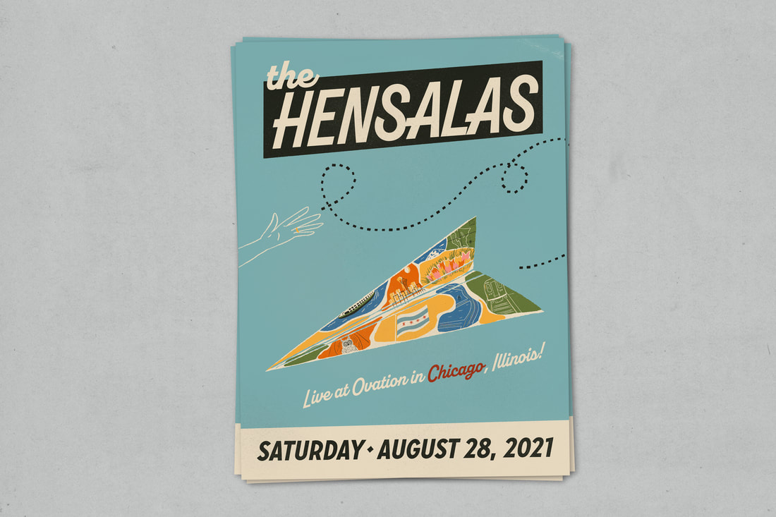 The City of Seattle and the Vera Project commissioned me to design a shirt welcoming folks back to the city after long COVID closures. This design was printed by the folks at the Vera Project in limited numbers. 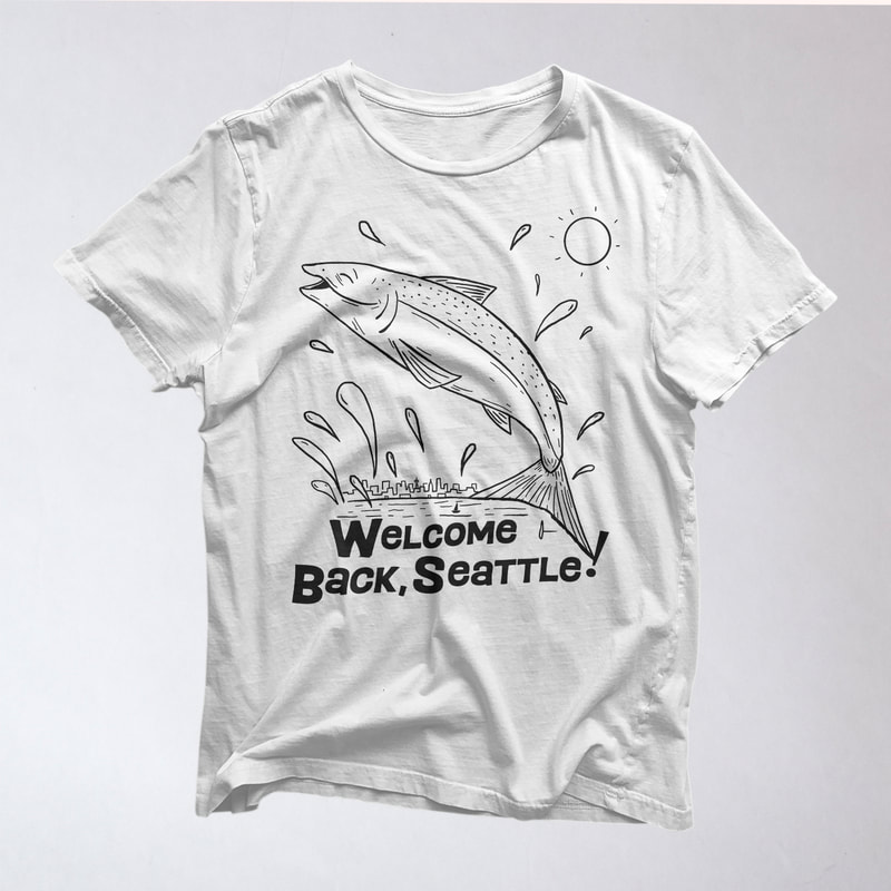 I love designing for Take Care Yoga because I so often and so easily see eye to eye with owners Anna and Joel in creating what they're envisioning. We have a great understanding of the "vibe" one another sees and it makes for a fun design process. I also took these photos after the printing had been completed. 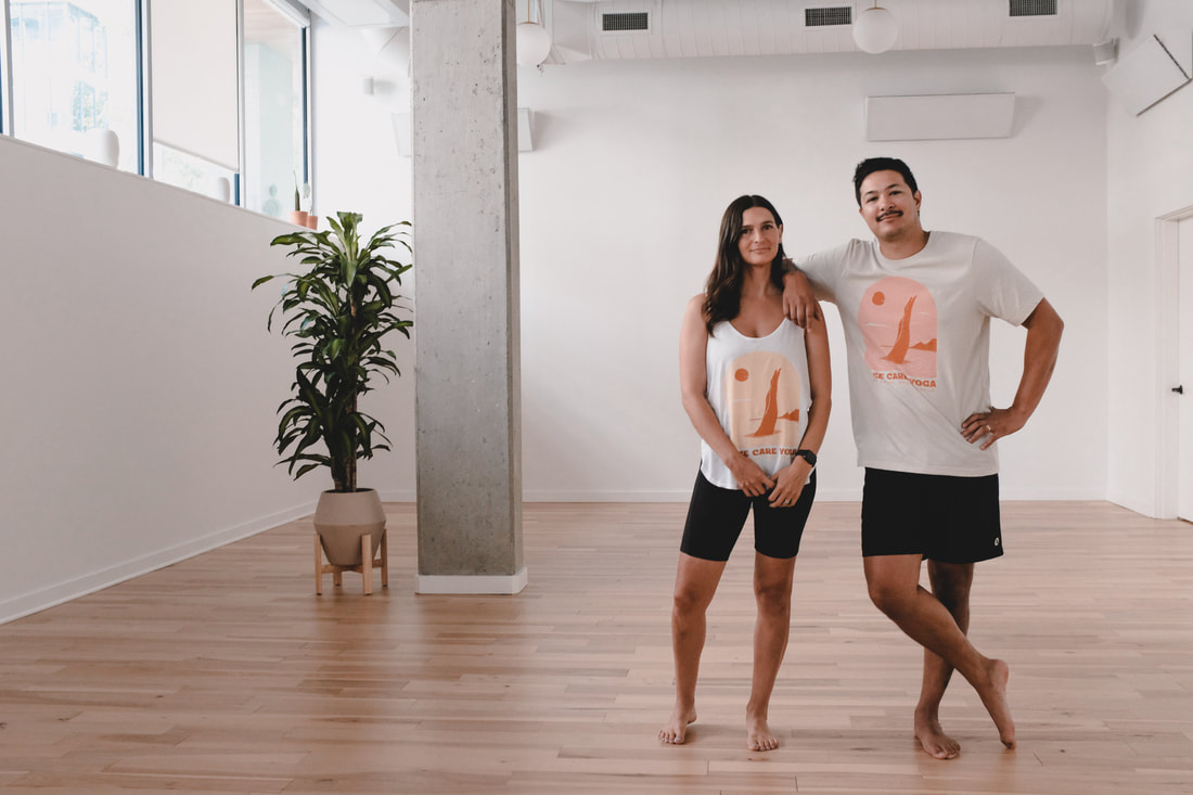 As a very casual, very bad golfer, I loved coming up with these fun designs for Nation Golf in Southern California. Nation is an incredible brand that doesn't take itself too seriously while enjoying the game. Grab one of these tees or one of their mid-century-inspired polos at nationgolfco.com/
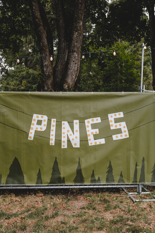
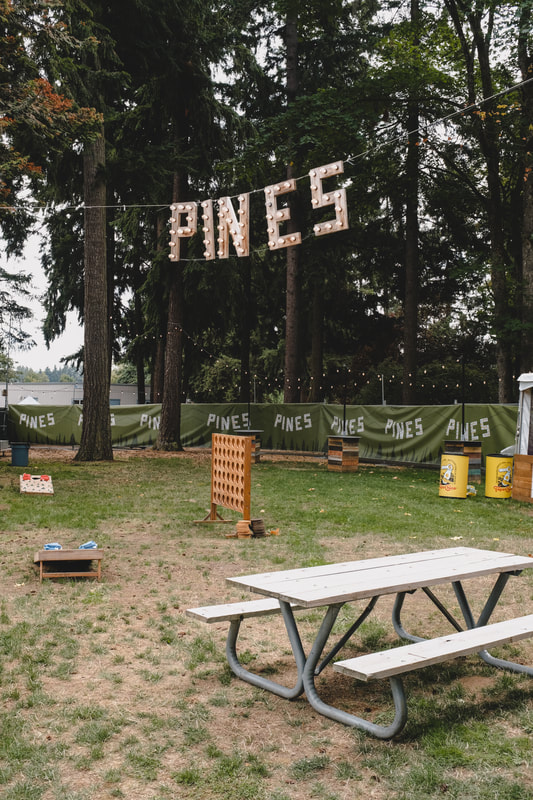
Lastly, a few of of my favorite photos from the month... August brought a variety of fun stuff. First was some repeating fencing for the VIP area of Marymoor Park's concerts, hosted by AEG. The Pines provides a sweet, comfortable VIP experience and I was more than happy to create the fencing (based on their signage) to add to the ambiance.
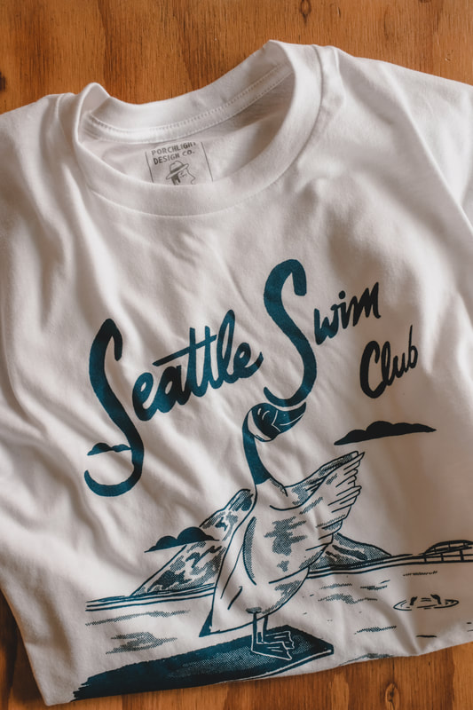
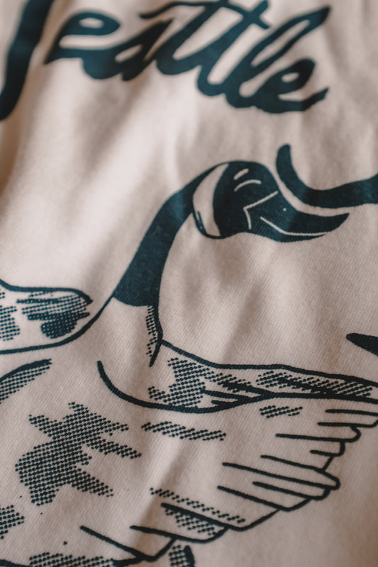
Next up is some branding for interiors organizer Mess Mgmt. I came up with a logo featuring two hands arranging the words "MESS MGMT". The hands are meant to evoke the organizational way we tidy up a countertop or mold shapes the way we want them. 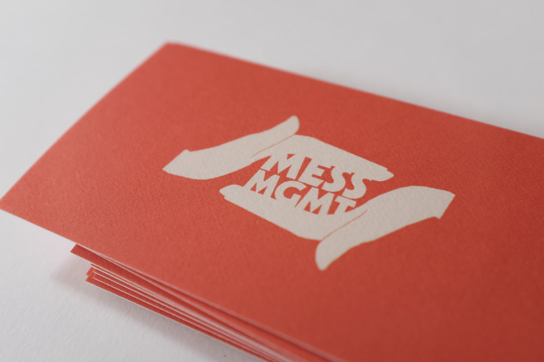 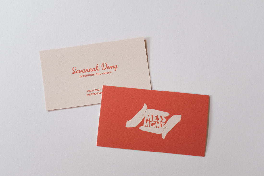 A fun poster for the pals in Hey Marseilles, playing their first show in a LONG time. 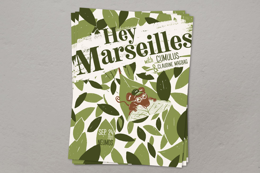 This month, I also did something I haven't done in quite some time–I released an album. Every now and then I record some lo-fi music and get help from friends. The project is called Pretty Old (a name stolen from a Jawbreaker song). I also created a little video for the first "single" from the album, which premiered on KEXP. Read the article here. 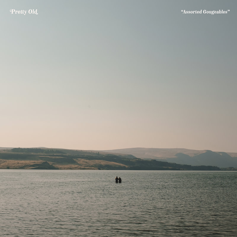 Lastly, a few of my favorite photos from August. July was a bit poster heavy. It started off with a poster for El Corazon, a venue I grew up going to, even back before it changed from Graceland to its current name. See Tickets recently took over the ticketing duties for a handful of US venues and commissioned this "show poster" advertising El Corazon becoming part of the See Tickets family. 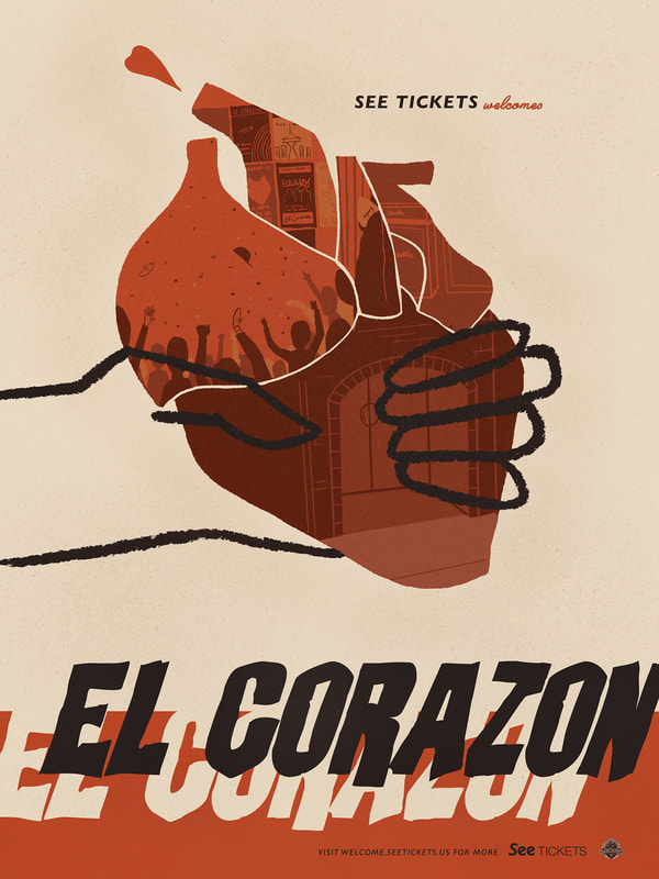 Next, a poster for New Pornographers. The band planned a tour in which each city gets two evenings to celebrate their first two albums. 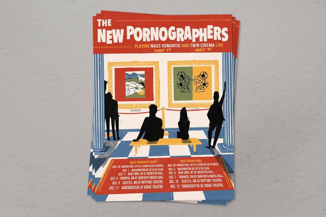 This show has since been postponed to October, but I designed this Northwest-focused ferry show poster for my pals Ben Gibbard and David Bazan, two of the best the Northwest has to offer. 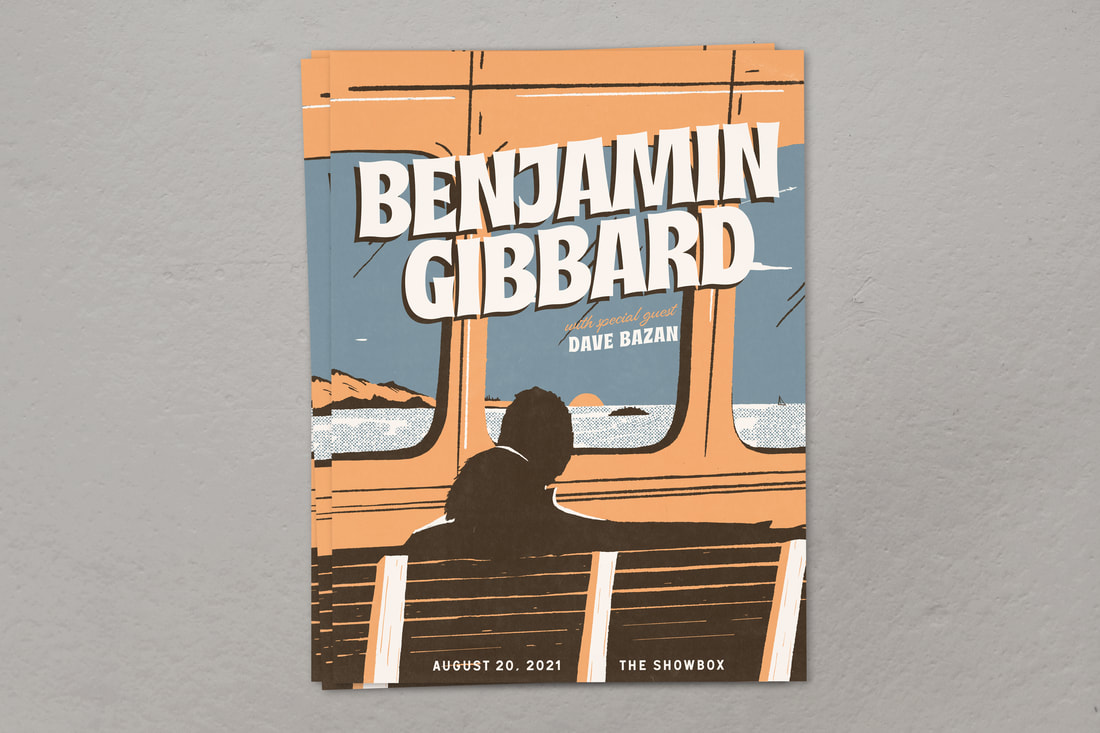 I designed this one for Tomo Nakayama so that we could finally celebrate and have a release show for his wonderful album "Melonday" on Porchlight Records. In my opinion, a disco ball moon is the best way to represent it. 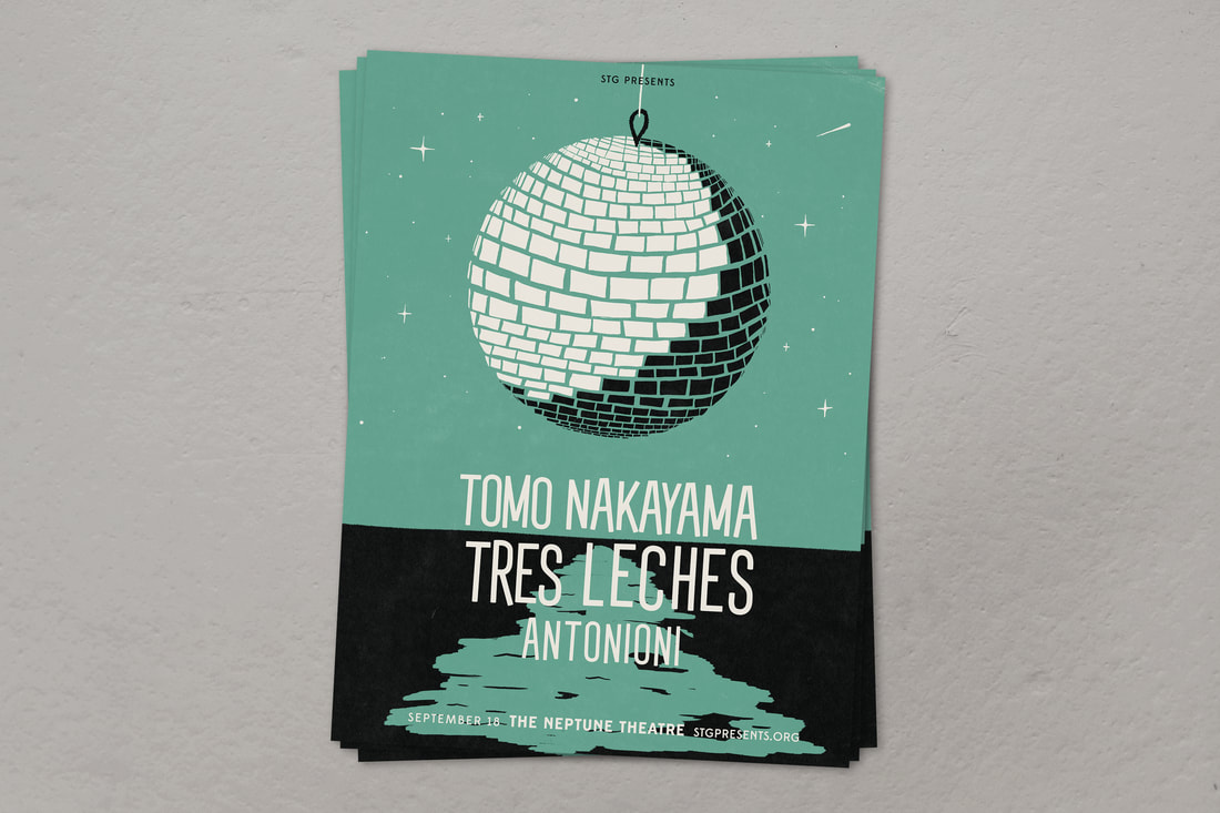 To round out the month, a fun shirt that only the few and proud will understand: Seattle Swim Club. 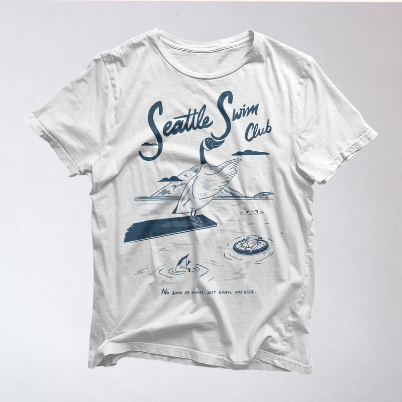
Lastly, some of my favorite photos from July...
I've been a bit busy and haven't had a ton of time to recap the last few months, so here's the June 2021 recap being posted at the end of August...
Brand new Porchlight two-color tote bag design featuring a server's hand bringing all that you could ask for–a plate of vinyl and coffee. They're available in-store at Porchlight, as well as online at Porchlight Design Co. 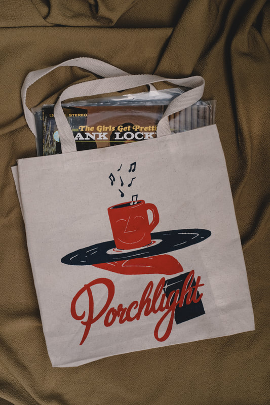
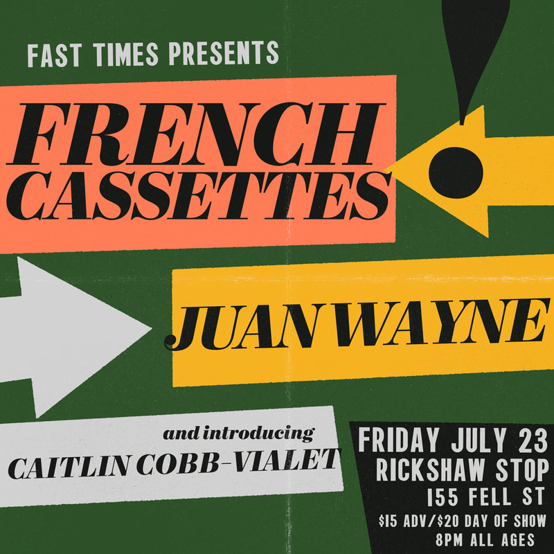
A fun little square poster for the pals at Fast Times Presents, featuring French Cassettes, Juan Wayne and Caitlin Cobb-Vialet at the Rickshaw in San Francisco.
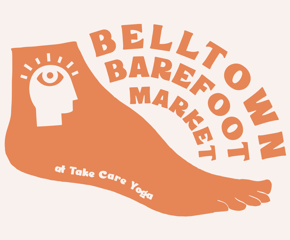
The folks at Take Care Yoga started hosting the Belltown Barefoot Market, a literal barefoot makers market inside of the yoga studio. I created the logo for the event and incorporated their standing logo which features an eye inside of a silhouette.
This month I also created a couple happy pink two-color prints, available at Porchlight Design Co.
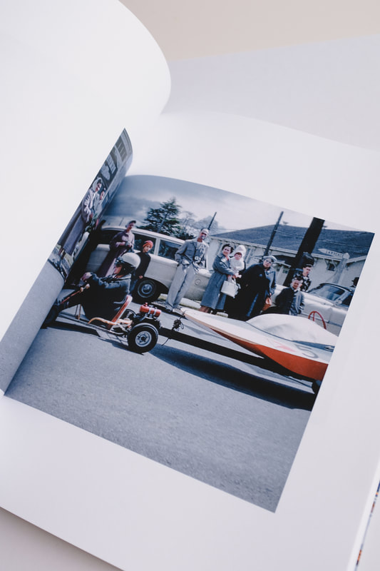
My biggest project yet took me about two years to complete and in June it finally came to life. "Washington" is a book of amateur photography taken between 1942 and 1979 in the Evergreen State.
The images inside are intended as glimpse of the state's structures, people and life during the 1940s through the end of the 70s in Washington State. You'll find Pike Place Market in 1966, downtown in earlier decades, Volunteer Park in the 1940s and 60s, and a whole lot more throughout King County and all over Washington. I found, scanned, retouched and researched every slide in the book to fill 166 pages and couldn't be prouder of how it turned out. The book is a softcover with raised glossy lettering on the cover, a printed interior cover and full color throughout. Below you'll find a video I made to show the details as well as an instrumental soundtrack I recorded earlier. 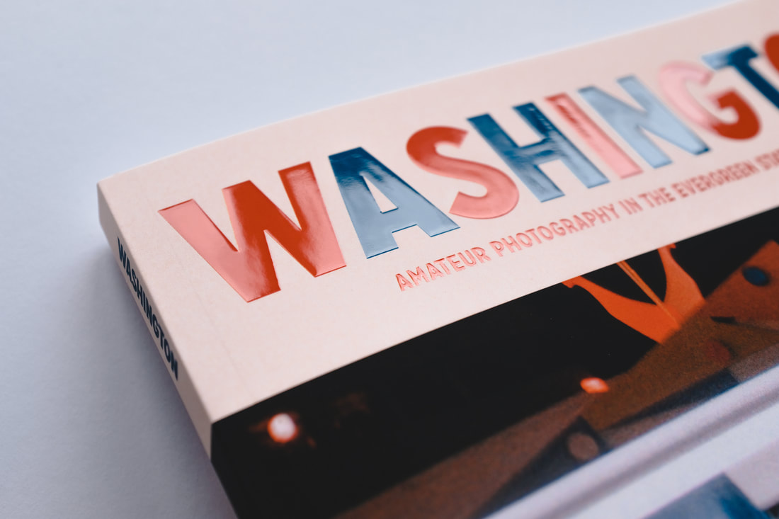
And lastly, my favorite photos from the month of June...
|