|
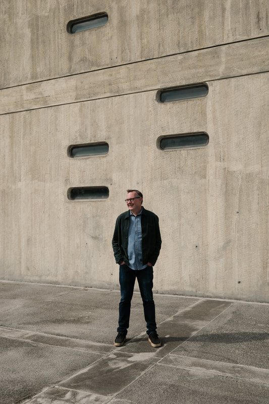
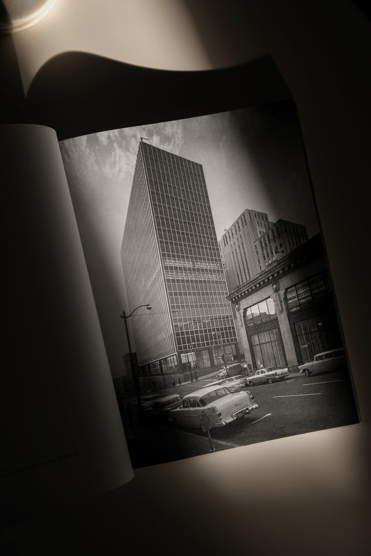
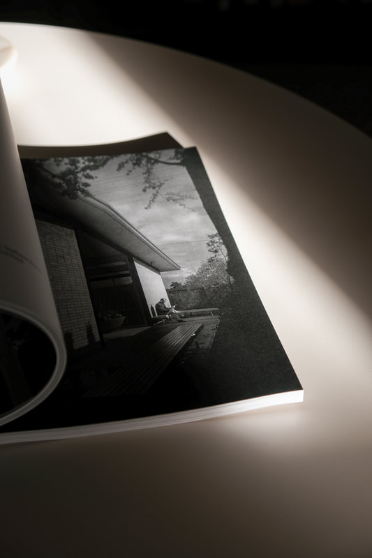
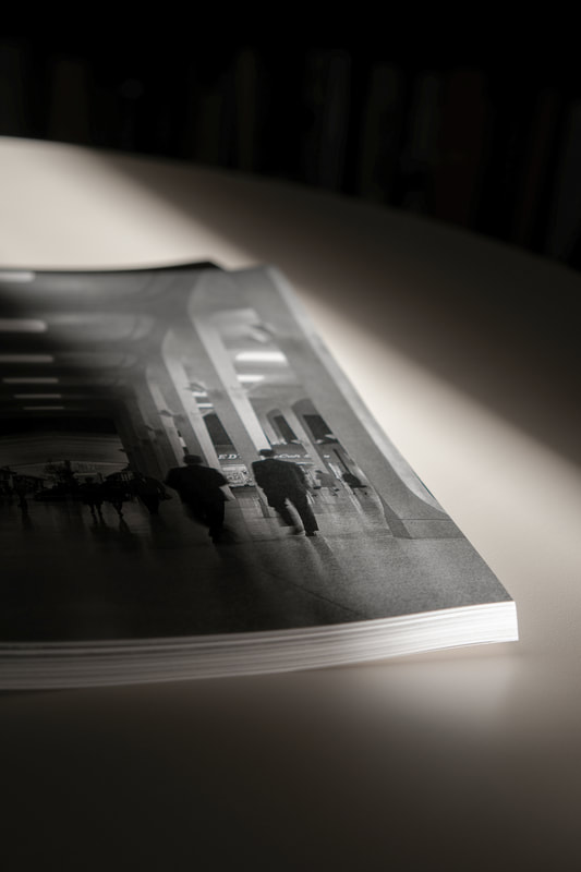
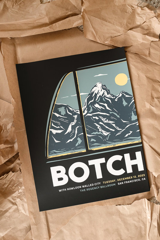
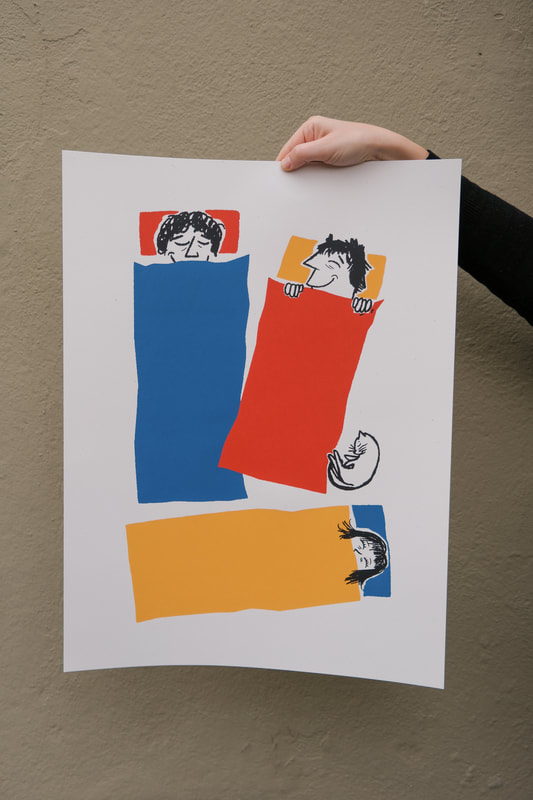
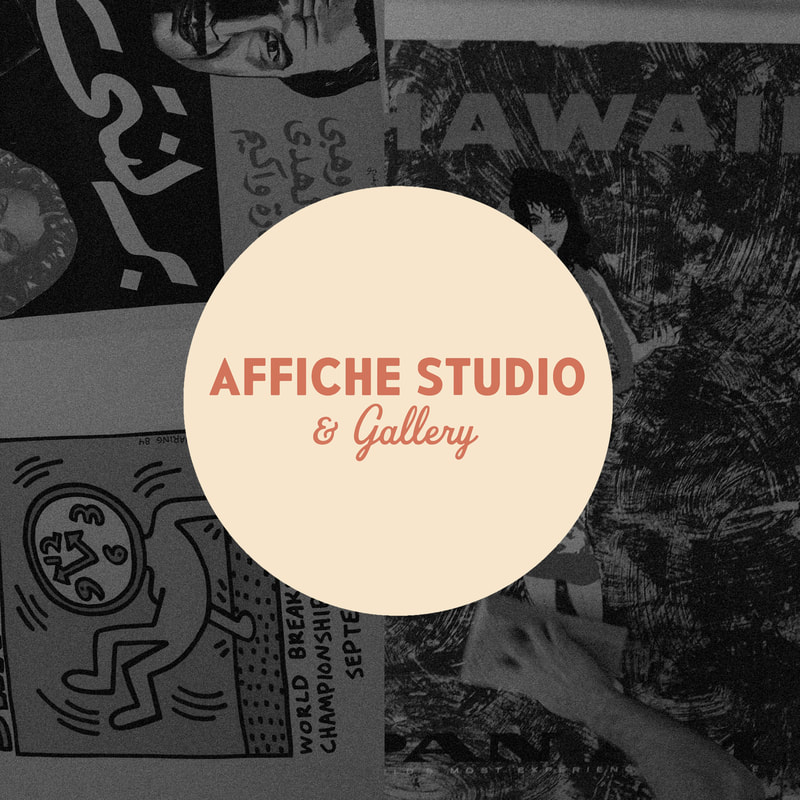
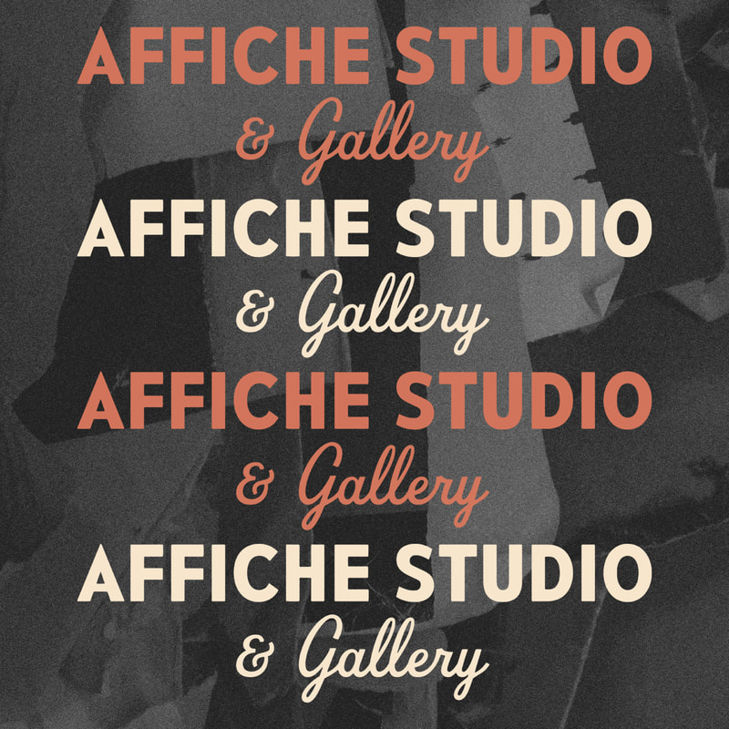
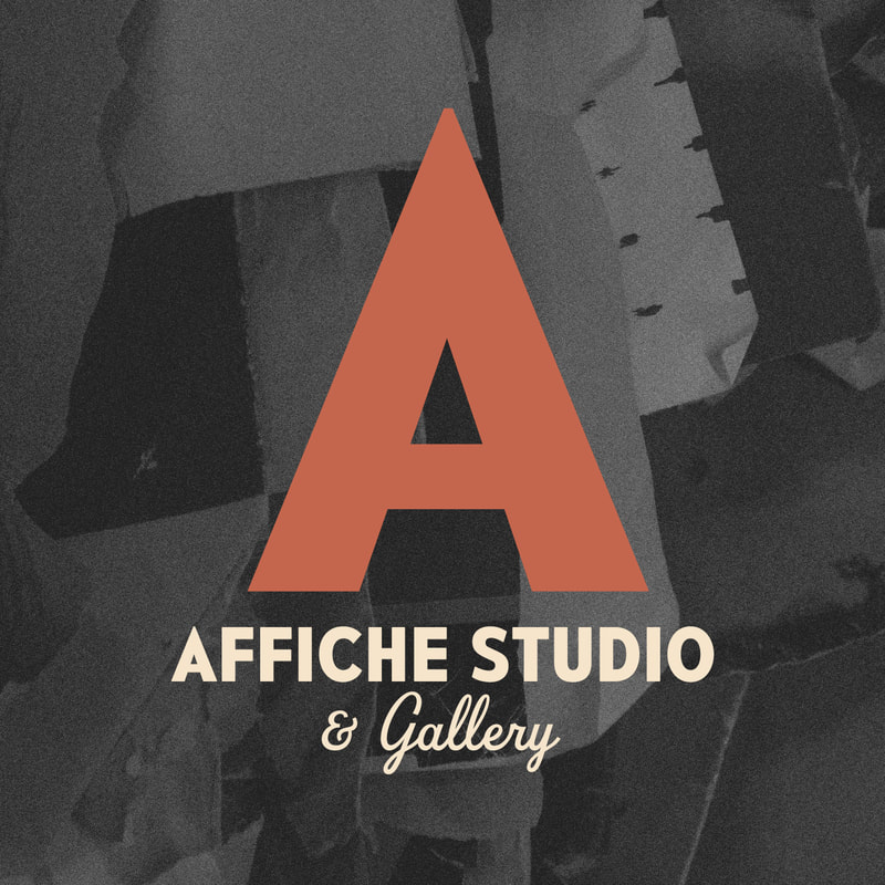
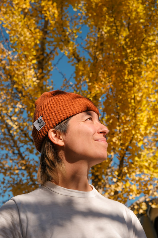
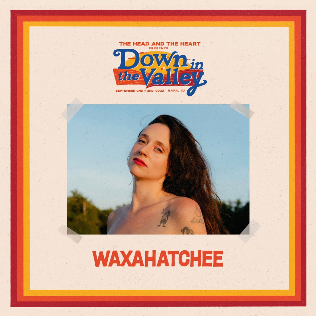
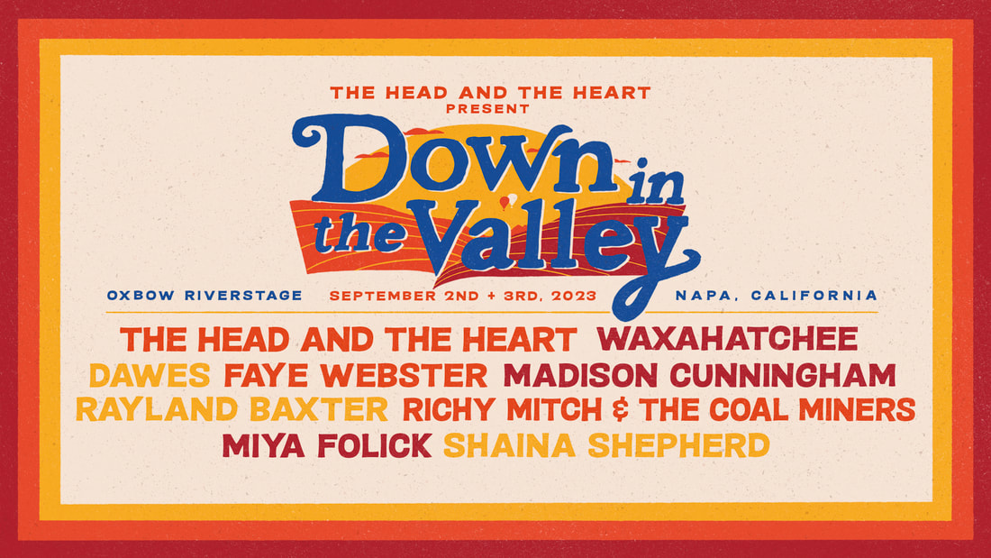
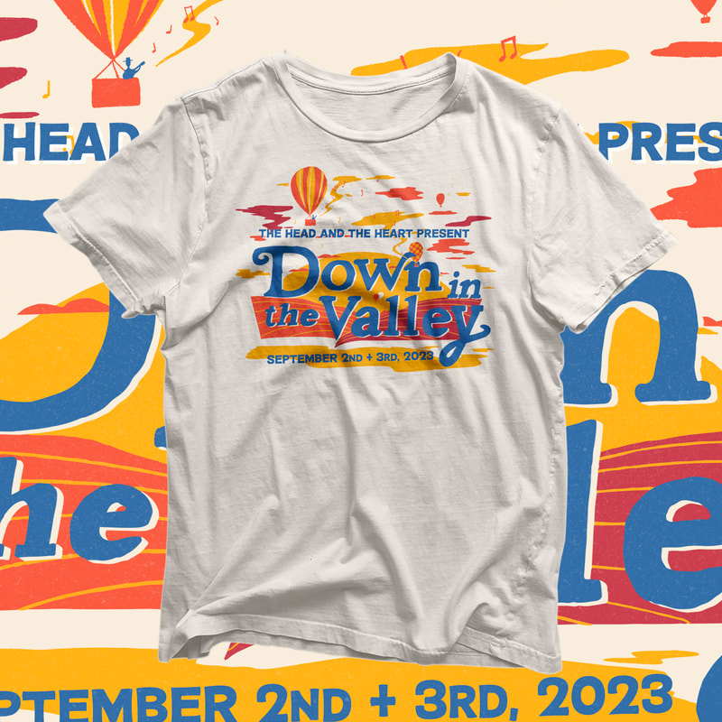
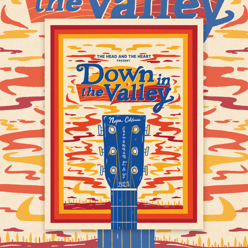
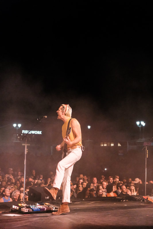
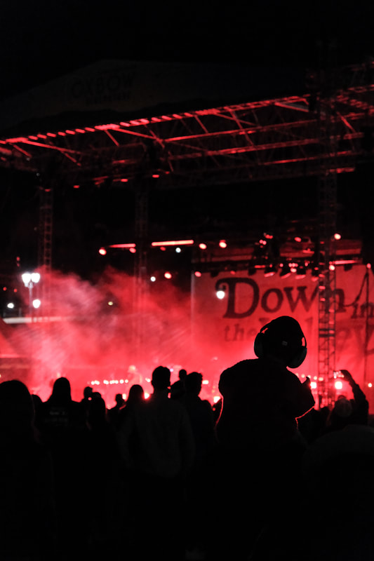
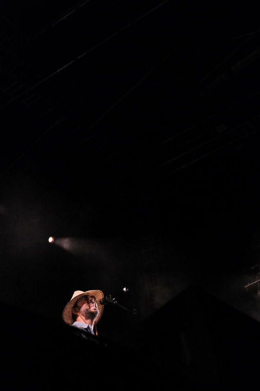
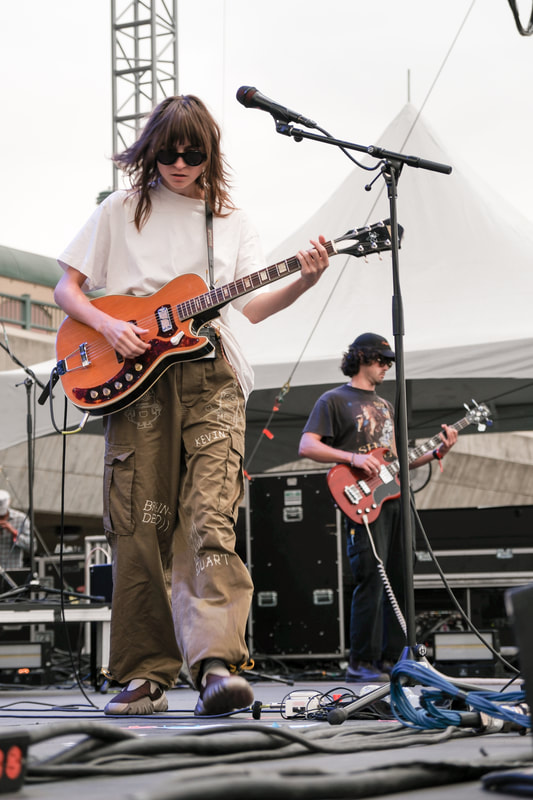
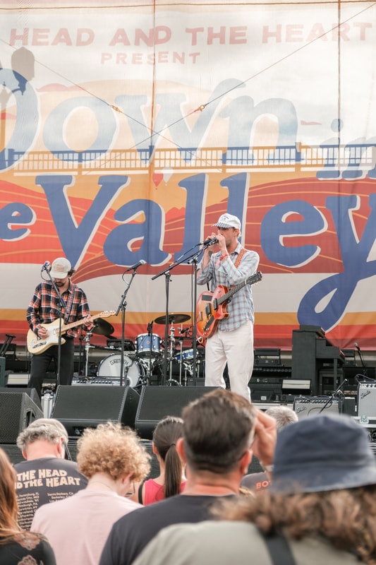
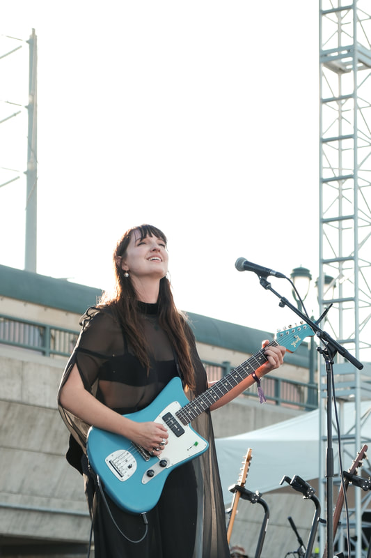
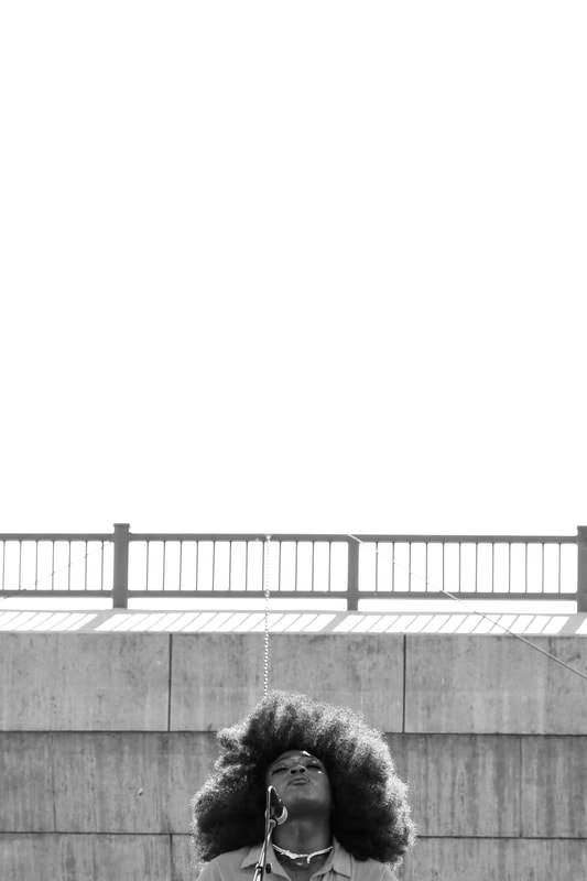
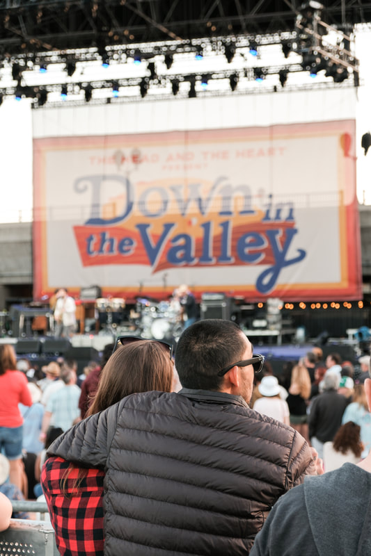
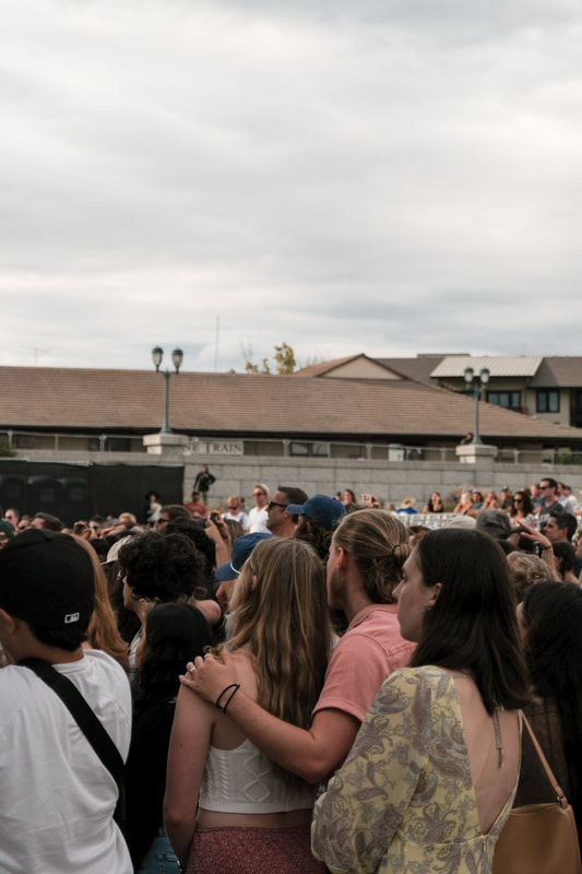
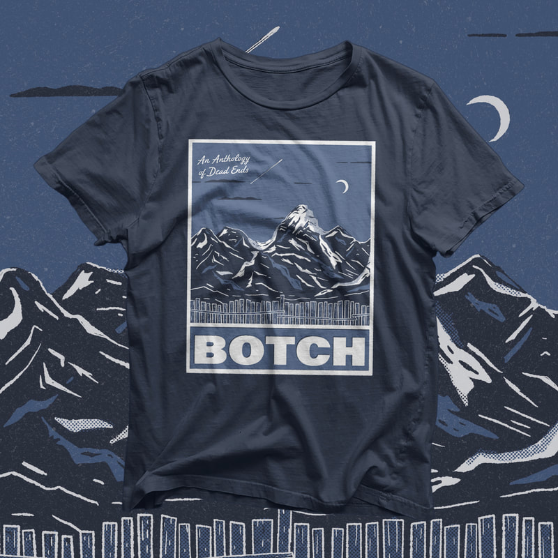
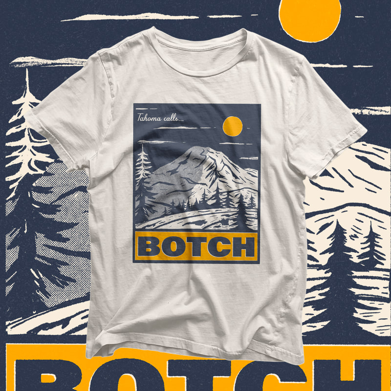
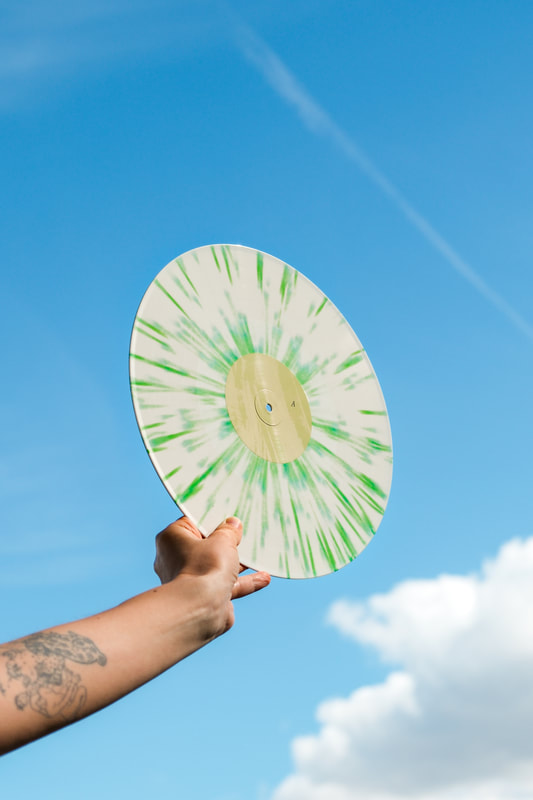
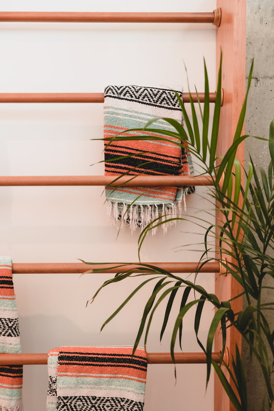
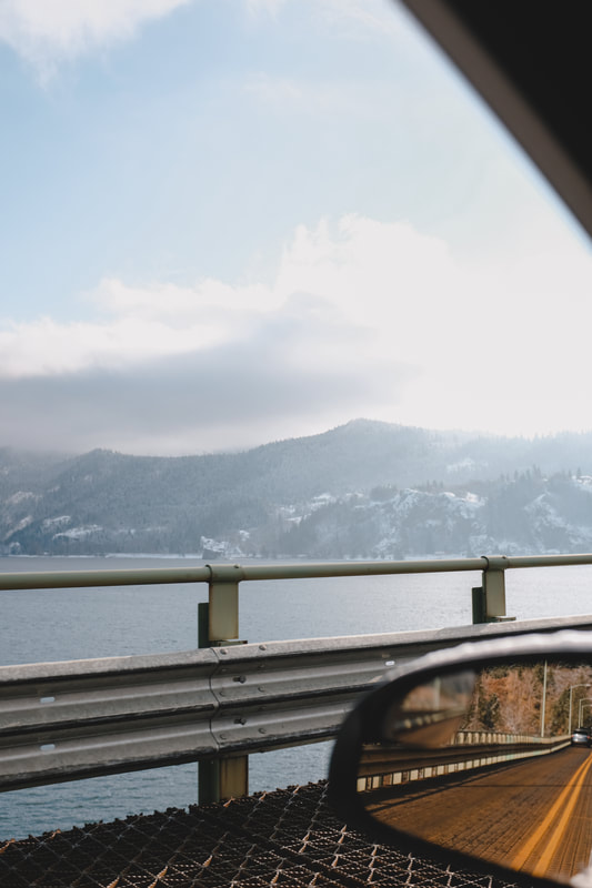
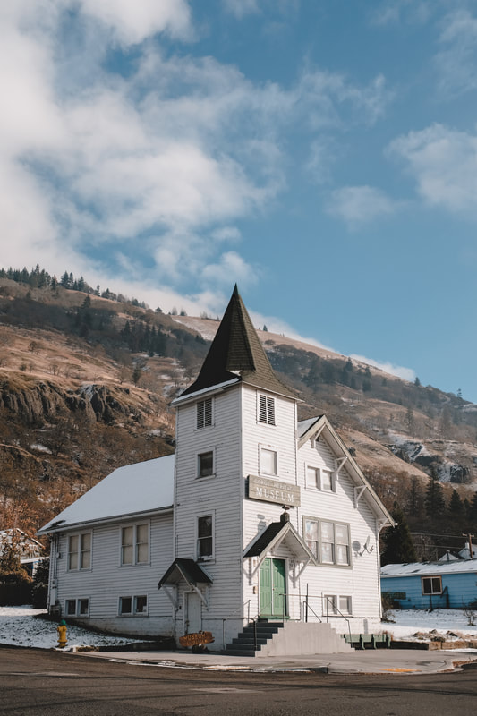
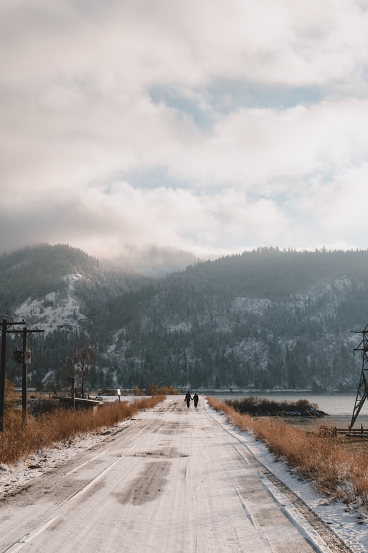
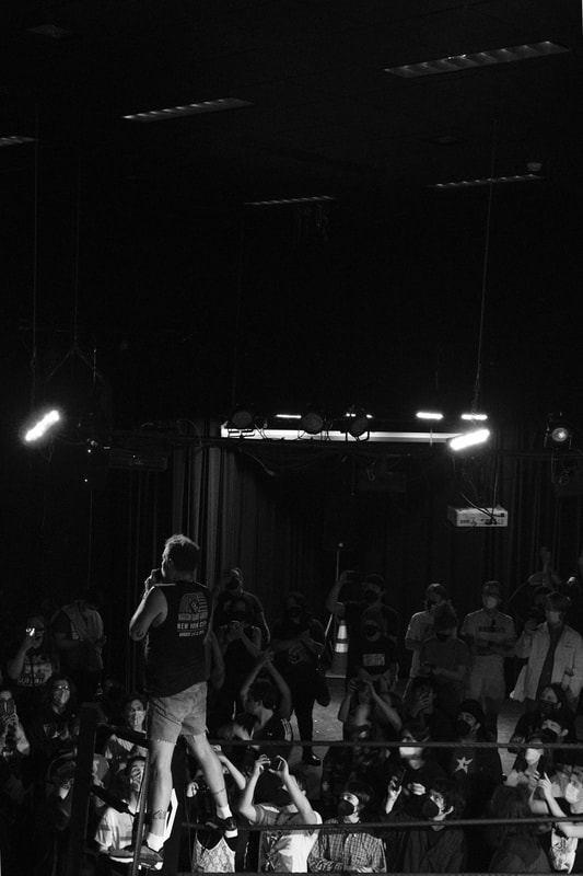
One of my favorite branding projects to date--Imaginary Friends. Dave Holloway is at the helm, but with many collaborators. IF helps other companies bring their ideas and products to life with messaging that makes sense to everyone. Having worked with Microsoft, Brooks Running, and countless others across tech, food and travel, you'll be in good hands with Imaginary Friends. Dave and I both share a love of mid-century design and this project was heavily influenced by the Eameses, Alexander Girard and various packaging from the 1950s and 1960s. I set out to create branding that was just the right amount of playful and colorful with a bit of seriousness mixed in. In addition to branding and helping design the IF website, I took some portraits of founder Dave Holloway for website, LinkedIn and marketing use.  I've been designing slipmats for years. Occasionally for clients, but mostly just for Porchlight. My slipmats have been sold in record shops in the Philippines, Texas, Toronto, Florida, Seattle and elsewhere. The last few years I haven't been designing many, but got the urge again. This Flower slipmat is a simple design, inspired by late 1960s/1970s dishware. It'll really spruce up your turntable too. Available at Porchlight Design Co.  I love collaborating with Good Luck Bread. I've not only branded the company, but designed all their packaging as well. Back in February, I updated their frozen cookie packaging. I can't recommend them enough! Order a few and keep 'em in your freezer, but they probably won't stay in their too long (they will clearly wind up in your belly ASAP). Get pizza and cookies over at Good Luck Bread. After years as a doctor at Swedish in Seattle, Dr. Matt Fradkin decided he wanted to open his own practice. Not only is he a medical professional that loves playing music and going to shows, he wanted to combine the fun stuff (light-hearted design, nods to great bands, cartoons) with the great stuff (more time with patients, same-day and next-day visits). In addition the branding (shared on the blog earlier), there is plenty more that's always ongoing. A short list of what I've designed for the practice so far: branding, headshots, band posters in which the puffin was swapped in as the star (Death Cab, The Clash, Descendents), waiting room posters with different styles of puffin (baseball, rockstar, and more), a ten-foot painted logo behind the reception desk, puffin feet painted as a marker for the eye chart, a coloring page for the waiting room and there is plenty more still coming to Puffin Pediatrics. If you've got kids and live in Seattle, Puffin Pediatrics is for you! 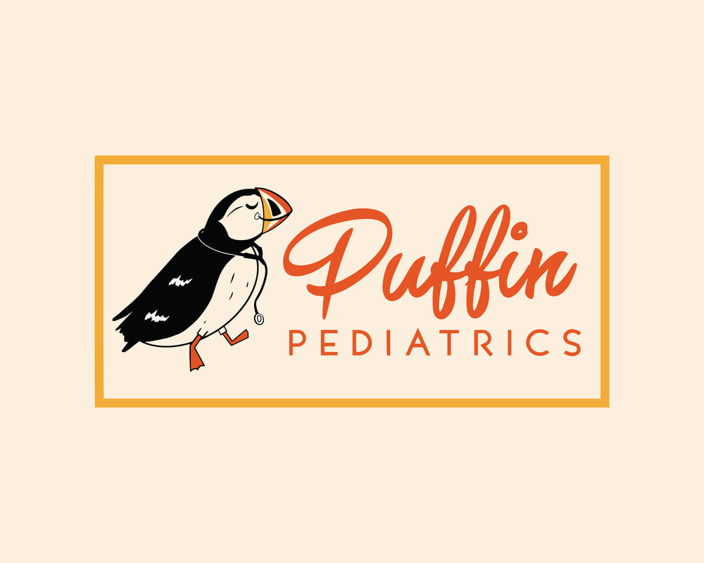 I've always loved old Pyrex and Fireking mugs I've come across in antique shops and occasionally at my grandmother's house growing up. I've always wanted to make some Porchlight mugs in that style, but couldn't find a way to manufacture them. Finally it happened! We've started offering this style of mug at Porchlight Supply where you can have them made for your own businesses as well. This design was the first offering in the style and very quickly sold out. But don't worry, there will be more designs coming soon!  This design is also featured on a tote bag available in person at Porchlight or online right here.  To finish off the recap, here are some of my favorite photos taken on Kodak Tri-X back in January. I've been falling behind a bit on the recaps, but it's better late than never. I'm very excited to share my branding for Puffin Pediatrics. The practice was started by Dr. Matt Fradkin with a fun and unique approach to kids' medical care. Focusing on giving more time to patients, same and next-day-visits and providing a fun space for kids, Puffin Pediatrics is an absolute gem. See photos of the space right here. I love designing for Good Luck Bread Pizza almost as much as I love eating Good Luck Bread Pizza. This entirely custom packaging was very fun to design. If you haven't tried it yet, just know that it truly lives up to its name! 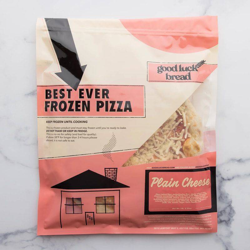 Another big project that was released at the end of the year was my book on mid-century photographer Art Hupy. As an architectural photographer, Art Hupy not only documented the rise of mid-century modernism in the Pacific Northwest but unintentionally and beautifully captured the growth of the region as a whole. This new book is the first to display a curated collection from Art Hupy's vast career. Until now, the majority of his work has only been seen in newspapers and other editorial publications—most of which are long out of print. As a tireless freelancer, Hupy never considered his editorial photography as art—he considered it his work. But luckily for us, he took great pride in doing great work. This book required hours upon hours of digital retouching to make sure Hupy's photos were up to par how he himself would have expected. I took care of the entire book design, layout and research. Eugenia Woo of Historic Seattle generously wrote a foreword as well. The first printing of this book was an 8" x 10" softcover with silver foil lettering on the cover, and 162 black and white pages. As a special bonus for those purchasing the first edition, I recorded a short instrumental song that was pressed on a postcard record that plays on a turntable. The first printing is down to its last few copies. Look for the second printing coming soon. 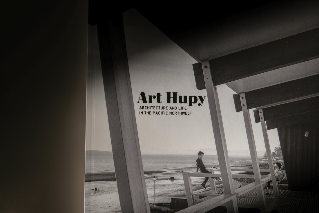 I designed a few different prints during November and December, including a show poster for the very heavy, very good Botch and their show in New York. A turntable slipmat is a great way to spruce up your record set up. I designed this shaky coffee hand just for that purpose. Get one here. 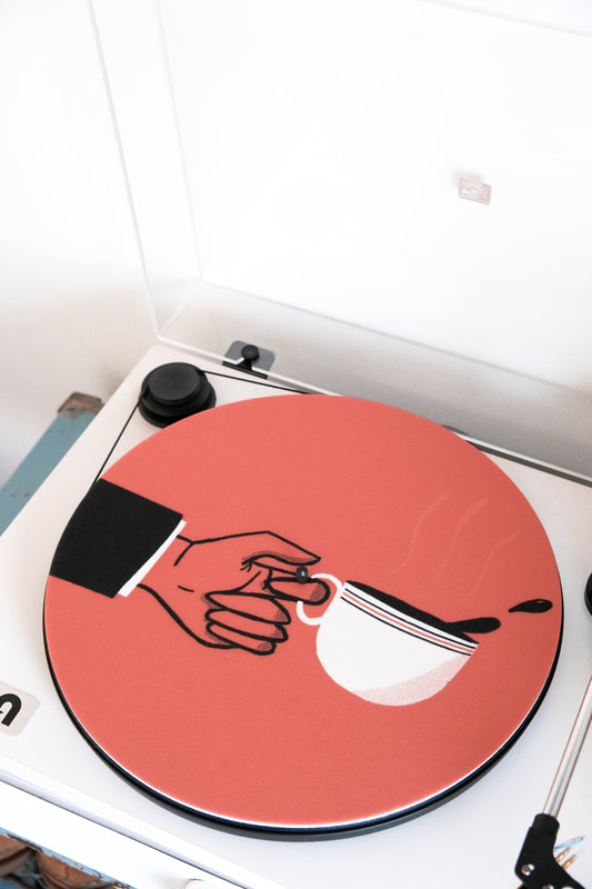 Affiche Studio & Gallery does wonderful work restoring posters in Portland. I created some updated branding for 'em to spruce things up. See photos of the restoration process here as well. 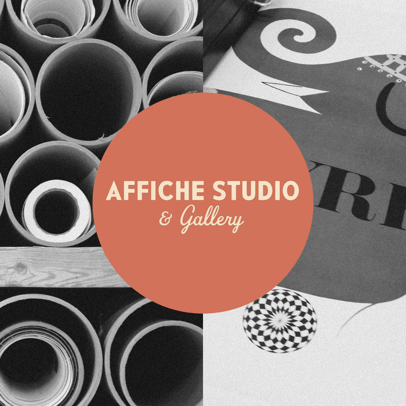 To finish things off, my favorite photos from the end of the year! It was a busy summer...and a busy fall.... A big one throughout the year was branding Down in the Valley, a brand new two-day festival hosted by the Head and the Heart. I provided the branding, digital marketing materials and some photography at the festival. The main requests for the branding were that the lettering evoked their classic lettering used on the band's first album and singles and that it focused on the beauty of the Napa region where the festival was held. In addition, I designed a souvenir poster and shirt for the fest as well. 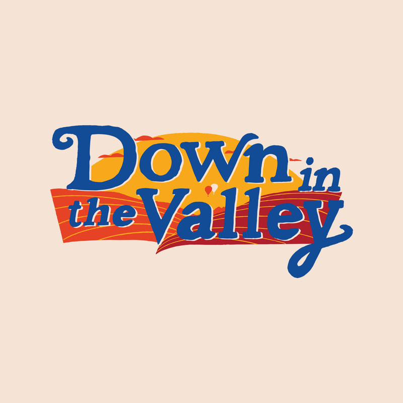 My approach to festival photos was to capture the mood of the weekend, photos from backstage and more traditional photos of the acts as well. Here are a few of my favorites: Next, a t-shirt design for Washington Brewshed Alliance, an conservation organization that partners with breweries across the state. It was a fun one, showing the outdoors and a very cheery cheers. 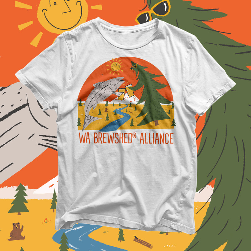 Growing up as a Seattle Mariners fan, I feel super lucky to have gotten the opportunity to create a goofy design for a Mariners/ Death Cab For Cutie collaboration. Using the likeness of Mariners utility player Jose "Cabby" Caballero and Death Cab's "We Have the Facts" cover art, "Death Cabby For Cutie" was born. The shirts were part of a fundraiser on Jose Caballero's actual birthday and all shirts were quickly snagged and sold out. 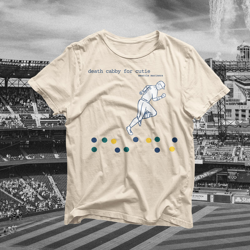 In a region surrounded by water, with a decent amount of extra water added through rainfall, Seattle is always finding new ways to keep residents safe from flooding—especially in South Seattle. This poster was designed to celebrate the opening of the new South Park Pump Station and bring awareness to flood preparation. 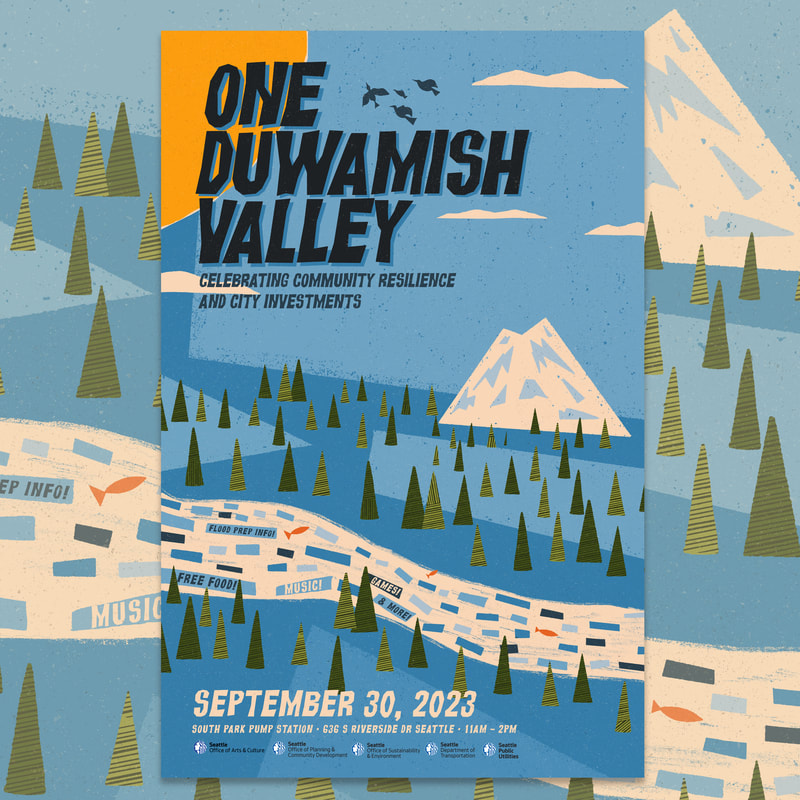 Having grown up in King County, I was closely familiar with hardcore/metal/mathcore locals Botch. Once I started listening to more than just pop punk bands, Botch had seeped into my playlists via a couple close friends. I later became familiar with the offshoots of Botch: Russian Circles, Minus the Bear and These Arms Are Snakes and when bassist Brian asked me to design a couple shirts, I jumped on the idea. Knowing my style of design isn't exactly in line with most hardcore and metal bands, Brian reassured me that I was the man for the job—creating some vintage national park-inspired designs.
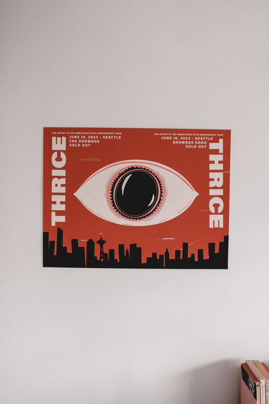
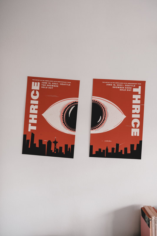
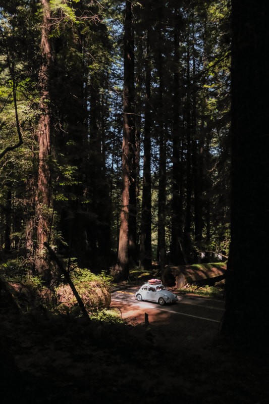
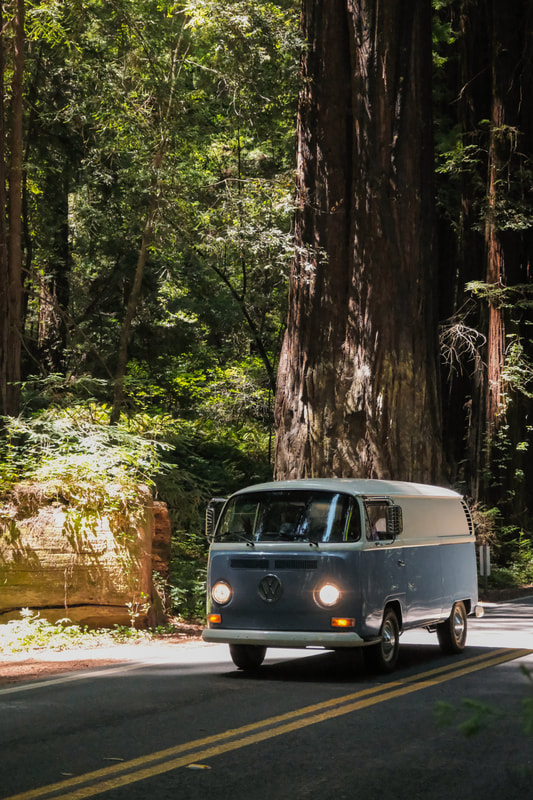
One of the biggest tours of the year was clearly the Death Cab For Cutie / Postal Service co-headlining run of shows. Each show on the tour had its own screen printed show poster that was available in a standard edition as well as a limited-edition foil version. Posters sold out QUICKLY. I designed two posters for the tour, both of which combined Death Cab's "Transatlanticism" album art and The Postal Service's iconic "Give Up" art. Below is the Minneapolis design and in the next recap I'll show you the Phoenix design. 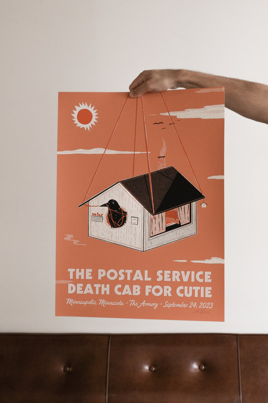 This poster I designed was inspired by a recent drive through the Redwoods where we encountered dozens of Volkswagen enthusiasts parading under the tall trees. I decided to focus on one single VW bus driving just out of the frame. Both shows were sold out before the poster was even designed! 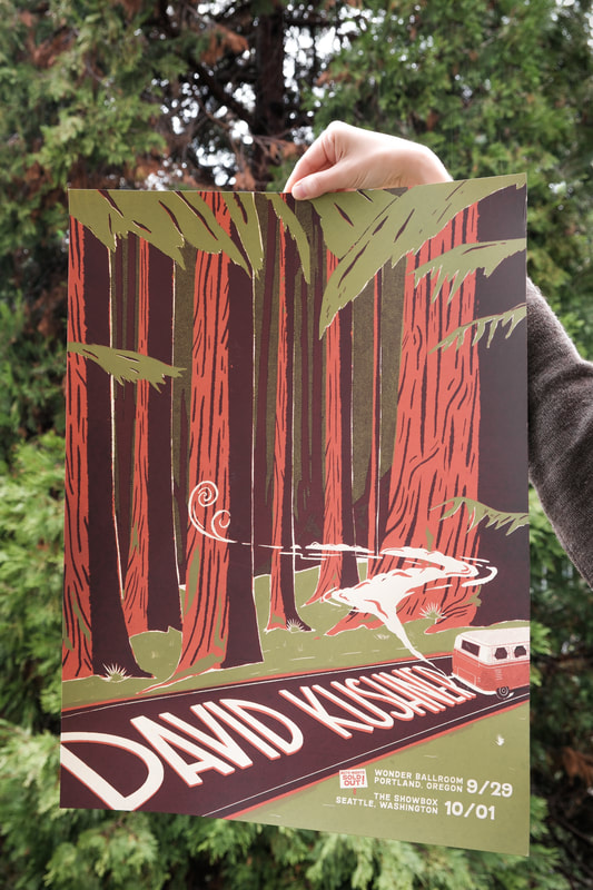 Lastly, some of my favorite photos, taken in the early fall. Here's a little recap of the Spring/Summer crossover period. First, a design I created for The Dip. They wanted a fun Space Needle-focused design for their Miir travel mugs that integrated their song title "Slow Sipper" and this is what I came up with for 'em. 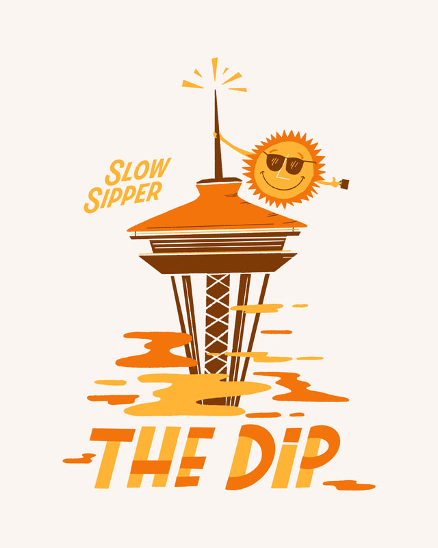 Next, a poster for the band Babe Corner, as they toured on their album "Cry Baby". I integrated the lavender colors of their tour poster along with some tissues as a play on their album. 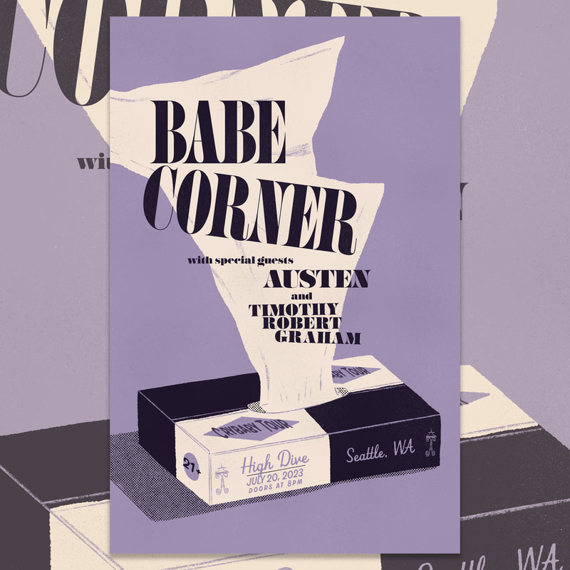 I was asked to create a diptych style poster for Thrice's shows at the Showbox here in Seattle. I wanted to come up with a design that looked good and made sense on its own while looking even better with it's other half.
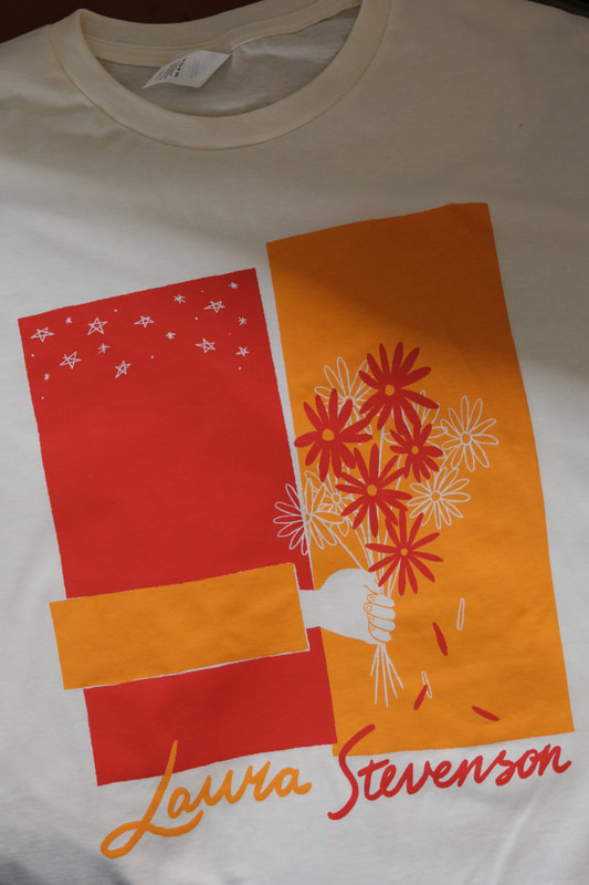
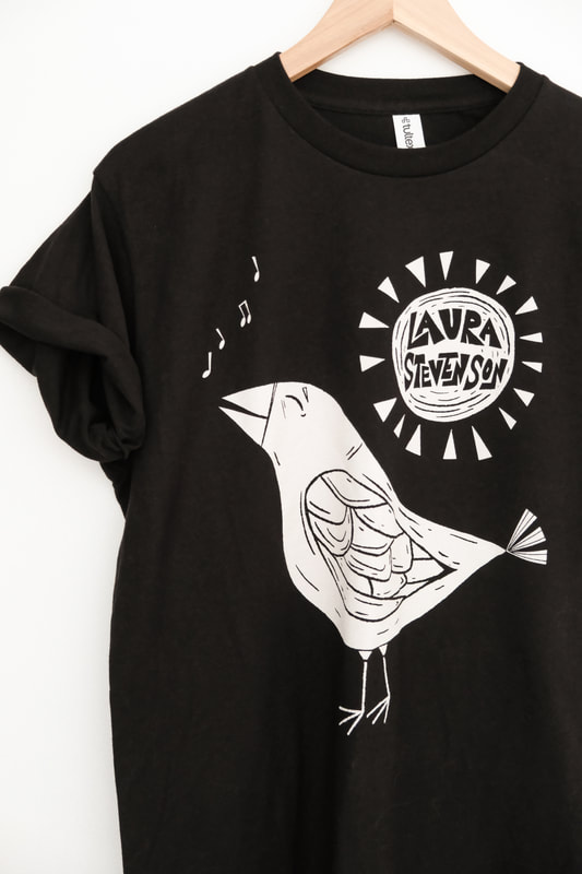
I was asked by Good and Well Supply Co. to create a series of candle labels that would be named the "Destination" series, paying homage to different cities in the style of mid-century travel posters. See 'em and grab 'em here. 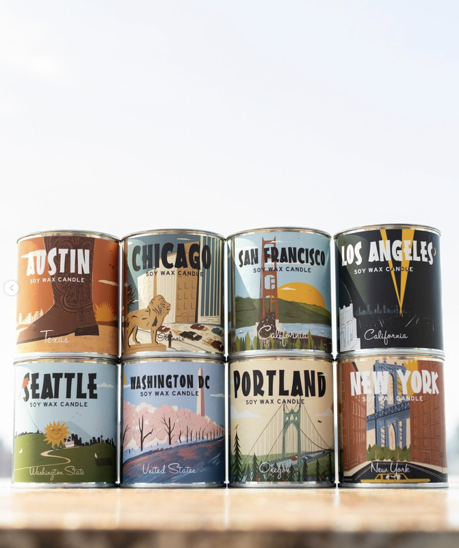 I don't consider myself a videographer, but I do occasionally make videos. I filmed and edited this video for Tomo Nakayama and his new song "Contigo". Take a look! It's no secret that I love working with The Head and the Heart. I've created a lot of merch designs for the band and this summer I designed their Fall tour poster. 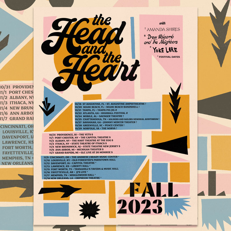 These two months brought on a lot of photos! A couple road trips and then some. See even more at the Porchlight Photo Journal. This spring I designed the festival poster for the Bothell Block Party and Brew Fest, a small festival hosted by the University of Washington to showcase bands and breweries. The poster needed to convey the fun and blooming of the small town as well as springtime flowers, while incorporated UW school colors. My design turned a sunny spring into a a hi-fi system, with the sun as a turntable, connecting through the flowers to the speaker system. 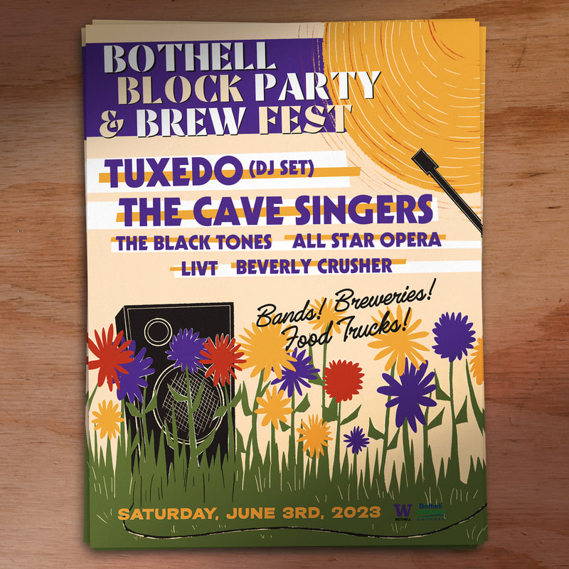 I met Laura Stevenson over a decade ago when we played a house show together here in Seattle with Jeff Rosenstock's Bomb The Music Industry. Ever since I first heard Laura, I've been blown away by her songwriting, voice and musicianship. She's truly one of the most talented musicians I've ever known. When she asked me to design some new merch for her, I gladly agreed. Here are the results.
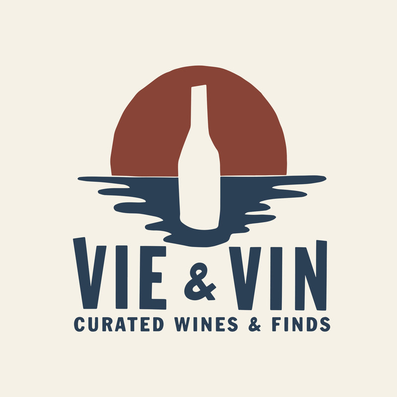
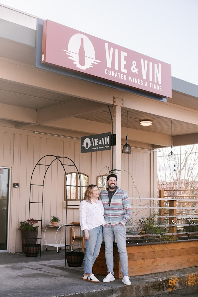
Vie & Vin is a new wine shop located in Edmonds, Washington. The couple that opened the shop also came up with the concept of the main logo, but wanted some help bringing it to life with some charming wonkiness. I helped them do that and also created some alternatives to accompany the main logo.
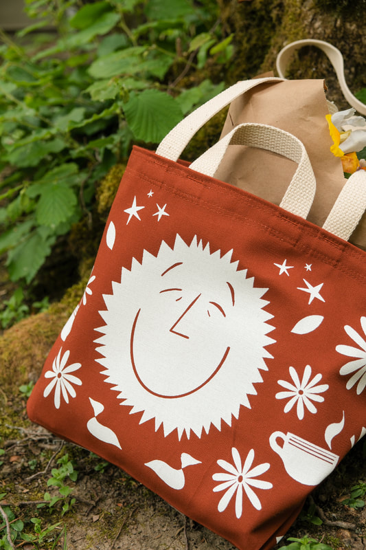
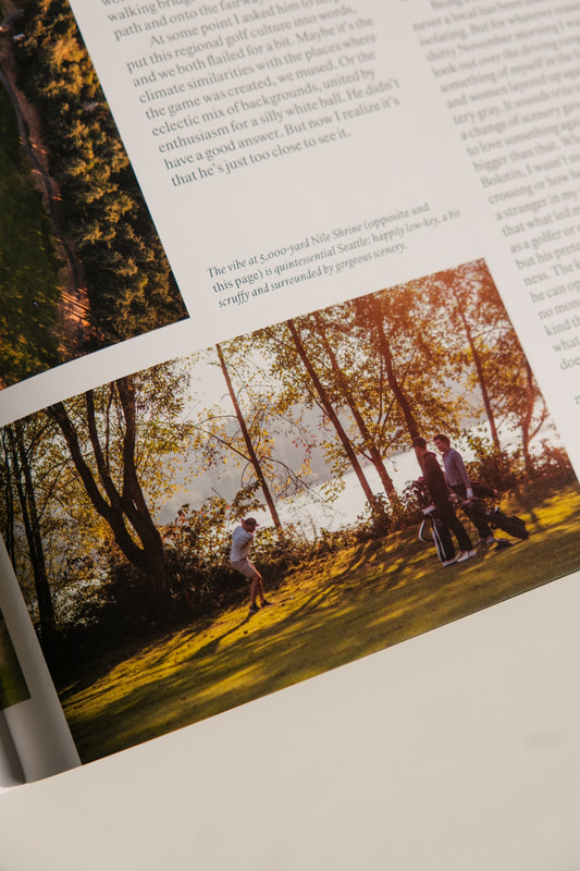
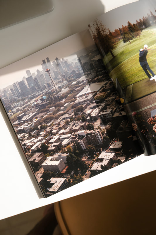
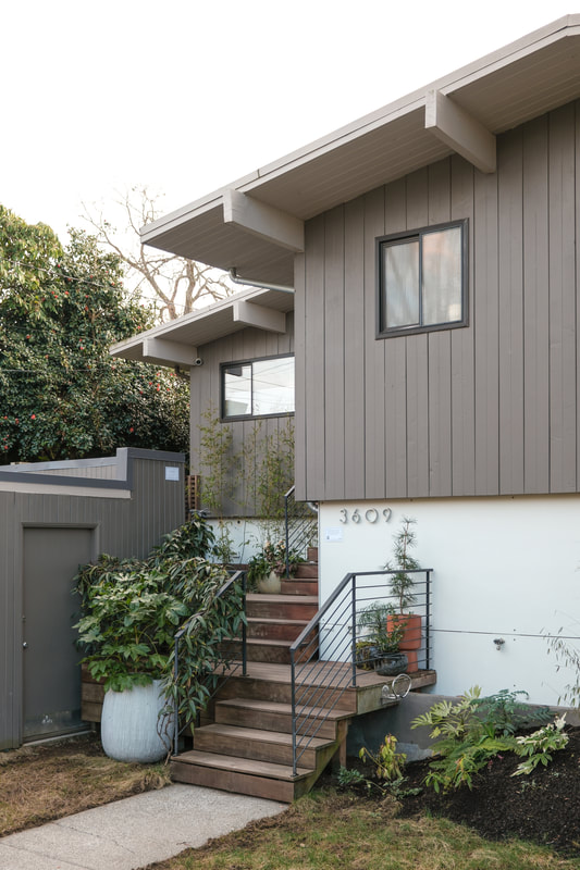
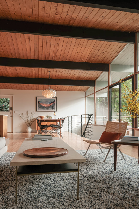
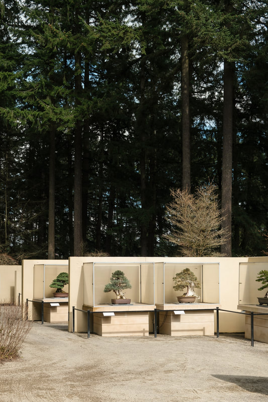
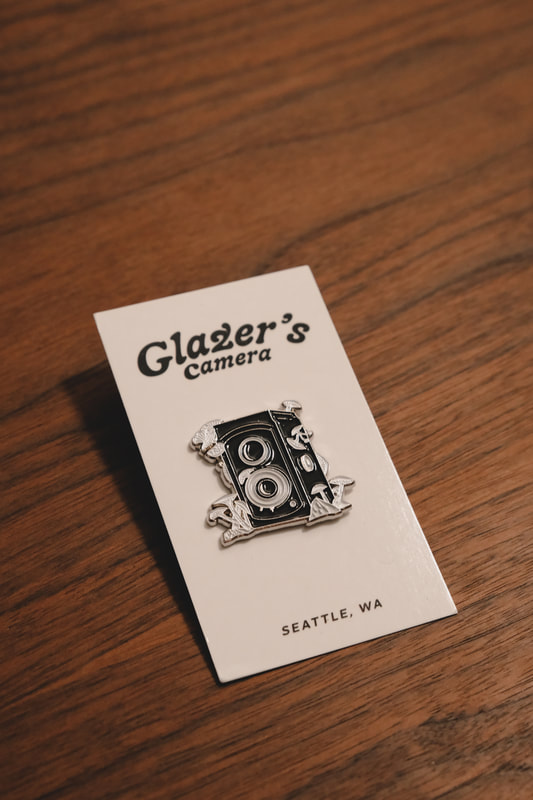
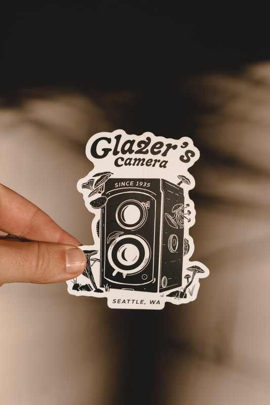
 On the anniversary of the eruption of Mount Saint Helens, Pacific Northwesterners Joseph played the Showbox. The venue asked me to create an eruption-based design for the show. This is a three-color screen print, printed here in Seattle by Broken Press. 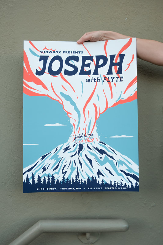 It's rare to be able to produce a fully custom, made-in-Seattle tote bag...but it happened thanks to Moop. The Seattle-based bag makers made this short run of Happy Sun Handmade Totes that I designed and you can find them at Porchlight Design Co. Printed on a burnt orange rust with off white ink, it looks even better in person. 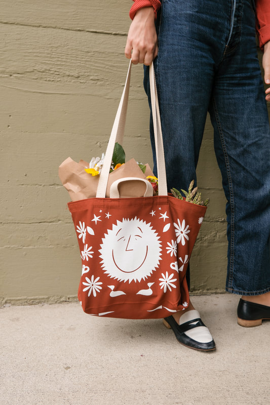 Located in Eastern Washington, Spokane Pavilion is hosting the likes of The Head and the Heart, Billy Idol, Incubus and more this summer. I branded the Falls Club, the VIP area of the venue and created signage as well. 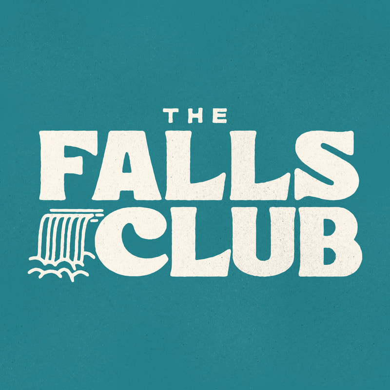 It's no secret that I love neon signs. My favorite being the Elephant Car Wash in Seattle, created in the 1950s. In true mid-century form, I made some small 5oz juice glasses with a "Seattle" version of the neon sign. Grab a set of two right here. 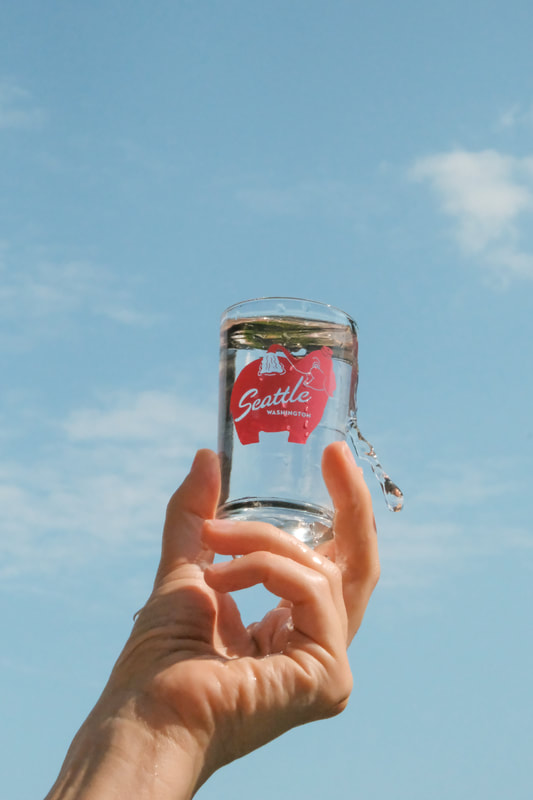 As a big fan of sports and all petty games, I also occasionally play bad golf. A while back, Golfer's Journal, got in touch with me to talk about the city of Seattle, casual golf and coffee. The Journal is an incredibly handsome magazine, with great photography and writing. It's miles above other sports magazines and it was a real treat to be featured. Here are a few photos. 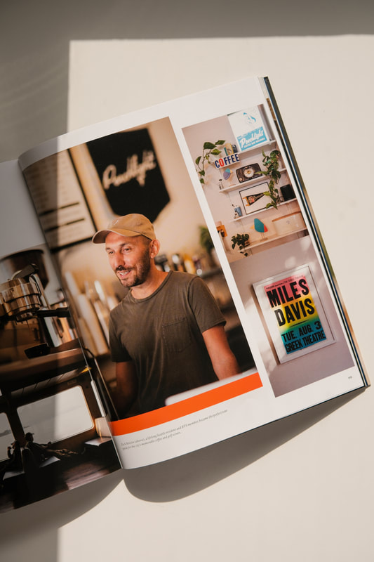 And here are a few of my favorite photos from April and May! A little rundown from February in March includes some show posters, some bumper stickers and some photos! First up, a Death Cab For Cutie poster, for their shows down in Little Rock and New Orleans. Hope you like pencils. This three-color screen print is available in limited remaining quantities at PorchlightDesignCo.com 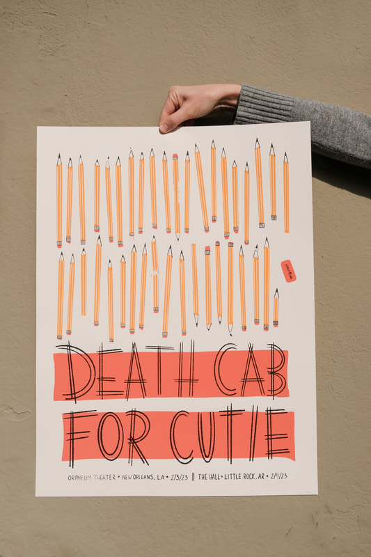 I was recently asked to take some photos of a beautiful 1957 mid-century home in the Laurelhurst neighborhood to help promote a new real estate listing. The home's original architect was Robert McDaniel and the recent interiors were done by Emily Foster Henry. Almost exactly a year ago, I provided branding for East West Machines. The company was started by the folks that run a great big growing apparel printing company called Night Owls. They not only screen print, but also provide direct-to-garment printing which requires a heat press. They decided to make their own heat presses as East West Machines. These cheeky bumper stickers were made to give away at a trade show. 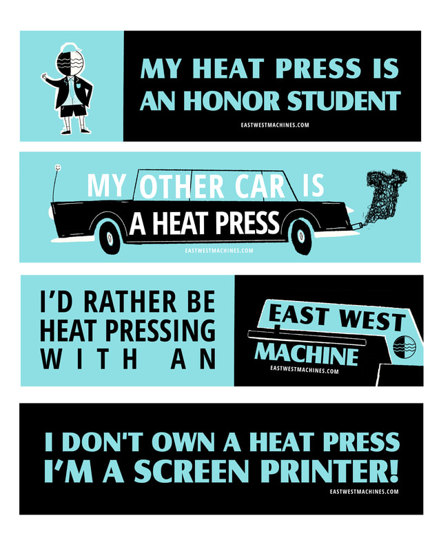 I love designing for the historic Fillmore in San Francisco. The venue has a rich history in show posters dating back to the 1960s. My design for ALO's sold out show was a fun one with rollerskating, monsters, astronauts, divers, rockets and the beach. 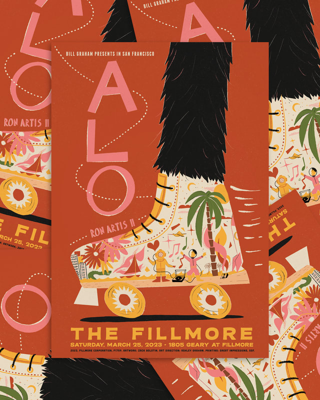 Because the original Smith Tower print had been sold out for a little while, I decided to do a short run of a different colorway. Find the Smith Tower print in blue at Porchlight Design Co. 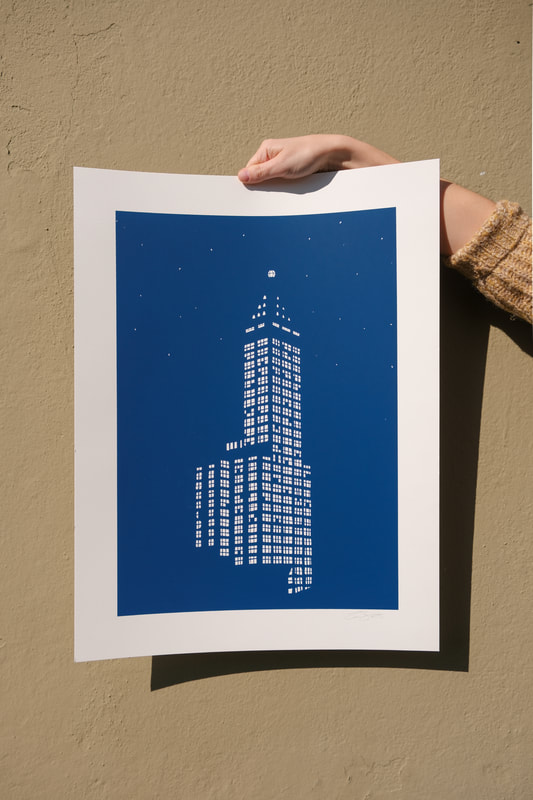 Keeping up with keeping Porchlight stocked with merch and designs in general is a big ol' task, but I managed to make some new shirts. The Porchlight Platter shirt is available online and in-store.  Tomo Nakayama and Bryan John Appleby headed out on tour together and I got to make 'em a poster. Beep beep. 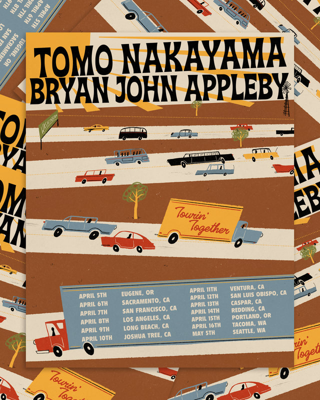 Last, but certainly not least: The Head and the Heart / Revivalists Tour posters! 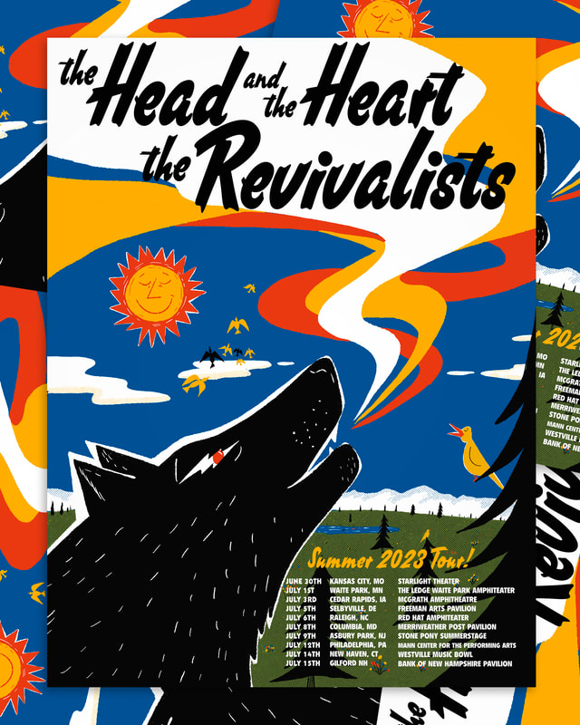 Lastly, some of my favorite photos that I took during February and March... In December I published my 7th volume of Mid Seattle. I started the annual as a way to thoughtfully display the still-standing mid-century architecture in Western Washington. Luckily, folks seem to enjoy it! Each volume is approximately 40 pages and is accompanied by a related enamel pin. This year's pin is a miniature Rainier Tower, which is seen inside the pages of Volume Seven. You can find it at Porchlight Design Co. 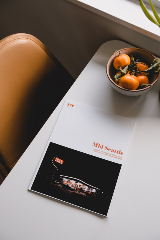 Next, I designed stickers and enamel pins for Glazer's Camera. I've been working with them for years now, periodically designing shirts, enamel pins and stickers. This design was modeled after a Rolleiflex camera as if it were overtaken by mushrooms. You can find both the pin and sticker at Glazer's Camera in Seattle.
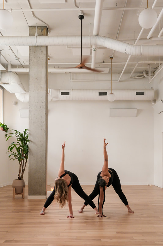
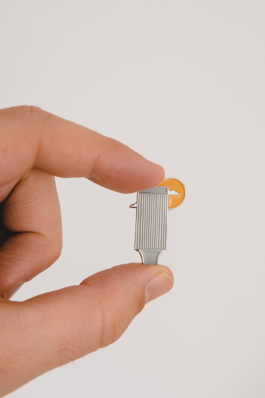
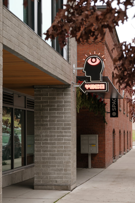
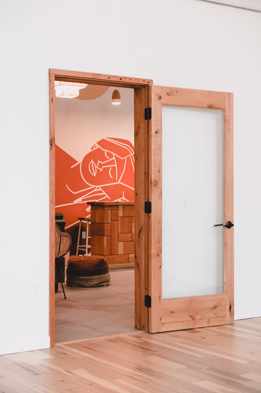
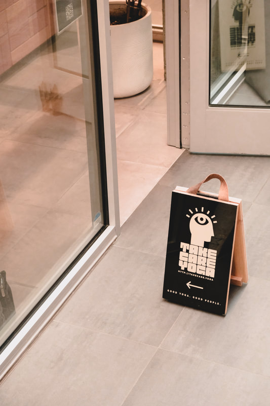
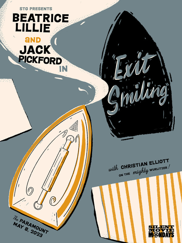
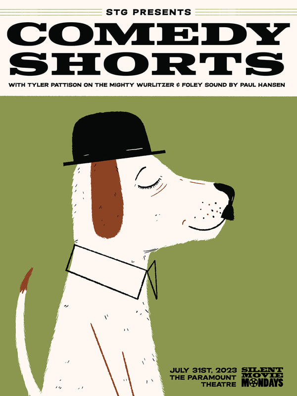
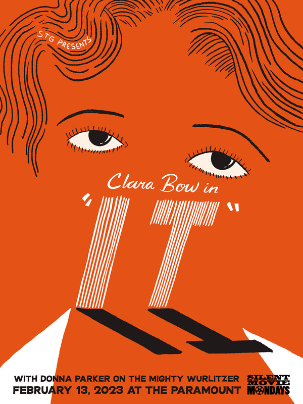
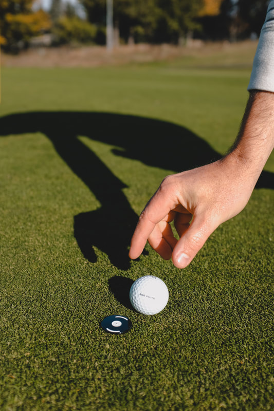
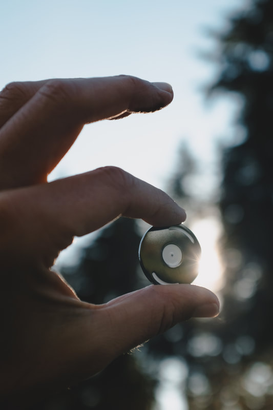
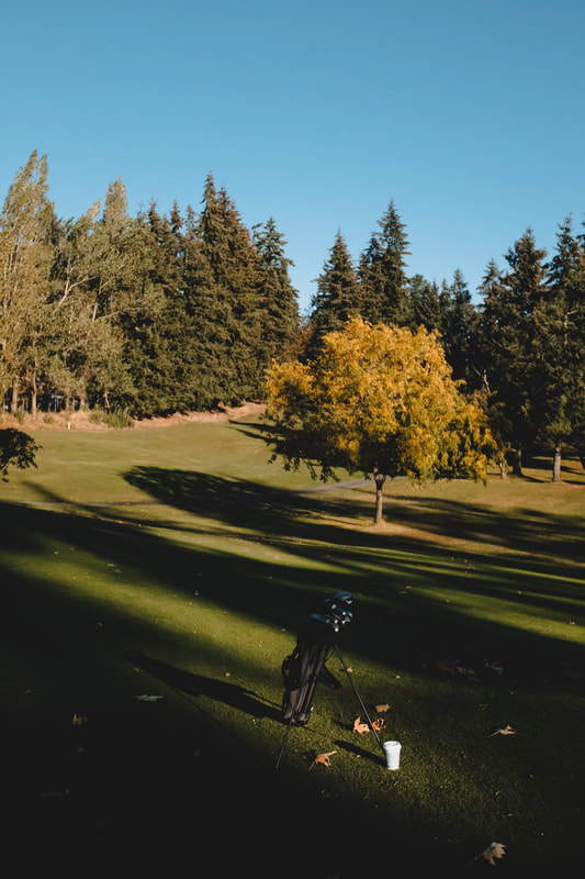
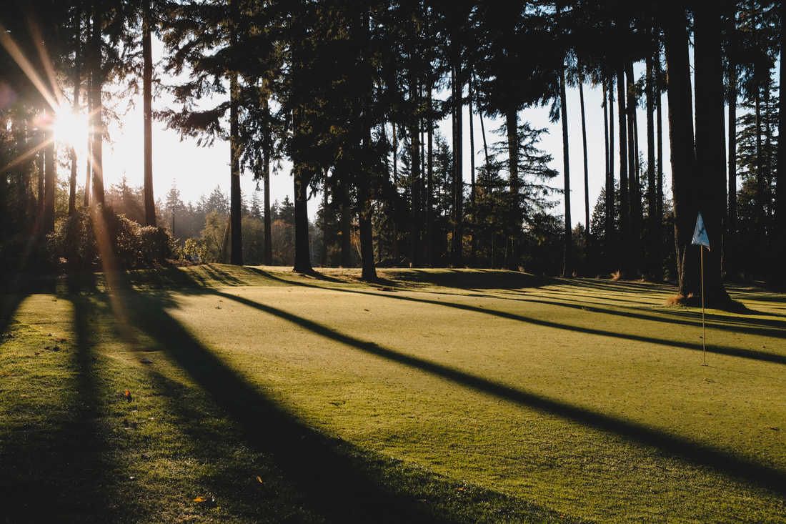
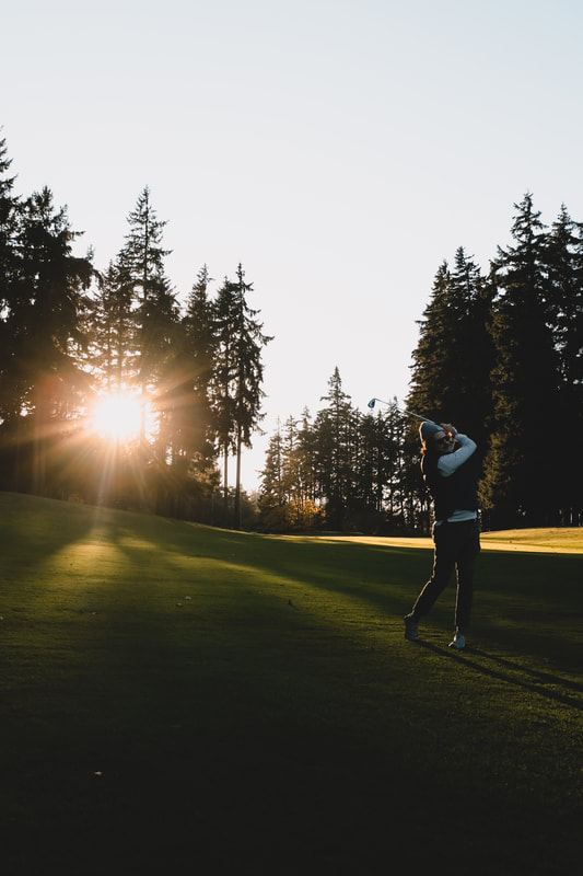
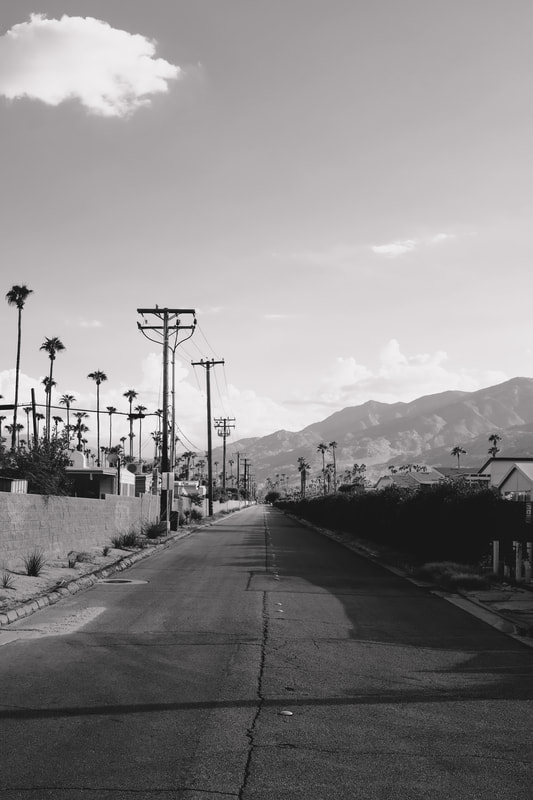
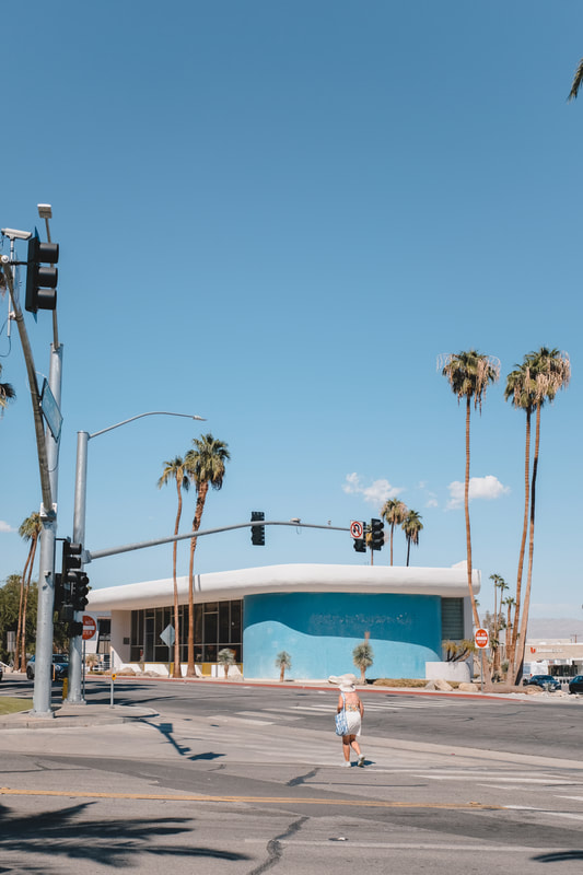
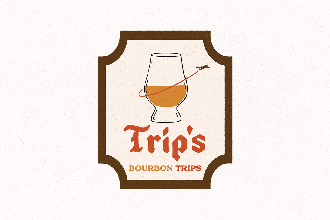
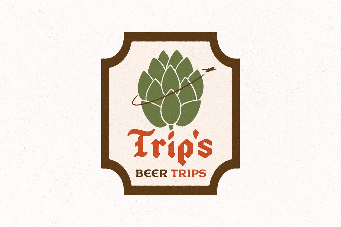
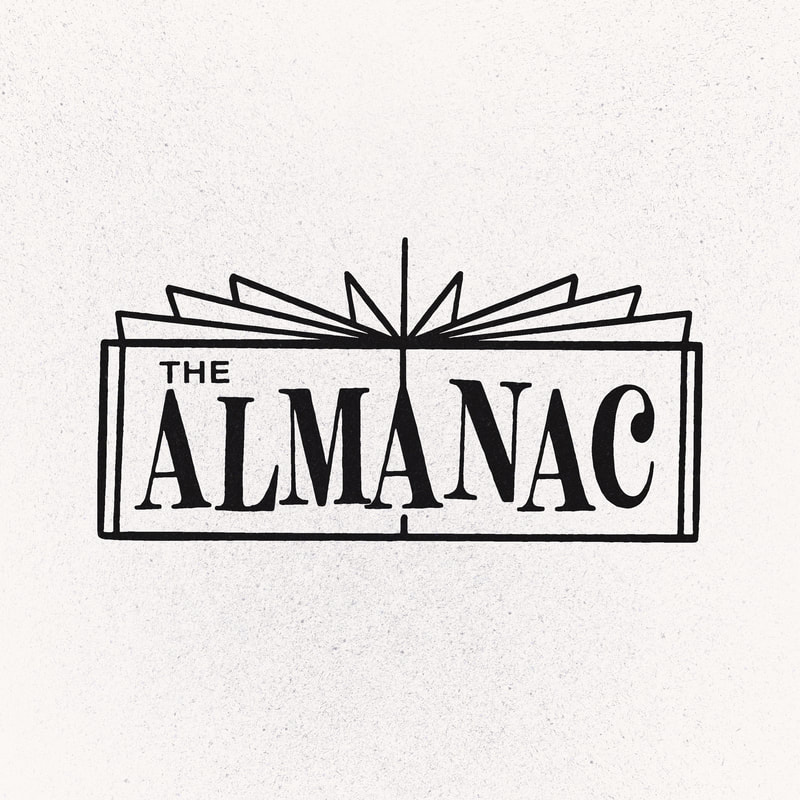
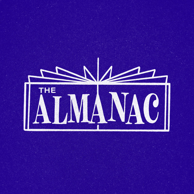
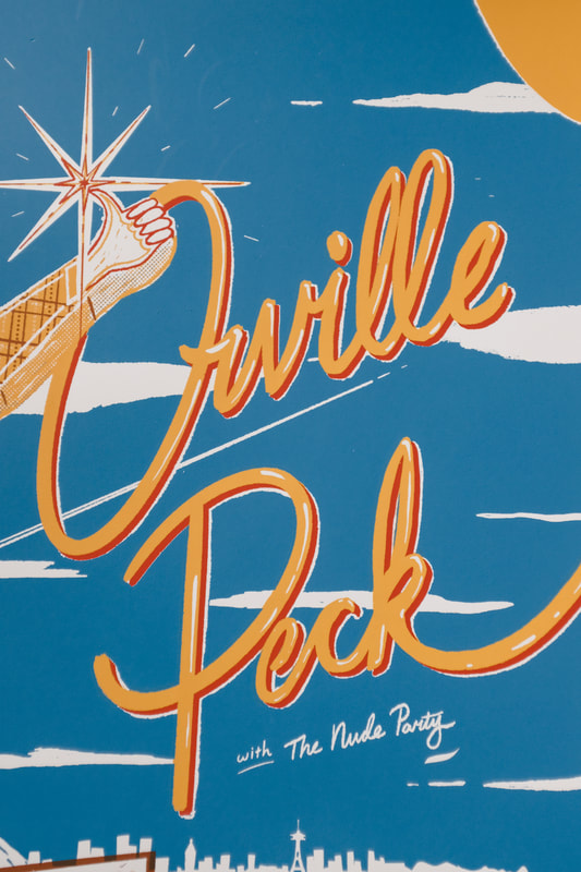
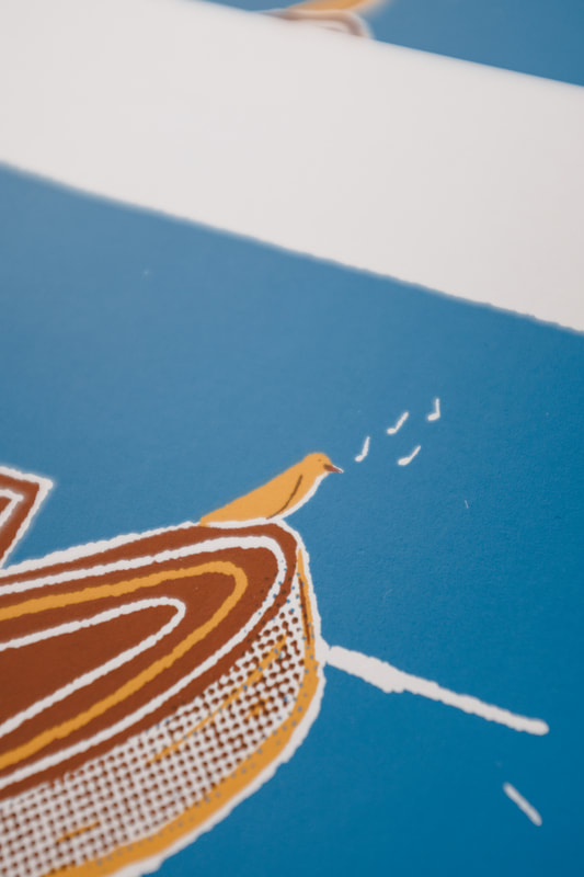
I made another visit to Take Care Yoga to provide some updated interior shots. Over the years, I've designed apparel and taken photos of the yoga studio, their teachers and students. The goal was to capture how inviting this community space is as a whole. Towards the end of 2022 I got to design for the famous film company Ilford. The goal was to make a fun illustration that would translate to shirts and stickers, while going a little outside of the brand's comfort zone. Using their slogan, I illustrated some type in the form of an unraveling film roll. 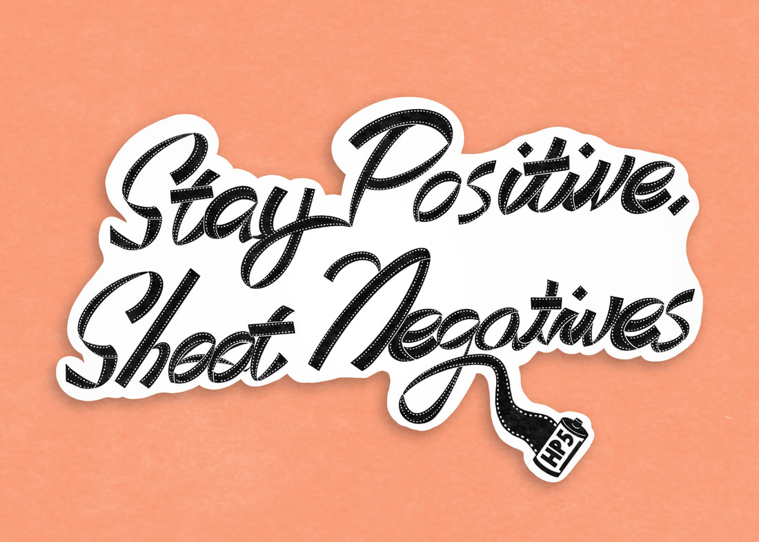 Sticking with the photography theme, here is a poster I designed recently called "35mm Film Parade". It's pretty self explanatory and very fun. Grab one at Porchlight Design Co. 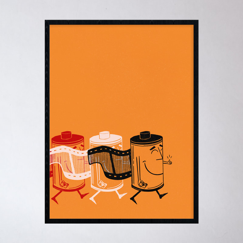 At the coffee shop, we recently sold out of all of our diner mugs. Keeping tabs on all the coffee shop ordering plus merchandise ordering can be a little overwhelming and some things slip through the cracks—but it's not really allowed with mugs (says me to myself). I luckily ordered these guys just in time though! Grab one in-store or online at Porchlight. 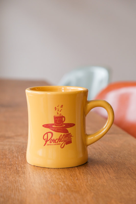 Lastly, here are some of my favorite photos from the cold months of January and February and a quick escape to Southern California. This fall brought some new designs and a rare week-long vacation for me to Southern France, where I visited family that I hadn't seen for over 25 years. See the photos at the very end of this post. I designed two posters for the Head and the Heart in Oct/Nov. The first is an 18 x 24 silkscreened print for the band and their fundraising show. The theme of the poster revolves around what makes Washington home. The second is a 16 x 20 traditional poster, designed for the band's in-store at Easy Street Records with a moody nighttime theme. 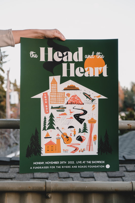 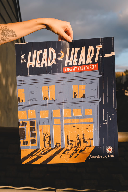 I also converted the "Home" design to a t-shirt for the band: 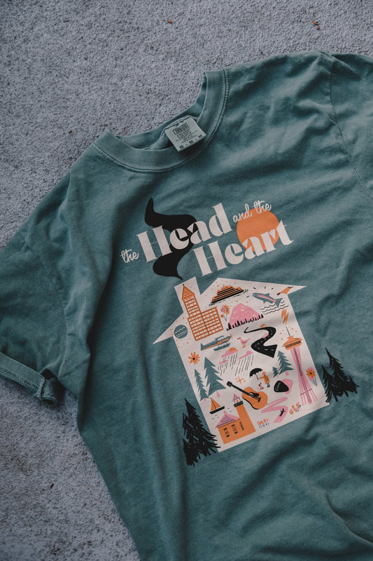 In November, I did a small run of these hats which are burnt orange cotton caps with a Happy Sun in off-white embroidered on the front. A few are still available in-store and at Porchlight Design Co. 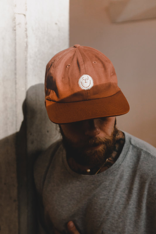 I was asked to design some posters for Seattle Theater Group's "Silent Movie Mondays", putting my spin on some early 1900's movie posters. It was a fun project and here's what came from it! Golf is many things—dumb is definitely one of them, but so is fun. I made some fun little golf ball markers to bring some music (kinda) to the course. Below, you can see the marker, the packaging and the promotional photos I took on the course at Nile up near Mountlake Terrace.They're available at Porchlight Design Co. 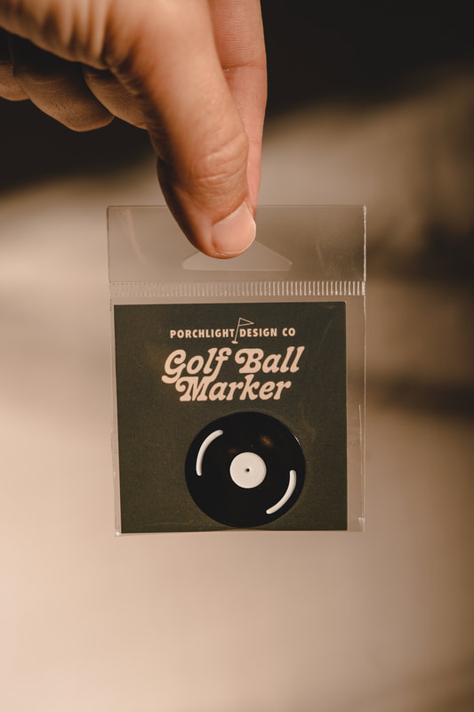 Lastly, some photos from the months. Some are from a quick Thanksgiving weekend to the Washington Coast, a couple from Palm Springs and others from Aix-en-Provence See the Photo Journal entry at Porchlight Design Co. for more from Southern France too. Finally catching up on a busy end-of-summer / early fall... Lots of posters: Death Cab For Cutie, Novo Amor, Lake Street Dive, Polyrhythmics, and more. Take a peek below. 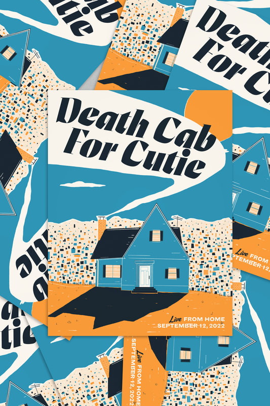 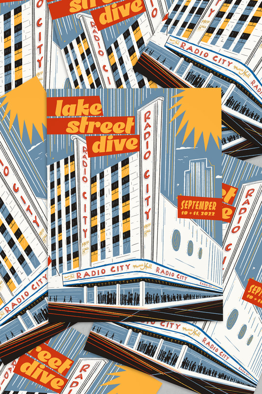 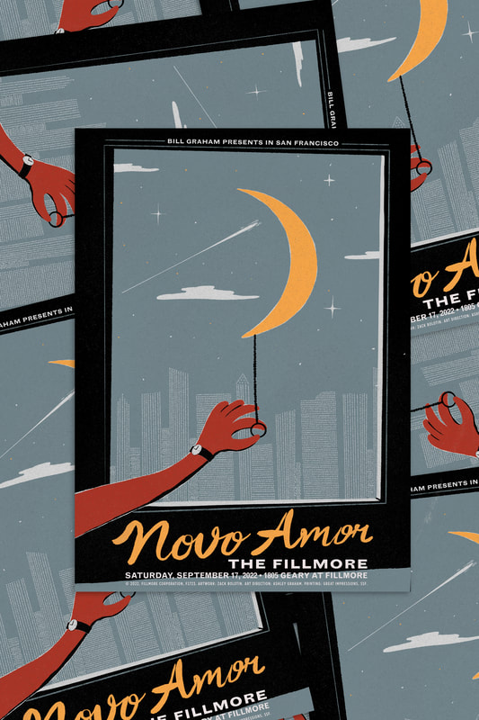 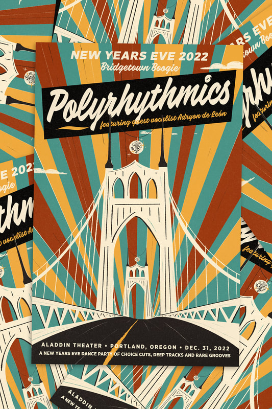  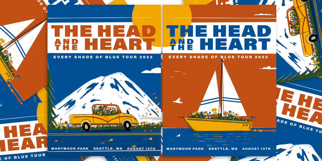 I "developed" a funny little fake film shop t-shirt that pays homage to my former Porchlight neighbor, 60 Minute Photo. They're now mostly sold out, but some sizes are still left at Porchlight Design Co. 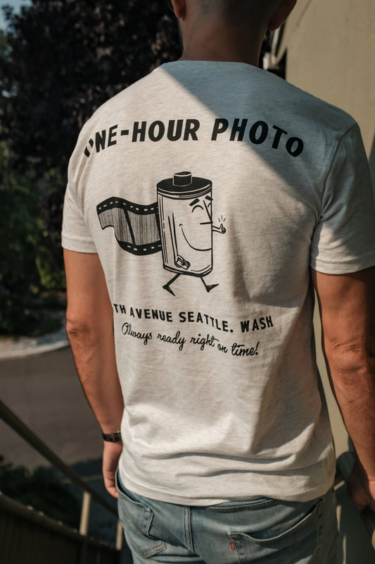 The other shirt I designed at the end of summer is that Happy Sun tee. It features a simple small print on the breast of a soft vintage style black tee. Some sizes are still available at Porchlight Design Co as well. 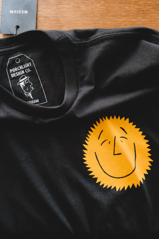 Lastly, I came up some branding for a small vintage-based business in Chicago, Casa Bazaar. 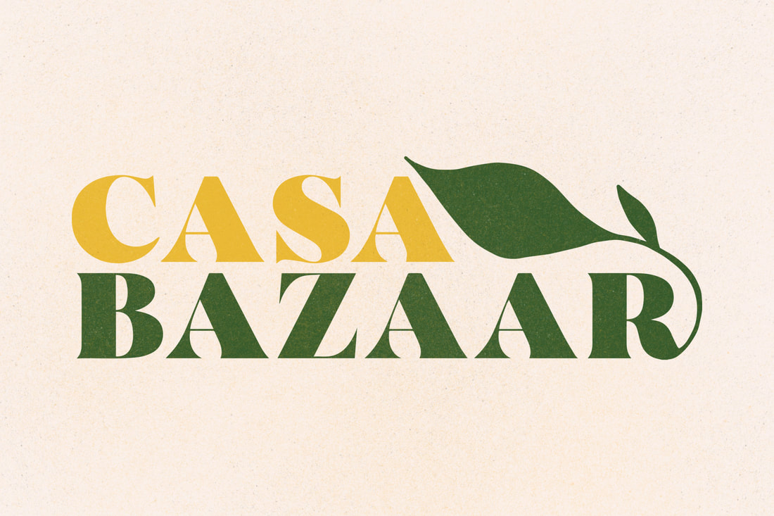 This summer was a busy one... First, two candle label designs for Good + Well Supply Co. These are the beginning of a series of city and neighborhood candles with labels influenced by vintage travel posters. The Ballard candle shows the Ballard Locks, while the Seattle candle has Gasworks Park on a sunny day. Find 'em in-store at Good + Well's retail shop in Ballard or online! 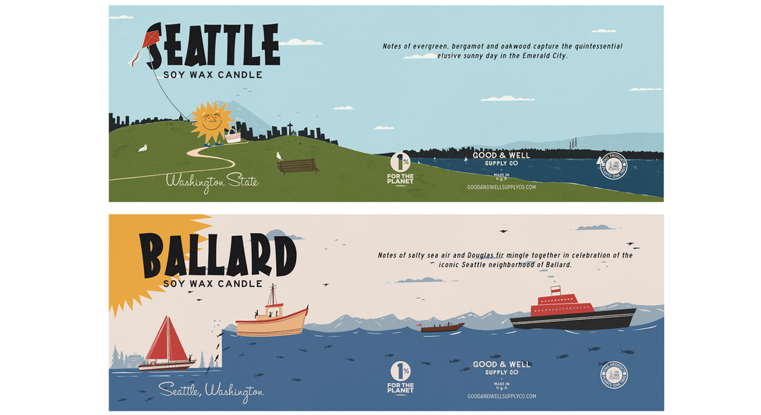 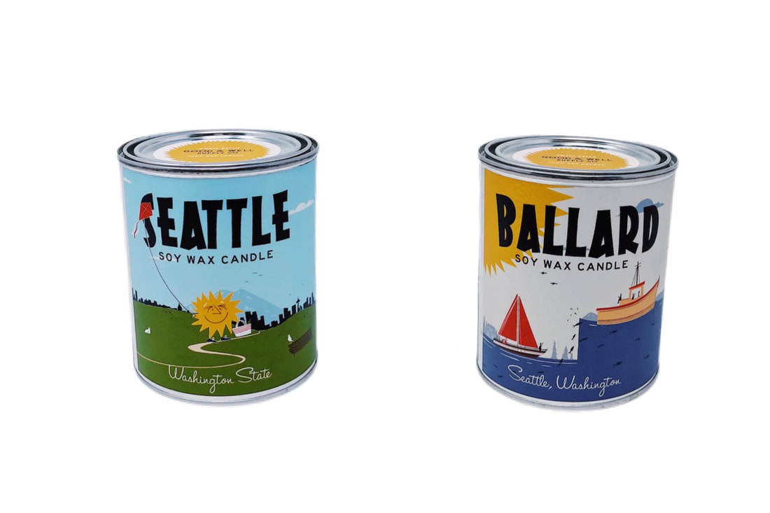 The summer also brought some fun branding projects. Trip Kloser, a beer industry veteran, started Trip's Beer Trips and Trip's Bourbon Trips to give folks a chance to go on fun and informational booze trips around the world. My boozy branding was meant to show influence from classic Bavaria and mid-century design while appealing to contemporaries of all ages. 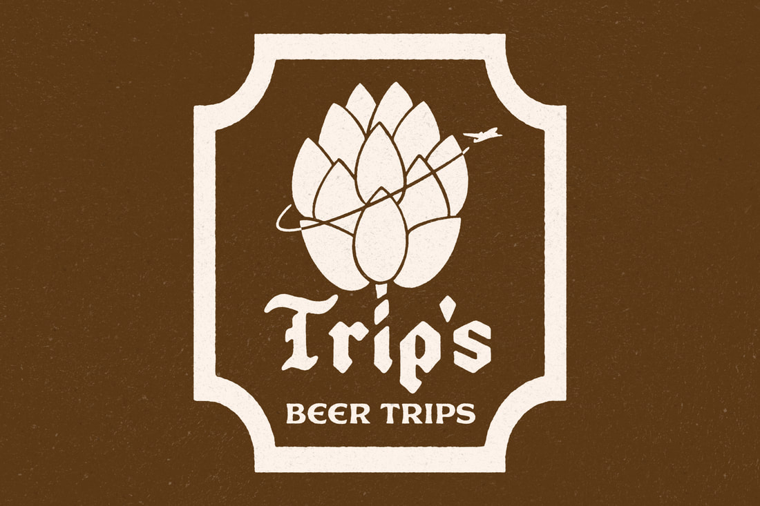 Next, some branding for The Almanac, a digital alt-weekly with no ads or gimmicks, launched by Alma in Tacoma! Taking a cue from classic one-color logos, this was intended to evoke art-deco radio towers and airwaves along with the flipping of book pages. 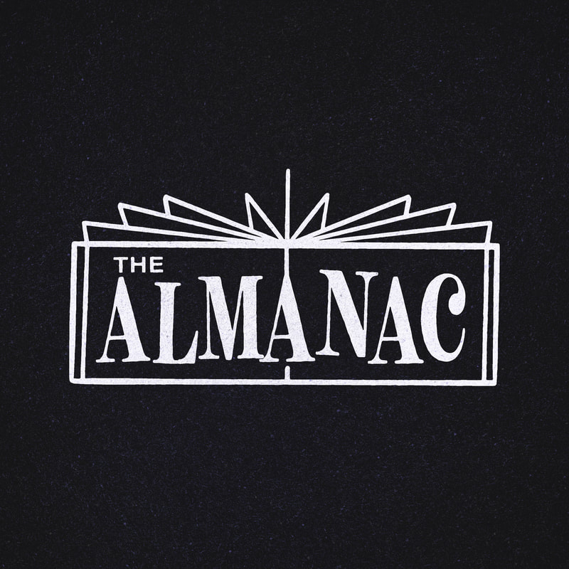 The Almanac wasn't the only work for Alma this summer, I also created the branding for their secret concert series, Off the Record. While the use of a vinyl record is a bit obvious, I added the turntable tone arm shushing to complete the branding. Keeping it in a classic one-color design, it can be implemented easily into various types of print. 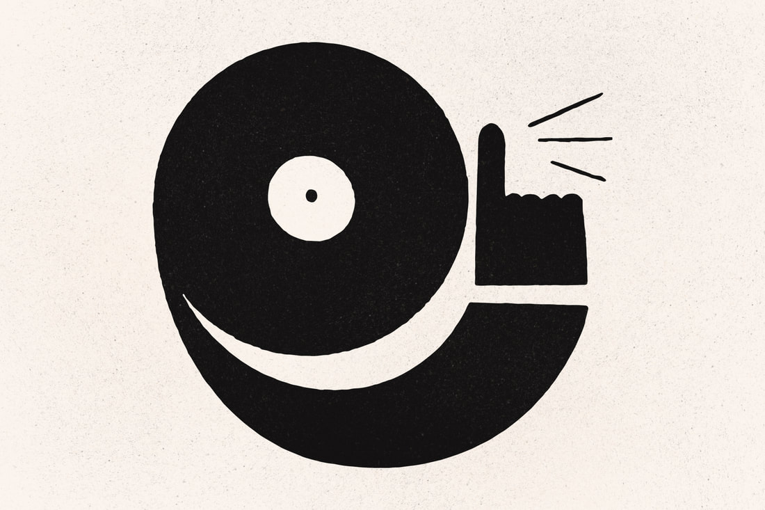 This poster is one of my favorites for one of my favorite performers of the last few years—Orville Peck. If there's one thing the world needs more of, it's gay country music. These posters are four-color screen prints made here in Seattle. A few are still available via Porchlight Design Co. 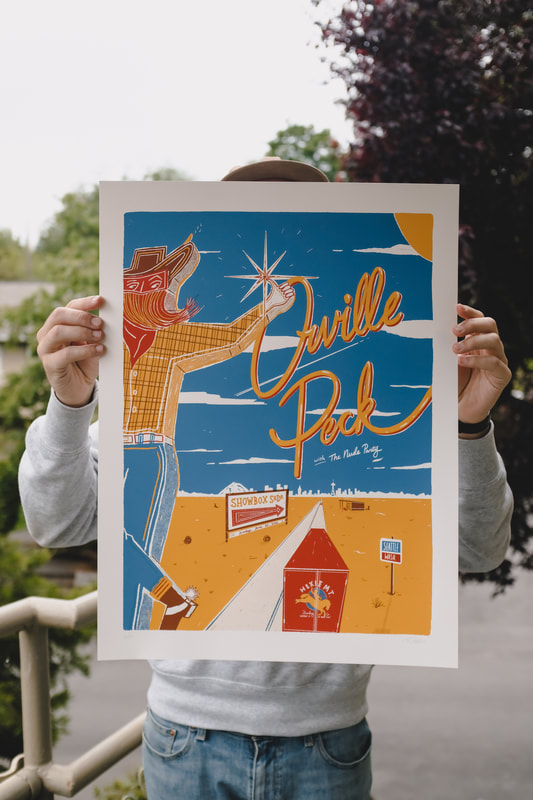 Next in the land of show posters, two designs for the local folks Ivan and Alyosha! 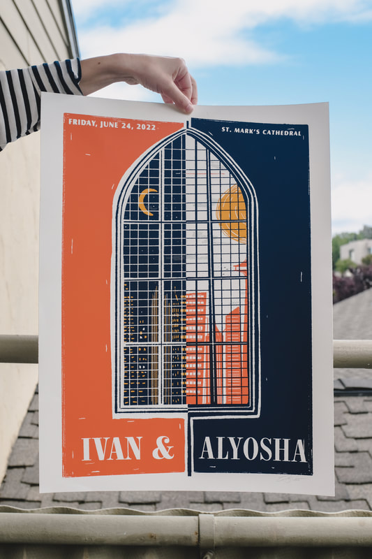 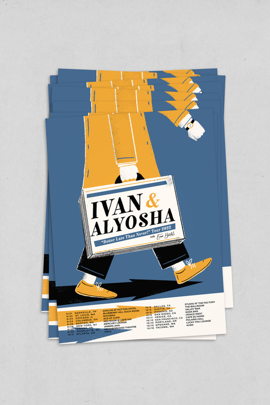 This next poster was for a local concert series on Beacon Hill. In its second year, the Jefferson Jumpstart shows happen in a relaxed atmosphere in Jefferson Park and I wanted the design to evoke the fun, but family-friendly and culturally diverse shows happening there. 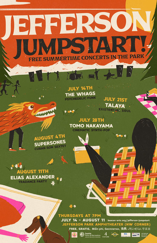 I created another pin for the fine folks at Pacific Bonsai Museum. This one is a purple wisteria pin, available via the museum's online shop and in-person at the gift shop. 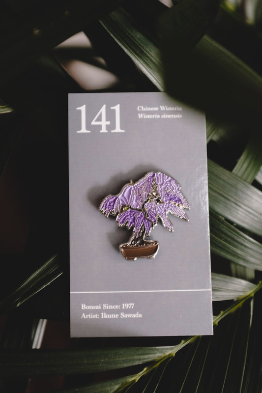 I helped Yonder Cider "pin-a-fy" one of their cans. They already have a beautiful typographic logo, which the design was based around. Grab one here! 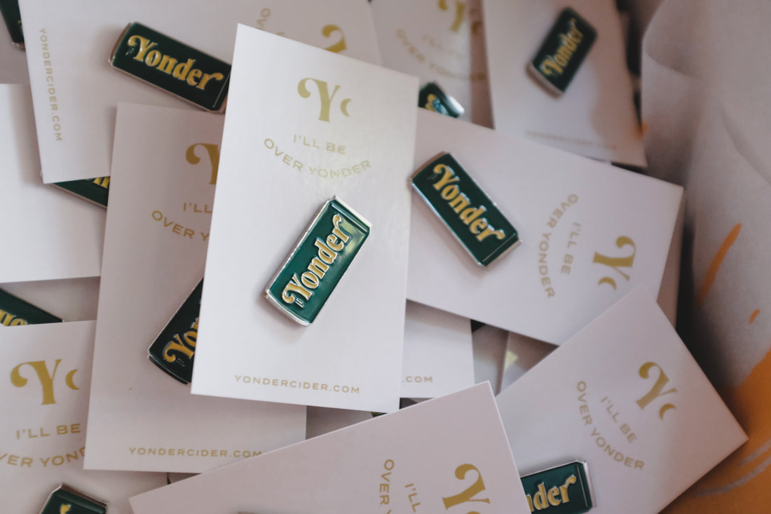 Lastly, here are some of my favorite photos from June and July! |