|
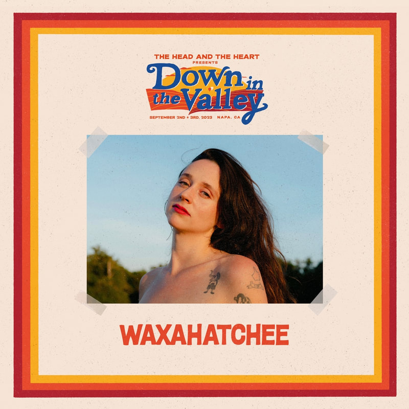
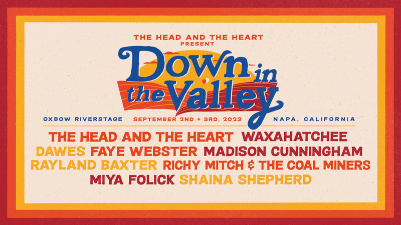
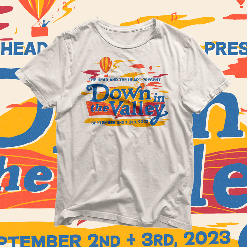
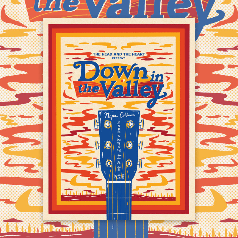
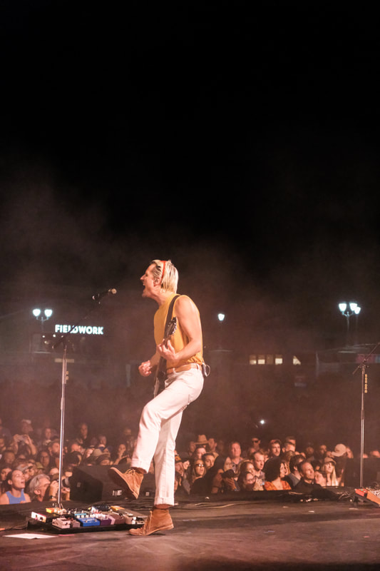
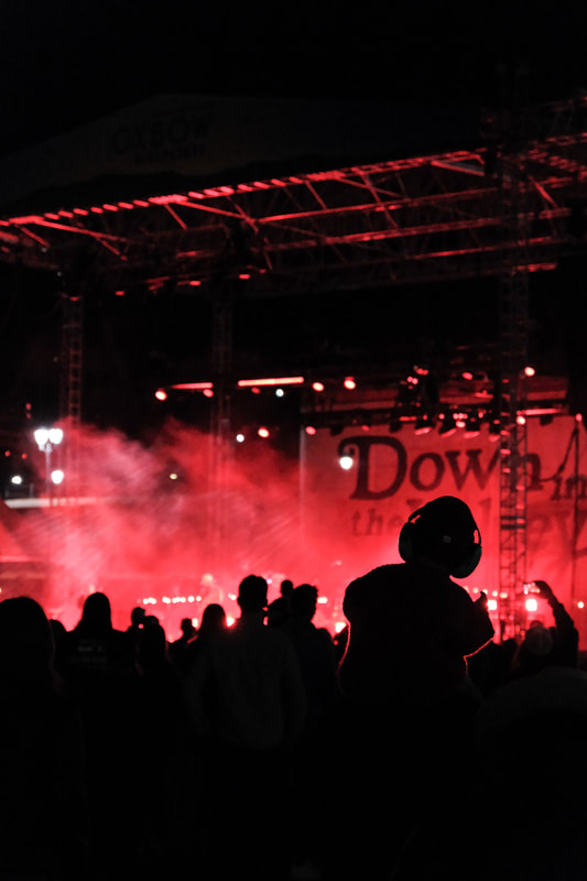
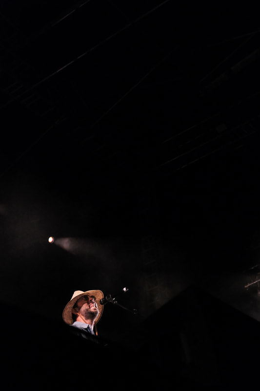
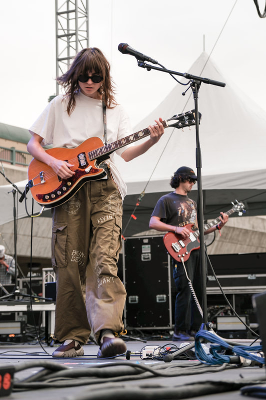
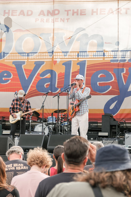
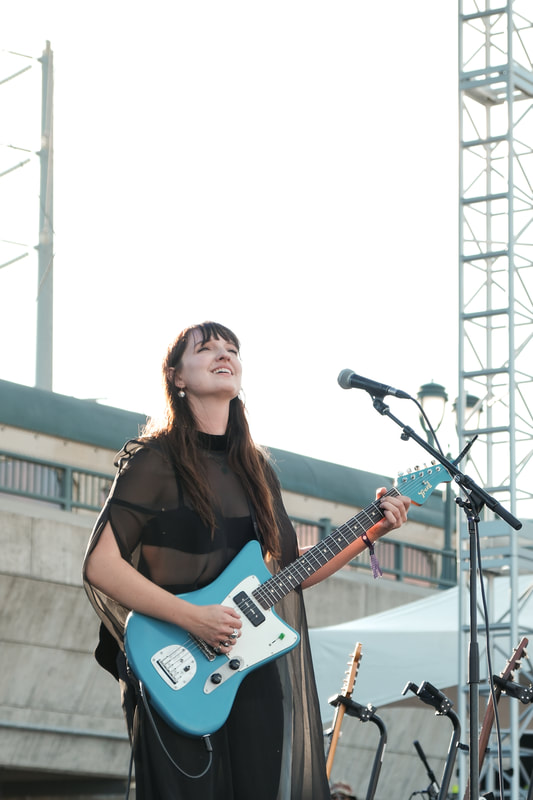
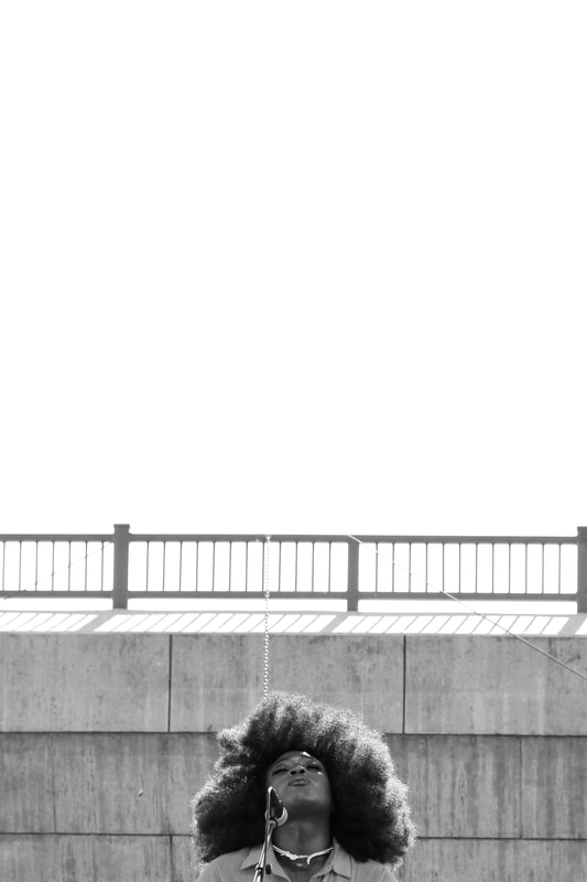
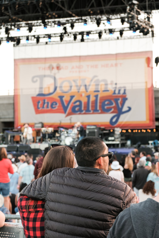
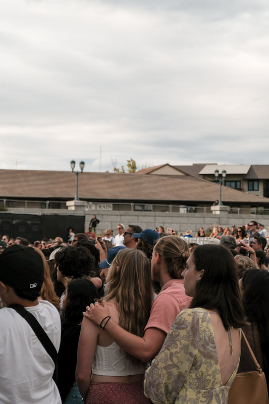
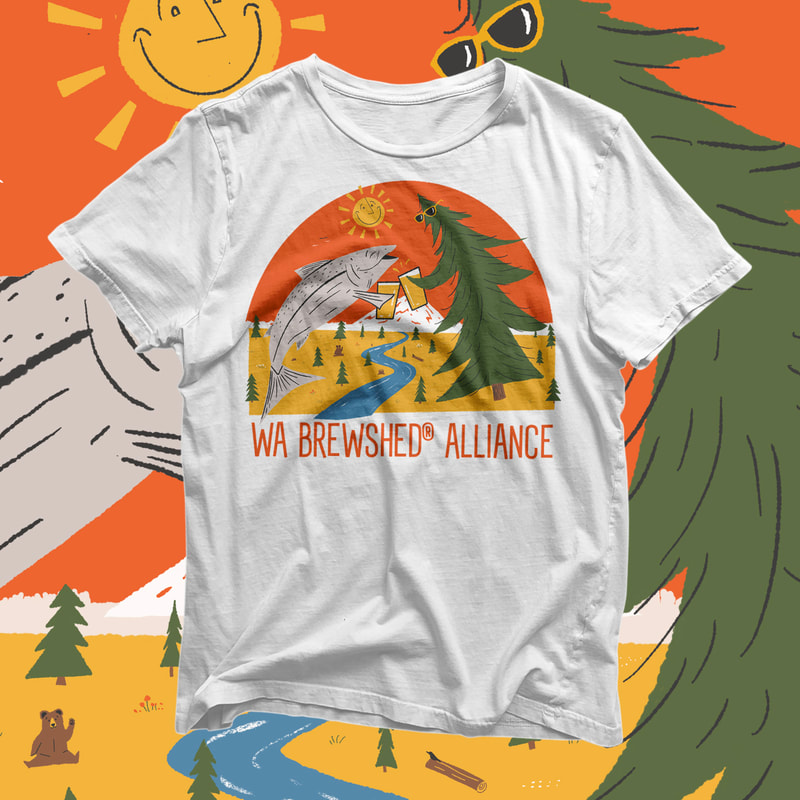
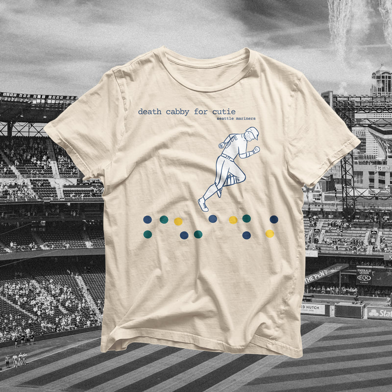
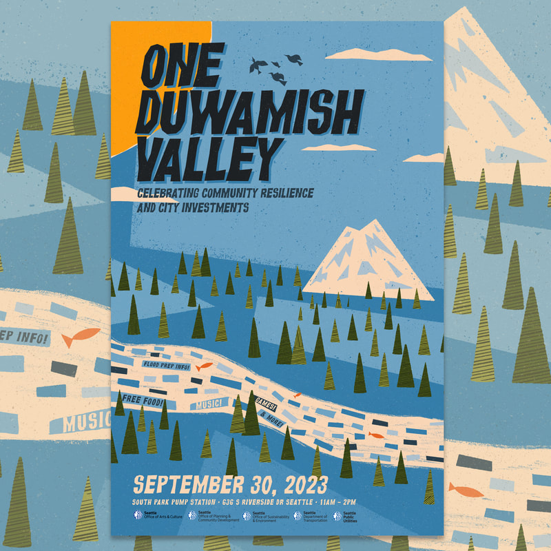
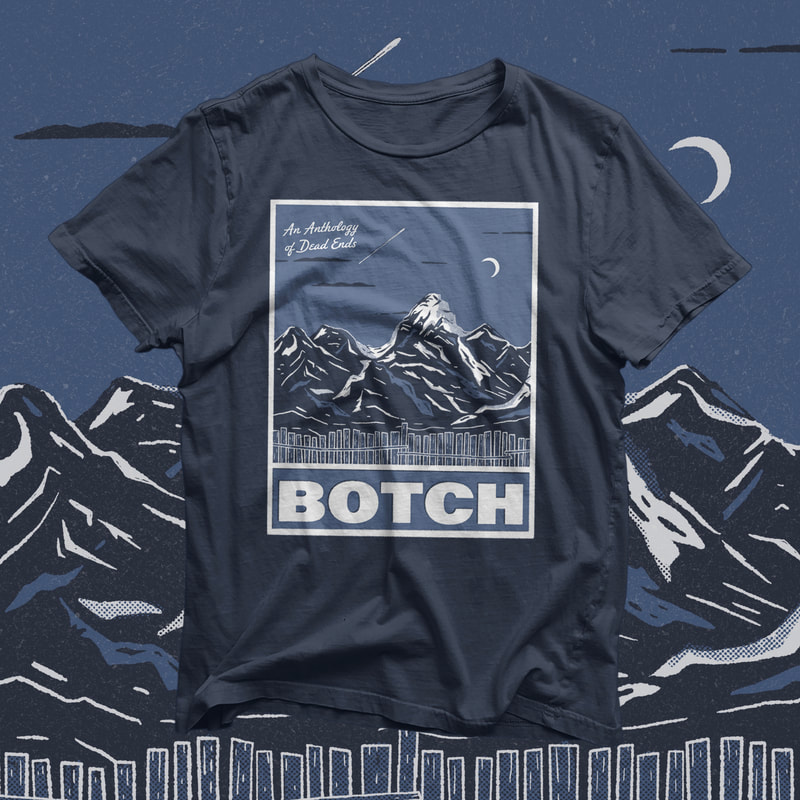
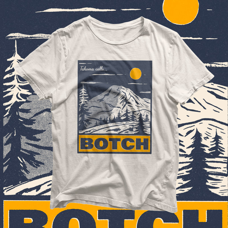
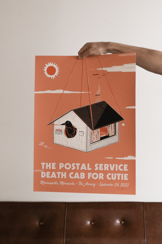
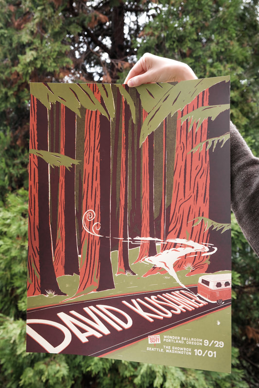
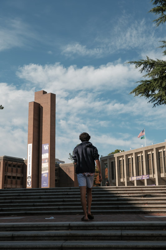
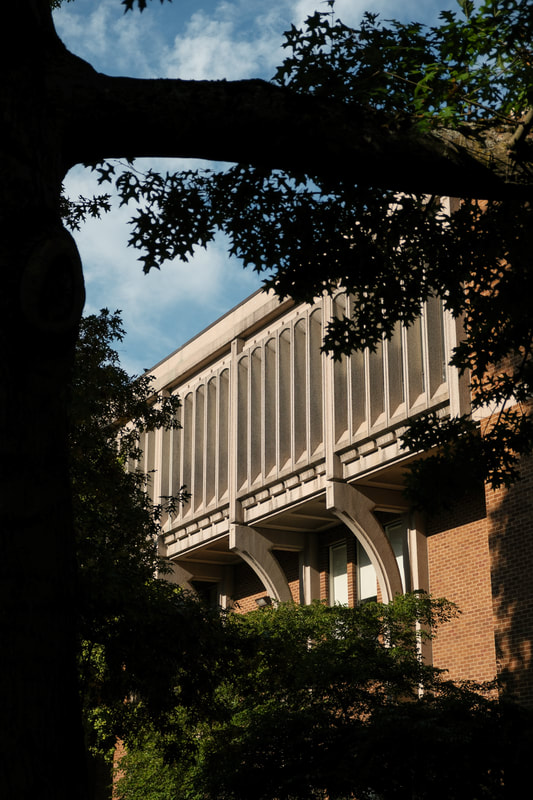
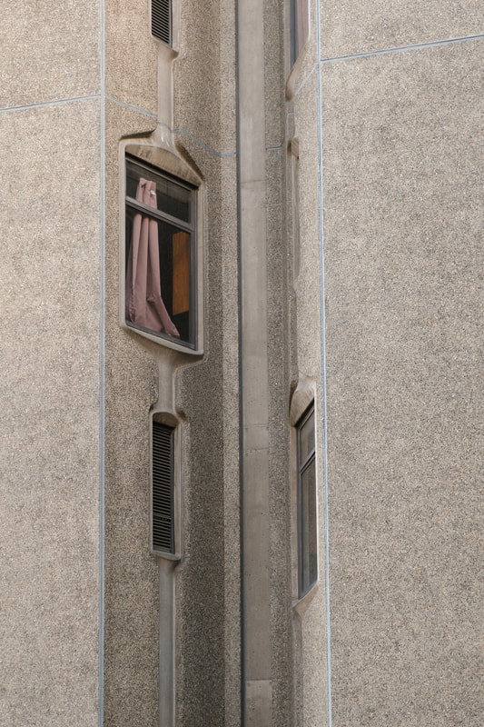
It was a busy summer...and a busy fall.... A big one throughout the year was branding Down in the Valley, a brand new two-day festival hosted by the Head and the Heart. I provided the branding, digital marketing materials and some photography at the festival. The main requests for the branding were that the lettering evoked their classic lettering used on the band's first album and singles and that it focused on the beauty of the Napa region where the festival was held. In addition, I designed a souvenir poster and shirt for the fest as well. My approach to festival photos was to capture the mood of the weekend, photos from backstage and more traditional photos of the acts as well. Here are a few of my favorites: Next, a t-shirt design for Washington Brewshed Alliance, an conservation organization that partners with breweries across the state. It was a fun one, showing the outdoors and a very cheery cheers. Growing up as a Seattle Mariners fan, I feel super lucky to have gotten the opportunity to create a goofy design for a Mariners/ Death Cab For Cutie collaboration. Using the likeness of Mariners utility player Jose "Cabby" Caballero and Death Cab's "We Have the Facts" cover art, "Death Cabby For Cutie" was born. The shirts were part of a fundraiser on Jose Caballero's actual birthday and all shirts were quickly snagged and sold out. In a region surrounded by water, with a decent amount of extra water added through rainfall, Seattle is always finding new ways to keep residents safe from flooding—especially in South Seattle. This poster was designed to celebrate the opening of the new South Park Pump Station and bring awareness to flood preparation. Having grown up in King County, I was closely familiar with hardcore/metal/mathcore locals Botch. Once I started listening to more than just pop punk bands, Botch had seeped into my playlists via a couple close friends. I later became familiar with the offshoots of Botch: Russian Circles, Minus the Bear and These Arms Are Snakes and when bassist Brian asked me to design a couple shirts, I jumped on the idea. Knowing my style of design isn't exactly in line with most hardcore and metal bands, Brian reassured me that I was the man for the job—creating some vintage national park-inspired designs. One of the biggest tours of the year was clearly the Death Cab For Cutie / Postal Service co-headlining run of shows. Each show on the tour had its own screen printed show poster that was available in a standard edition as well as a limited-edition foil version. Posters sold out QUICKLY. I designed two posters for the tour, both of which combined Death Cab's "Transatlanticism" album art and The Postal Service's iconic "Give Up" art. Below is the Minneapolis design and in the next recap I'll show you the Phoenix design. This poster I designed was inspired by a recent drive through the Redwoods where we encountered dozens of Volkswagen enthusiasts parading under the tall trees. I decided to focus on one single VW bus driving just out of the frame. Both shows were sold out before the poster was even designed! Lastly, some of my favorite photos, taken in the early fall.
Comments are closed.
|
Archives
February 2024
|
